skip to Main Content

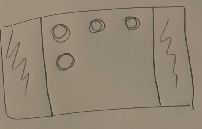
Here’s what I’m trying to accomplish. I want some padding left and right but then I don’t want the items themselves to appear centered.

enter image description here

I have a container as follows:

.container {
    display: flex;
    flex-wrap: wrap;
    justify-content: space-between;
}

My question is how do I add padding so that on the rows there’s some space left and right in the container?

2

Answers


  1. If I understood your question correctly, I think you just need to add horizontal padding:

    .container {
      display: flex;
      flex-wrap: wrap;
      justify-content: space-between;
      padding: 0 20px;
    }
    
    Login or Signup to reply.
  2. You should sue grid for this but works the same for flexbox. padding only works on the inside and does nothing with the value auto. What you actually need is to simply add a margin to the outside: margin: 0 auto

    .d-flex {
      display: grid;
      grid-template-columns: repeat(3, max-content);
      margin: 0 auto;
      width: min-content;
      gap: 1em;
    }


    /* for demo purpsoe only */
    .d-flex {
      border: 2px dashed blue;  
    }
    
    .card {
      width: 100px;
      height: 100px;
      border: 1px solid red;
    }
    <div class="d-flex">
      <div class="card">1</div>
      <div class="card">2</div>
      <div class="card">3</div>
      <div class="card">4</div>
    </div>
    Login or Signup to reply.
Please signup or login to give your own answer.
Back To Top
Search