 Question posted in


Is a duplicate from this question, which was apparently too vague.
I want to clip elements using a clip-path in CSS, having specific requirements. I’ve been fiddling with it and reading MDN docs, but can’t figure out how to do it, and if it can even be done.
The clip-path should be a perfect circle (so I was thinking about the circle function), of which the left side aligns with the left side of the element to clip. The circle should obtain its diameter by getting the height of the element to clip, and multiple that by 3 (so the circle should be 300% of the height of the element to clip).
Here is an example of what I’m trying to achieve:
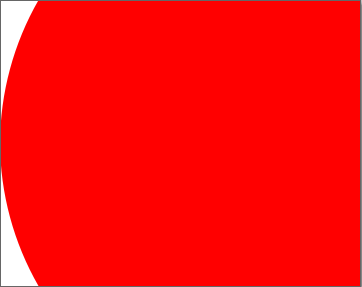
Where the red bit is my content, the part of the element I want to keep/show. The element could have different widths and heights, the clip-path should adapt to that.
2
Answers
Not sure if it’s possible to get the height but getting the width is doable
@Temani offered good idea, but
farthest-sideis not correct in this contest.Width of box is not important, let height 1, then radius should be 1.5.
And center of the circle should be (1.5, 0.5).