skip to Main Content

I’ve been struggling to reproduce this button :

button with round border which becomes transparent around the check icon

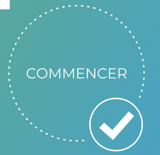
Specifically I can’t seem to find how to make the border invisible around the check icon. At the moment it’s "finished" except for this part.

It’s a nuxt3 component and it looks like this :

 <template>
  <div class="button-container">
    <nuxt-link :to="link.link">
      {{ link.title }}
    </nuxt-link>
    <div class="check-container">
      <svg-icon type="mdi" :path="mdiCheckBold" class="icon is-large" />
    </div>
  </div>
</template>

<script setup lang="ts">
import { defineProps } from 'vue'
import SvgIcon from '@jamescoyle/vue-icon'
import { mdiCheckBold } from '@mdi/js'

type Link = {
  title: string;
  link: string;
};

interface Props {
  link: Link;
}

defineProps<Props>()
</script>

<style scoped lang="scss">
@import 'assets/style/_variables.scss';

.button-container {
  position: relative;
  border: dotted $white 0.24rem;
  border-radius: 50%;
  display: flex;
  justify-content: center;
  align-items: center;
  width: 18rem;
  height: 18rem;
  a {
    text-decoration: none;
    color: $white;
    font-size: 2rem;
  }
  .check-container {
    position: absolute;
    top: 11.5rem;
    left: 11.5rem;
    border: solid $white 0.24rem;
    border-radius: 50%;
    display: flex;
    justify-content: center;
    align-items: center;
    width: 7rem;
    height: 7rem;
    color: $white;
    background: $background-gradient;
  }
}
</style>

Any help would be great, thank you in advance !

3

Answers


  1. You can use mask to cut part of the border:

    .box {
      --a: 40deg; /* the position */
      --r: 35px; /* the radius */
    
      width: 200px;
      aspect-ratio: 1;
      border-radius: 50%;
      border: 3px dashed red;
      -webkit-mask:
         radial-gradient(var(--r) at
           calc(50% + 50%*cos(var(--a)))
           calc(50% + 50%*sin(var(--a))),
          #0000 98%,#000)
    }
    <div class="box"></div>

    An idea of the full code:

    button {
      --a: 40deg; /* the position */
      --r: 35px; /* the radius */
    
      font-size: 20px;
      aspect-ratio: 1;
      color: #fff;
      padding: 1em;
      border: none;
      background: none;
      border-radius: 50%;
      cursor: pointer;
      position: relative;
    }
    button:before {
      content:"";
      position: absolute;
      inset: 0;
      border-radius: inherit;
      border: 3px dashed;
      -webkit-mask:
         radial-gradient(var(--r) at
           calc(50% + 50%*cos(var(--a)))
           calc(50% + 50%*sin(var(--a))),
          #0000 98%,#000)
    }
    button:after {
      content:"";
      position: absolute;
      border-radius: inherit;
      inset: calc(50% - var(--r) + 10px); /* adjust the 10px to control the gap */
      background: url(https://picsum.photos/id/1/200/200) center/cover; /* place your SVG icon here */
      /* adjust the 70px based on your real use case */
      transform: rotate(var(--a)) translate(70px) rotate(calc(-1*var(--a)))
    }
    
    
    body {
     background: linear-gradient(90deg,blue,pink);
    }
    <button class="box">Commencer</button>
    Login or Signup to reply.
  2. A solution to render an halo around the .check-container element, that will hide anything behind (see the parent element border) could be using box-shadow

    :root{
      --border-color: white;
      --link-color: white;
      --check-color: white;
      --check-border: white;
      --check-bg: aqua;
      --parent-bg: aqua;
    }
    
    body{
      background: var(--parent-bg);
    }
    
    .button-container {
      position: relative;
      
      display: flex;
      justify-content: center;
      align-items: center;
        
      border: dotted var(--border-color) 0.24rem;
      border-radius: 50%;
      
      width: 18rem;
      height: 18rem;
      
      background: var(--parent-bg);
    }
    
    .button-container a {
      text-decoration: none;
      color: var(--link-color);
      font-size: 2rem;
    }
    
    .button-container .check-container {
      position: absolute;
      
      top: 11.5rem;
      left: 11.5rem;
      
      border: solid var(--check-border) 0.24rem;
      border-radius: 50%;
      
      display: flex;
      justify-content: center;
      align-items: center;
      
      width: 7rem;
      height: 7rem;
      
      color: var(--check-color);
      background: var(--check-bg);
         
      box-shadow: 0 0 0 1em var(--parent-bg);  
    }
    
    
    .icon-circle {    
        font-size: 5em;    
    }
    <link rel="stylesheet" href="https://cdnjs.cloudflare.com/ajax/libs/font-awesome/6.5.1/css/all.min.css" integrity="sha512-DTOQO9RWCH3ppGqcWaEA1BIZOC6xxalwEsw9c2QQeAIftl+Vegovlnee1c9QX4TctnWMn13TZye+giMm8e2LwA==" crossorigin="anonymous" referrerpolicy="no-referrer" />
    
    <div class="button-container">
      <a href="">COMMENCER</a>      
      <div class="check-container">
        <i class="fa-solid fa-check icon-circle"></i>
      </div>
    </div>
    Login or Signup to reply.
  3. If you want simple and rookie solution , use other over it , add different z-index to both elements and adjust position as per your need .

    Login or Signup to reply.
Please signup or login to give your own answer.
Back To Top
Search