skip to Main Content

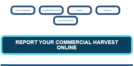
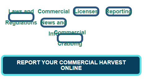
I have a button that a predecessor created but when viewed on a smartphone or shrunken browser window, the text shrinks and is barely legible. I’ve also created my own button which doesn’t have this issue but I’m trying to figure out how to fix the old ones and see where the problem is. I’m thinking it’s because the font size for them is vw, while mine is a set pixel amount, but I’m not sure. ๐Ÿ™

/* OLD: */

.Button-transparent03 {
  display: inline-flex;
  height: 6vh;
  width: 17vw;
  line-height: 2em;
  padding: 0.2em;
  margin: 0.3em;
  border: 6px solid #2b547e;
  border-radius: 13px;
  font-size: 1vw;
  font-weight: bold;
  text-align: center;
  /*   display: flex; */
  justify-content: center;
  align-items: center;
  background-color: transparent;
  word-wrap: break-word;
}
.Button-transparent03:hover {
  color: #001f3f;
  /*    background-color: white; */
  background-image: url("/buttons/WTR-landscape.jpg");
  color: white;
}

/* NEW */

/* Hot Topic Button */
.Button-solid {
  display: inline-flex;
  color: white;
  border: 6px solid #5ce1e6;
  border-radius: 13px;
  font-family: Arial;
  text-transform: uppercase;
  text-align: center;
  line-height: 1;
  font-size: 18px;
  font-weight: bold;
  background-color: #083f5c;
  padding: 10px;
  outline: none;
}
.Button-solid:hover {
  font-size: 18px;
  color: white;
  background-color: #083f5c;
}

See the difference between the old buttons and my new one

I’ve tried using px instead of vw for the old buttons but it just results in a mess.

Testing out a px size to see what happens

2

Answers


  1. I’ve created a code snippet which contains your predecessors old button, your new button, and a revised old button too.

    I changed the units of measurement from ones which change based on the viewport size to ones which are clearly defined. Changing from em & vw/vh to px allows for a consistent button design; no matter the viewport size.

    Some of the CSS attributes end up being redundant after adding specific width and height, so I removed the attributes which were no longer relevant.

    If the button needs to look adjust for the screen size, you can use media queries to accomplish this. I added an example for a smaller screen size of 600px wide:

    .Button-transparent03 {
      display: inline-flex;
      height: 6vh;
      width: 17vw;
      line-height: 2em;
      padding: 0.2em;
      margin: 0.3em;
      border: 6px solid #2b547e;
      border-radius: 13px;
      font-size: 1vw;
      font-weight: bold;
      text-align: center;
      /*   display: flex; */
      justify-content: center;
      align-items: center;
      background-color: transparent;
      word-wrap: break-word;
    }
    
    .Button-transparent03:hover {
      color: #001f3f;
      /*    background-color: white; */
      background-image: url("/buttons/WTR-landscape.jpg");
      color: white;
    }
    
    
    /* NEW */
    
    
    /* Hot Topic Button */
    
    .Button-solid {
      display: inline-flex;
      color: white;
      border: 6px solid #5ce1e6;
      border-radius: 13px;
      font-family: Arial;
      text-transform: uppercase;
      text-align: center;
      line-height: 1;
      font-size: 18px;
      font-weight: bold;
      background-color: #083f5c;
      padding: 10px;
      outline: none;
    }
    
    .Button-solid:hover {
      font-size: 18px;
      color: white;
      background-color: #083f5c;
    }
    
    
    /* REVISED OLD */
    
    .New-Button-transparent03 {
      display: inline-flex;
      height: 35px;
      width: 150px;
      margin: 7px;
      border: 6px solid #2b547e;
      border-radius: 13px;
      font-size: 10px;
      font-weight: bold;
      text-align: center;
      justify-content: center;
      align-items: center;
      background-color: transparent;
      word-wrap: break-word;
    }
    
    .New-Button-transparent03:hover {
      color: #001f3f;
      background-image: url("/buttons/WTR-landscape.jpg");
      color: white;
    }
    
    @media all and (max-width: 600px) {
      .New-Button-transparent03 {
        display: inline-flex;
        height: 25px;
        width: 120px;
        margin: 4px;
        border: 3px solid #2b547e;
        border-radius: 7px;
        font-size: 7px;
        font-weight: bold;
        text-align: center;
        justify-content: center;
        align-items: center;
        background-color: transparent;
        word-wrap: break-word;
      }
    }
    <button class="Button-transparent03">Old Button</button>
    <button class="Button-solid">New Button</button>
    <button class="New-Button-transparent03">Revised Old Button</button>
    Login or Signup to reply.
  2. Yes it is because you are using viewport units. Also, you do not need to set width and height of a button, use padding to control the size of the button.

    .btn-1 {
        padding: 10px 20px;
        border: 6px solid #2b547e;
        border-radius: 13px;
        font-size: 20px;
        font-weight: bold;
        background-color: transparent;
    }
    <button class="btn-1">Button 1</button>

    p.s you do not need to center the button text using CSS, it is centered by default.

    Login or Signup to reply.
Please signup or login to give your own answer.
Back To Top
Search