skip to Main Content

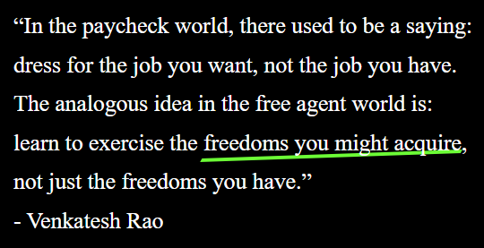
As shown in this fiddle, I have a custom underline that uses transform: skew(-30deg) rotate(-2deg);.

How can I replace the -2 with a formula that uses the width?

E.g. [width in pixels] * .004 - 2.4

I never know the width ahead of time because the quotes and fonts can change.

.underlined {
  $lineColor: #4ffe25;
  position: relative;
  z-index: 2;
  &::before {
    background-color: $lineColor;
    content: "";
    position: absolute;
    width: calc(99% + 0px);
    height: 15%;
    left: 0;
    top: 95%;
    z-index: -1;
    transform: skew(-30deg) rotate(-2deg); /* How to use a formula for the `rotate` value?  */
  }
}

screenshot

2

Answers


  1. I don’t think there is a supported angle unit that takes dynamic radius into consideration. However, you could consider using clip-path instead. The use of length-percentage refers to the length and height of the element.

    .underlined {
      --line-color: #4ffe25;
      position: relative;
    }
    
    .underlined::before {
      background-color: var(--line-color);
      content: "";
      position: absolute;
      width: 100%;
      height: 100%;
      top: 30%;
      z-index: -1;
      clip-path: polygon(2% 85%, 100% 55%, 98% 70%, 0% 100%);
      transform: skew(-20deg);
    }
    <div style="width: 600px">
      <div class="content" style="font-size: 80%; line-height: 170%;">
        <div class="quote">
          <div class="line">
            “In the paycheck world,
            <span class="underlined" style="font-size:30px"> there used to be a saying: </span><br>
          </div>
          <div class="line">dress for the job you want, not the job you have.<br> </div>
          <div class="line">The analogous idea in the free agent world is:<br> </div>
          <div class="line"> learn to exercise the <span class="underlined"> freedoms you might acquire</span>,<br> </div>
          <div class="line">not just the freedoms you have.” </div>
        </div>
        <div class="person"><span class="underlined" style="font-size:10px">- Venkatesh Rao </span></div>
      </div>
    </div>
    Login or Signup to reply.
  2. You could play around with gradient background images as they ‘know’ about coming to/going from corners and don’t depend on your knowing the width in advance.

    Here’s an example which alters depending on font size.

    <style>
      .container {
        font-size: 24px;
      }
      
      .underlined {
        --lineColor: #4ffe25;
        --thickness: 0.1em;
        position: relative;
        z-index: 2;
        width: fit-content;
      }
      
      .underlined::before {
        content: '';
        width: 100%;
        height: 0.4em;
        position: absolute;
        top: 1em;
        left: 0;
        background-image: linear-gradient(to top left, transparent 0%, transparent calc(50% - var(--thickness)), var(--lineColor) calc(50% - var(--thickness)), var(--lineColor) calc(50% + var(--thickness)), transparent calc(50% + var(--thickness)), transparent 100%);
        z-index: -1;
      }
    </style>
    <div class="container">
      <div>Some text <span class="underlined">a short quote</span> and some more text</div>
      <div class="underlined">a rather longer quote</div>
      <div class="underlined">a much much much much much much longer quote</div>
    </div>
    Login or Signup to reply.
Please signup or login to give your own answer.
Back To Top
Search