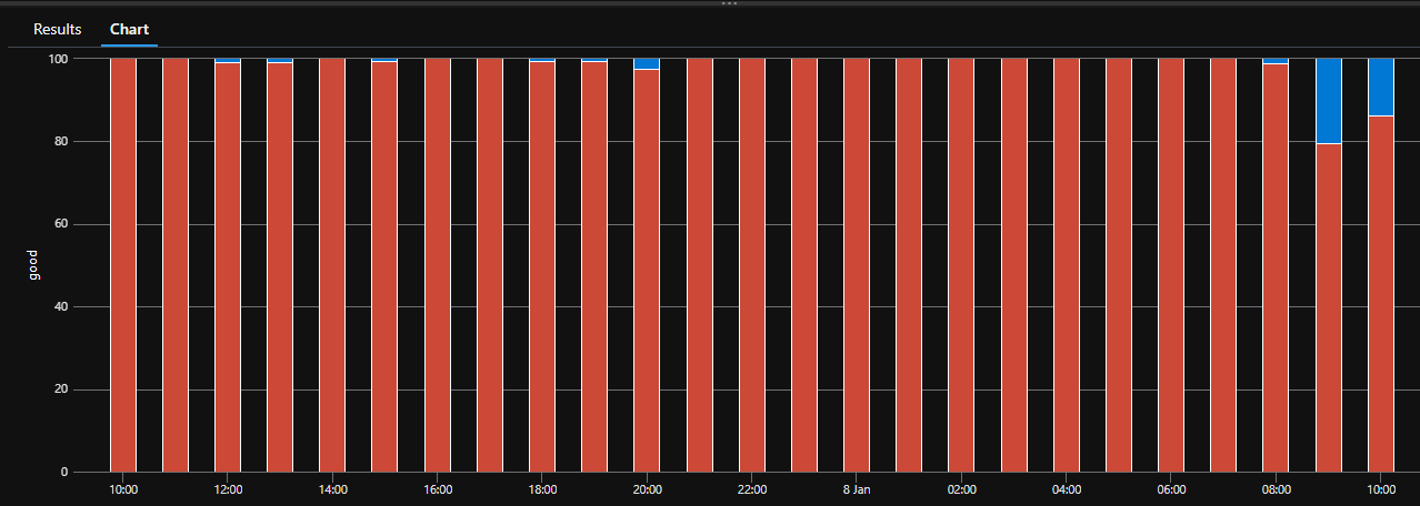
I am trying to create an Azure Monitor Workbook "step" to create a stacked100 graph.
This is easily achieved in Azure App Insights, but the same query refuses to render as a 100% graph and just gives a standard column chart
Using APP INSIGHTS LOGS pane
requests
| where name == "****"
| where url  == "****"
| summarize good=countif(duration < 30000), exceptions=countif(duration >= 30000) by bin(timestamp, 1h)
| render columnchart kind=stacked100
Using Azure Monitor Workbook
Query is EXCACTLY the same as above
Workbook step settings
Question: Is Stacked 100% not supported in Workbooks?

 Question posted in


2
Answers
Yes, it works in Azure Monitor Workbooks too:
Query :
Azure Monitor WorkBook:
App Insights:
The only difference is upside down of the chart.
Chart settings are default :
Workbooks itself does not have a stacked100 version of the chart (not all of the options supported by the render operation are supported in workbooks)
In workbooks you’d have to compute the %’s yourself to create a stacked 100 chart