 Question posted in


so i want to make 4 social media buttons arrange in a grid of 2×2 so i used the tailwind classes grid grid-cols-2 gap-4 on the parent container of the items. But this just gives me keeps the same top to bottom arrangement of all the items without arranging them in a grid.
Code attached below
<div class="social-grid grid col-span-2 gap-4">
            <div class="p-5 border-2 border-black rounded-full w-fit ">
              <i class="fab fa-twitter text-5xl"></i>
            </div>
            <div class="p-5 border-2 border-black rounded-full w-fit ">
              <i class="fab fa-facebook-f text-5xl"></i>
            </div>
            <div class="p-5 border-2 border-black rounded-full w-fit ">
              <i class="fab fa-linkedin-in text-5xl"></i>
            </div>
            <div class="p-5 border-2 border-black rounded-full w-fit ">
              <i class="fab fa-instagram text-5xl"></i>
            </div>
          </div>
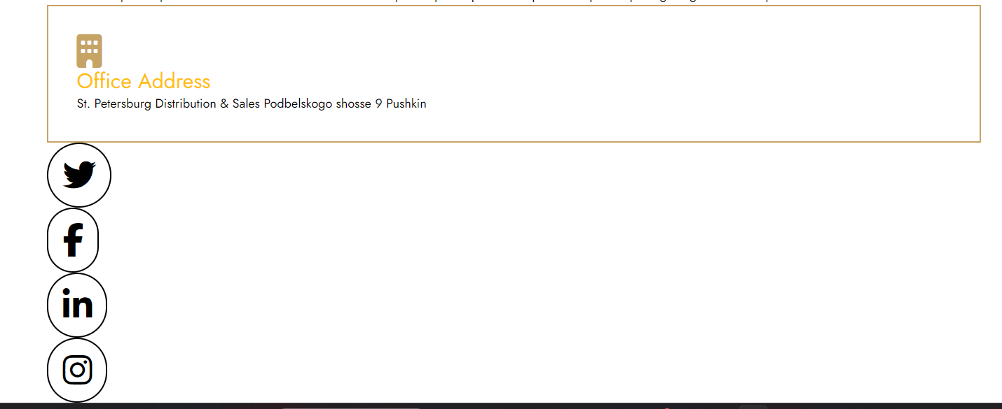
This is how the web page looks right now
How do i fix this and make the 2×2 grid
I tried a lot of different things but still not able to trouble shoot this issue
2
Answers
You seem to have used
col-span-2on the grid container element which appliesgrid-column: span 2 / span 2. This would be used on grid children to control how they arrange themselves in the grid, not defining the amount of grid columns there are in the grid.Instead, consider applying
grid-template-columnsto the grid container element which defines the grid columns themselves. As you say, you could add thegrid-cols-2class name to have a 2×2 grid:In the code you pasted, you aren’t using
grid-cols-2, you are usingcol-span-2which would be used on a child item, not the parent. It seems based on your question you understand this, it may be a simple typo! Changingcol-span-2togrid-cols-2, and also addinggrid-rows-2in order to achieve the 2×2 effect you are looking for, should solve your problem.Additionally, you can specify
col-start-1col-start-2row-start-1androw-start-2on your child items classes to place them where you would like in the grid.