 Question posted in


I’m trying to draw box (DIV) with max-width and child span.
Somehow the parent DIV stretches to its max width, not the size of its child.
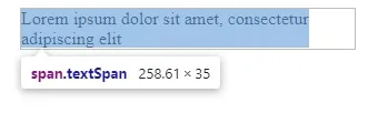
As you see on the pic, the size of child span is 258, but the DIV is still 300:
How to make DIV width equal to its child (= 258 + border)?
.borderDiv {
    max-width: 300px;
    border: 1px solid #bebdbd;
}

.textSpan {

}
<div class="borderDiv">
<span class="textSpan">Lorem ipsum dolor sit amet, consectetur adipiscing elit</span>
</div>I’ve tried inline-block, flex and border-box, it doesn’ work.
Any ideas?
4
Answers
you can use max-width:fit-content;. You can also keep max-width:300px if needed (instead of fit-content). Pls note that the word won’t be broken, so if a word can’t be fitted you will still have space. (otherwise you can use as well in .textSpan the word-break: break-all;
You can specify the width for the inner div and make the outer div an inline block or change the width of the outer div to 260px with border-box.
You can set the width to
min-content,max-contentorfit-content. These are slightly different but fairly self-explanatory but there’s a useful explainer on logrocket. If you want the div to shrink to the content but not exceed 300px then set thewidthas above thenmax-widthto 300px as below:A very stretched solution to make the div (block element) stretch to its content size (despite it being an inline element and thus not having an actual size but just phrasal content) it’s styling the parent container with
width: min-contentso that it will go as down as possible with its min width and yet enlarge according to the very subtle wrapping hint made with the<wbr>element put there for sizing reasons (otherwise you’ll need to style the span asinline-blockand give precise size to hint the wrap). For the wrapping to be forced like that requires the span to be styled withwhite-space: nowrap;.The main reason why I posted this answer it’s to show both the power of
min-contentand more importantly the lesser known<wbr>https://developer.mozilla.org/en-US/docs/Web/HTML/Element/wbr
I’m quite sure there’s no way to go further than this with css only.. the other solution would be to process the elements on document ready and resize the container using the actual content width rendered. Like you tried, the span is wrapping its text according to the container max width but will leave a white gap anyway otherwise.