 Question posted in


I’m trying to create a grid that shrinks items before creating new rows. Instead, it always creates new rows and never shrinks items.
.grid {
  display: grid;
  grid-template-columns: repeat(auto-fit, minmax(150px, 200px));
  justify-content: center;
  justify-items: center;
  grid-gap: 2em;
}

.grid > div {
  background: grey;
  min-height: 150px;
  min-width: 150px;
}
<div class="grid">
<div></div>
<div></div>
<div></div>
<div></div>
<div></div>
<div></div>
<div></div>
<div></div>
<div></div>
</div>Here is a photo of the grid 1px before shrinking it would lead to new rows:
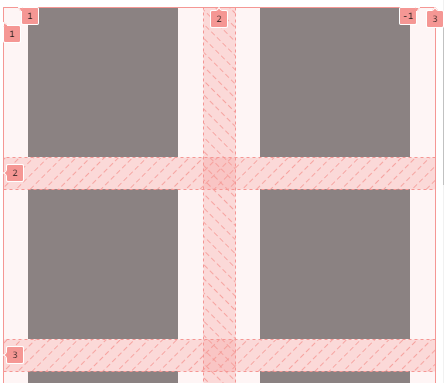
As you can see, there is plenty of room around the content in each cell. That content is 150px wide. The grid cell is 200px wide, the top end of its minmax, but refuses to get any smaller. It should shrink down to 150px before creating any new rows.
Everything I’ve read online or asked from AI has stated I’m doing this right. I’m using Opera GX, which does support this feature.
2
Answers
For those who care to know, found an answer here: CSS grid not considering min value in minmax along with auto-fit
Minmax does not work with a px unit for max.
Instead you have to use
grid-template-columns: repeat(auto-fit, minmax(150px, 1fr));Then set
max-widthon the sub-items. I have no idea why.Edit: I've found this is not an actual solution. It makes the rows larger than 200px if they can be (obviously). I want a max of 200px, and a min of 150px.
I am not sure if this can answer your question, but you can try using clamp() for a sort of responsiveness. I used it for width and height. You can change values according to your needs. You can check clamp()