skip to Main Content

Preview wanted

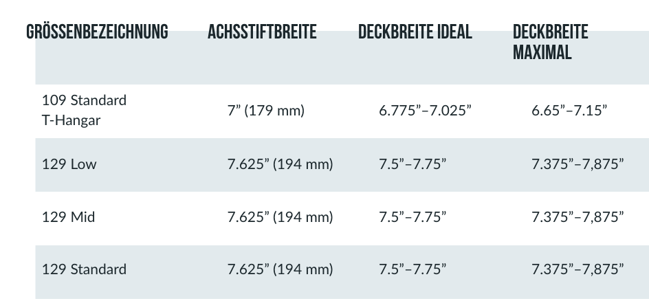
enter image description here

A client wants to have the table designed like this above.

But i cant seem to figure out how to alter the position of the text in the first row or better said in general, because things like margin-top: -20px; just dont work…

Also client will have employees create tables with non-html knowledge like Gutenberg Editor Table. This means i dont really have the option to add an extra element inside the td like a span :/

Any idea how and if this is doable ? Thank you very much!

tbody > tr:nth-child(1) > td {

???

}

I tried

tbody > tr:nth-child(1) > td {

margin-top: -20px;
margin-left: -20px;

}

to alter the position but that doesnt work.

5

Answers


  1. Try placing the texts on the first line in <span> and assigning position: absolute with top: -20px in them and position: relative in the <td>

    EDIT:

    Using javascript to wrap the text with span

    document.addEventListener('DOMContentLoaded', function() {
      var cells = document.querySelectorAll('td');
      cells.forEach(function(cell) {
        var span = document.createElement('span');
        span.textContent = cell.textContent;
        cell.textContent = '';
        cell.appendChild(span);
      });
    });
    
    Login or Signup to reply.
  2. To obtain the design you want you can simply modify the appearance of the thead element, I suggest you to use position: relative; and top: -.5em;.
    Of course, you can also act on tds directly, but be sure to encapsulate the content in a contanier, e.g. a <span>.

    Here it is a snippet with some examples:

    table {
      border: 2px solid #000;
    }
    td {
      border: 1px solid #000;
    }
    th > span {
      position: relative;
      top: -.5em;
    }
    .myclass {
      position: relative;
      top: -.5em;
    }
    tr:nth-child(1) > td:nth-child(2) {
      position: relative;
      top: -.5em;
    }
    tr > td:nth-child(2) > span {
      position: relative;
      top: -.5em;
    }
    <table>
      <thead>
        <tr>
          <th scope="col">A</th>
          <th scope="col"><span>B</span></th>
          <th class="myclass">C</th>
        </tr>
      </thead>
      <tbody>
        <tr>
          <td>data A</td>
          <td>data B</td>
          <td class="myclass">data C</td>
        </tr>
        <tr>
          <td>data A1</td>
          <td><span>data B1</span></td>
          <td><span class="myclass">data C1</span></td>
        </tr>
      </tbody>
    </table>
    Login or Signup to reply.
  3. Check this out, use overflow-wrap: break-word; to get the overflowing text into a second line. and also give a width: 200px , height: 55px, max-width: 200px to the table column, td element.

    HTML code:

    <!DOCTYPE html>
    <html>
      <head>
        <title>Hello, World!</title>
        <link rel="stylesheet" href="styles.css" />
      </head>
      <body>
         <table>
            <thead>
              <tr>
                <th scope="col">A1</th>
                <th scope="col">A2</th>
                <th scope="col">A3</th>
                <th scope="col">A4</th>
              </tr>
            </thead>
            <tbody>
              <tr>
                <td>Col 1</td>
                <td>Col222222222222wwwwwwwwwww2222</td>
                <td>Col2222222222222222 3</td>
                <td>Col 4</td>
              </tr>
              <tr>
                <td>Col 1</td>
                <td>Col 2</td>
                <td>Col 3</td>
                <td>Col 4</td>
              </tr>
            </tbody>
        </table>
      </body>
    </html>
    

    CSS code:

    table {
      border: 2px solid #000;
      overflow-wrap: break-word;
    }
    td,th {
      border: 0.5px solid #000;
      padding: 1px;
      margin: 8px;
      width: 200px;
      height: 55px;
      max-width: 200px;
    }
    
    Login or Signup to reply.
  4. As stated in comments and other answers, the point here is having the <th> content displaced relative to its box model. I’m doing my answer just for the sake of having a live snippet but I’m adding close to nothing to anything said already.

    There are mostly two ways to achieve that result:

    • By styling the <th> as position: relative and then having a child
      element styled as position: absolute so that its actual position
      will cross the border box of the container;
    • By still having a child element with text content styled with a
      translate;

    Here in this demo I’m showing the translate strategy. There are some tricks to keep things tidy up; for example the size of the th and td are stated statically to keep alignments correct and the word wrap is forced with a br both in the header text and in some td contents. The font is the closest I could pick that could be taken for granted and yet look close to the picture given.. that’s clearly a sans serif font but of course it should be more condensed.

    And now 2 further notes:

    • I noticed in a comment of yours you stated that you cannot change the
      html and you might be forced to create such child element inside each
      th via js. It sounds strange you can’t change the html by the way
      even if you are using a wysiwyg editor. But as suggested in the other
      answer, you can just have a js function running on DOMContentLoaded
      that will replace the th content with a new element wrapping it;
    • You also said in a latest comment that the table gets cropped around
      its box model… that’s not clear why and it may depend on how it’s
      embedded in the page and you didn’t show in your question so far;

    To say the whole truth there’s sill another way that would not need the html to be changed (well only slightly actually): using css rules adopting ::before/::after to add the displaced element on top of the th. I didn’t add this way because it would be required only if the html way isn’t suitable in your scenario.

    table{
      font-family:  'Arial Narrow Bold', Arial, sans-serif;  
      font-size: 10pt;
    
      margin: auto;
      margin-top: 4em;    
      border-collapse: collapse;
    }
    
    table thead th{  
      background-color: #E0EAED; 
      width: 14em;  
      max-width: 14em;  
      height: 2em;  
    }
    
    table thead th > .header{          
      height: 3em;  
      transform: translate(-.8em,-.7em);  
      text-align: left;    
    }
    
    tbody tr:nth-child(even) {
      background-color: #E0EAED; 
    }
    
    tbody tr:nth-child(odd) {
      background-color: #FFFFFF;
    }
    
    table tbody td{  
      height: 2em;
      padding: .5em;
    }
    <table>
      <thead>
        <tr>
          <th><div class="header">GRÖSSENBEZEICHNUNG</div></th>
          <th><div class="header">ACHSSTIFTBREITE</div></th>
          <th><div class="header">DECKBREITE IDEAL</div></th>
          <th><div class="header">DECKBREITE<br>MAXIMAL</div></th>
        </tr>
      </thead>
      <tbody>
        <tr>
          <td>109 Standard<br>T-Hangar</td>
          <td>7" (179 mm)</td>
          <td>6.775"–7.025"</td>
          <td>6.65"–7.15"</td>
        </tr>    
        <tr>
          <td>129 Low</td>
          <td>7.625" (194 mm)</td>
          <td>7.5"–7.75"</td>
          <td>7.375"–7,875"</td>
        </tr>
      </tbody> 
    </table>
    Login or Signup to reply.
  5. Other answers seem to have concentrated on moving the text.

    I would leave the text alone and instead alter the background of that first row.

    The reason for doing it this way is that the system adjusts the height of the greyish bit to accommodate any extra lines that may be put in the column headings.

    table {
      border-collapse: collapse;
    }
    
    tr:nth-child(odd)>td {
      background-color: #eeeeee;
    }
    
    tr:first-child>td {
      vertical-align: top;
      background-color: transparent;
      padding-bottom: 1em;
      background-image: linear-gradient(transparent 0 0.7em, #eeeeee 0.7em 100%);
    }
    <table>
      <tr>
        <td>A</td>
        <td>A</td>
        <td>A<br>B<br>more<br>more</td>
      </tr>
      <tr>
        <td>A</td>
        <td>A</td>
        <td>A</td>
      </tr>
      <tr>
        <td>A</td>
        <td>A</td>
        <td>A</td>
      </tr>
      <tr>
        <td>A</td>
        <td>A</td>
        <td>A</td>
      </tr>
    </table>
    Login or Signup to reply.
Please signup or login to give your own answer.
Back To Top
Search