 Question posted in


I’m trying to have a full page/full screen design, and fit a map on this page.
I’ve been trying different solutions, but can’t seem to fit/strecth the map.
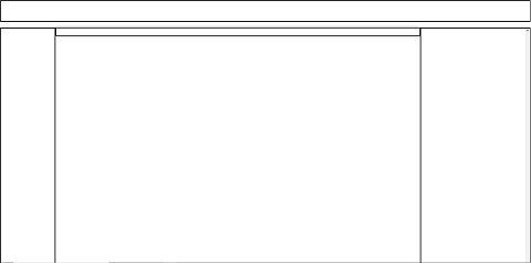
This is my skeleton :
<!DOCTYPE html>
<html lang="en">
<head>
   <meta charset="UTF-8">
   <meta name="viewport" content="width=device-width, initial-scale=1.0">
<body>
   <header>
   </header>
   <div id="container">
       <aside class="left-sidebar">
       </aside>
       <aside class="right-sidebar" style="overflow: scroll;">
       </aside>
       <div id="map"></div>
   </div>
</body>
</html>
   html, body {
       min-height: 100vh; /* this fixed my problem with the page
       width: 100%;
       height: max-content;
   }

   #container{
       padding-top: 20px;
       top: 100px;
   }

   header {
       height: 80px;
       padding: 20px;
       width: 100%;
       border-style: solid;
   }

   #map {
       flex: 1;
       padding: 20px;
       margin-left: 200px; /* Adjust the margin to match the width of the left sidebar */
       margin-right: 400px; /* Adjust the margin to match the width of the right sidebar */
       height: 100%;
       box-shadow: 0 0 10px rgba(0,0,0,0.5);
       padding-bottom: 5px;
       border-style: solid;
   }

   .right-sidebar {
       position: fixed;
       right: 0;
       padding: 20px;
       width: 400px; /* Adjust the width as needed */
       height:100%;
       border-style: solid;
   }

   .left-sidebar {
       position: fixed;
       padding: 20px;
       width: 200px; /* Adjust the width as needed */
       height:100%;
       border-style: solid;
   }
So this min-height: 100vh; fixed my problem with the full page. However, after implementing this, my map shrank. I’ve tried different solution for the map height but no success.
Do you have any idea how I could fix this ?
2
Answers
Problem is in your #map div where you are trying to set height 100%. It should be equal to (height of viewport – the height of header) for that you can use CSS dynamic function
height: calc(100vh – 20px):. use this
and also add flex properties to your body
I know you have a great answer but might I suggest a slight change to the layout to wrap it all in a container then make that a grid.
You can work out the
minmax(8em, 25%)for your left/right side bars and given you are going to have a map that map size would then drive the height as I did with the fake green block just for illustration.I added a footer and a full width header with size both of which could have a calculated size OR just let them flow with the content they have also since that is often seen. I used dashed borders just to show what is where but you could swap that for the solid I commented out.
Put this in full screen and then resize it a bit to see how it all reacts to that then just make the visual adjustments to sizes that please you the most.