skip to Main Content

I’m trying to make a custom progress bar implementing a UI concept which makes sense in the application context, but I don’t know exactly how to do it

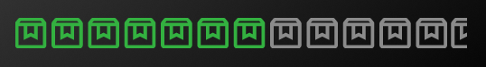
I’ve search for some packages but none of them seems to fullfil my needs, so I guess I’ll need to create a widget from scratch, I would like to have some directions on it. The intented result is as follow the image. The progress is indicated by how many boxes are painted green, naturally it reachs 100% when all boxes are painted.
progress bar using box icon

2

Answers


  1. It depends on what resolution you need. Do you need half boxes? or just full?
    For example, if you have 10 boxes, can your progress resolution round to the nearest 10%, so from 0-9% no boxes are filled, and then 10-19% one box is filled? And so on…
    If you wanted 15 boxes, your resolution would be 100% / 15 = 6.25 % per box.

    If having fully filled in boxes will work. here is some code to get you started.
    (The purple slider is only there to set the _progress variable).
    enter image description here
    enter image description here
    enter image description here

    class _MyHomePageState extends State<MyHomePage> {
      double _progress = 0;
    
      final double progressMin = 0;
      final double progressMax = 100;
      final int numBoxes = 10;
    
      @override
      Widget build(BuildContext context) {
        return Scaffold(
          appBar: AppBar(
            backgroundColor: Theme.of(context).colorScheme.inversePrimary,
            title: Text(widget.title),
          ),
          body: Center(
            child: Column(
              children: [
                Text(_progress.toStringAsFixed(1)),
                Slider(
                    value: _progress,
                    min: progressMin,
                    max: progressMax,
                    onChanged: (newVal) {
                      setState(() {
                        _progress = newVal;
                      });
                    }),
                Row(
                  children: [
                    for (int i = 0; i < numBoxes; i++)
                      Icon(
                        Icons.check_box_outline_blank_rounded,
                        color: _progress >= (i + 1) * (progressMax / numBoxes)
                            ? Colors.green[600]
                            : Colors.grey[400],
                      ),
                  ],
                ),
              ],
            ),
          ),
        );
      }
    }
    
    Login or Signup to reply.
  2. Here is an answer that gives essentially infinite resolution.

    You need a 2 images (pngs) to make this work. An ’empty’ image and a ‘full’ image. Think of the empty image on the bottom and the full image on top, and you are cropping the right side of the full image to show various progress points. The grey is empty and the green is full.

    Important note: This is much much much easier if both images are the exact same dimensions. You could make it work if they weren’t, but it seems like a huge headache.

    Full image on top on stack

    Empty image on bottom of stack


    enter image description here
    enter image description here

    class _MyHomePageState extends State<MyHomePage> {
      double _progress = 0;
    
      final double progressMin = 0;
      final double progressMax = 100;
    
      @override
      Widget build(BuildContext context) {
        return Scaffold(
          appBar: AppBar(
            backgroundColor: Theme.of(context).colorScheme.inversePrimary,
            title: Text(widget.title),
          ),
          body: Center(
            child: Column(
              children: [
                Text(_progress.toStringAsFixed(1)),
                Slider(
                    value: _progress,
                    min: progressMin,
                    max: progressMax,
                    onChanged: (newVal) {
                      setState(() {
                        _progress = newVal;
                      });
                    }),
                Padding(
                  padding: const EdgeInsets.symmetric(horizontal: 20),
                  child: Stack(
                    children: [
                      Image.asset('assets/empty.png'),
                      ClipRRect(
                        child: Align(
                          // align center left because we want a left to right progress. If you wanted bottom to top, this would be bottomCenter and use heightFactor instead
                          alignment: Alignment.centerLeft,
                          // map _progress to a range of 0 to 1 (or set the min and max on the slider to 0 and 1)
                          widthFactor: 0 +
                              ((1 - 0) / (progressMax - progressMin)) * (_progress),
                          child: Image.asset('assets/full.png'),
                        ),
                      ),
                    ],
                  ),
                ),
              ],
            ),
          ),
        );
      }
    }
    
    Login or Signup to reply.
Please signup or login to give your own answer.
Back To Top
Search