 Question posted in


I would like to use html and css to make it look like the title.
The requirements are as follows:
- There are one parent element, some child elements, and some grandchild elements.
- The child elements are aligned horizontally in a 6:4 ratio, with equal spacing.
- The grandchildren elements are lined up with equal spacing within them. There are three text boxes on the ratio 6 side and two buttons on the ratio 4 side.
- Multiple grandchild elements may be deleted. In this case, I want to delete the second text box and the first button.
- Even if I delete a grandchild element, I want to keep the other items in their original positions.
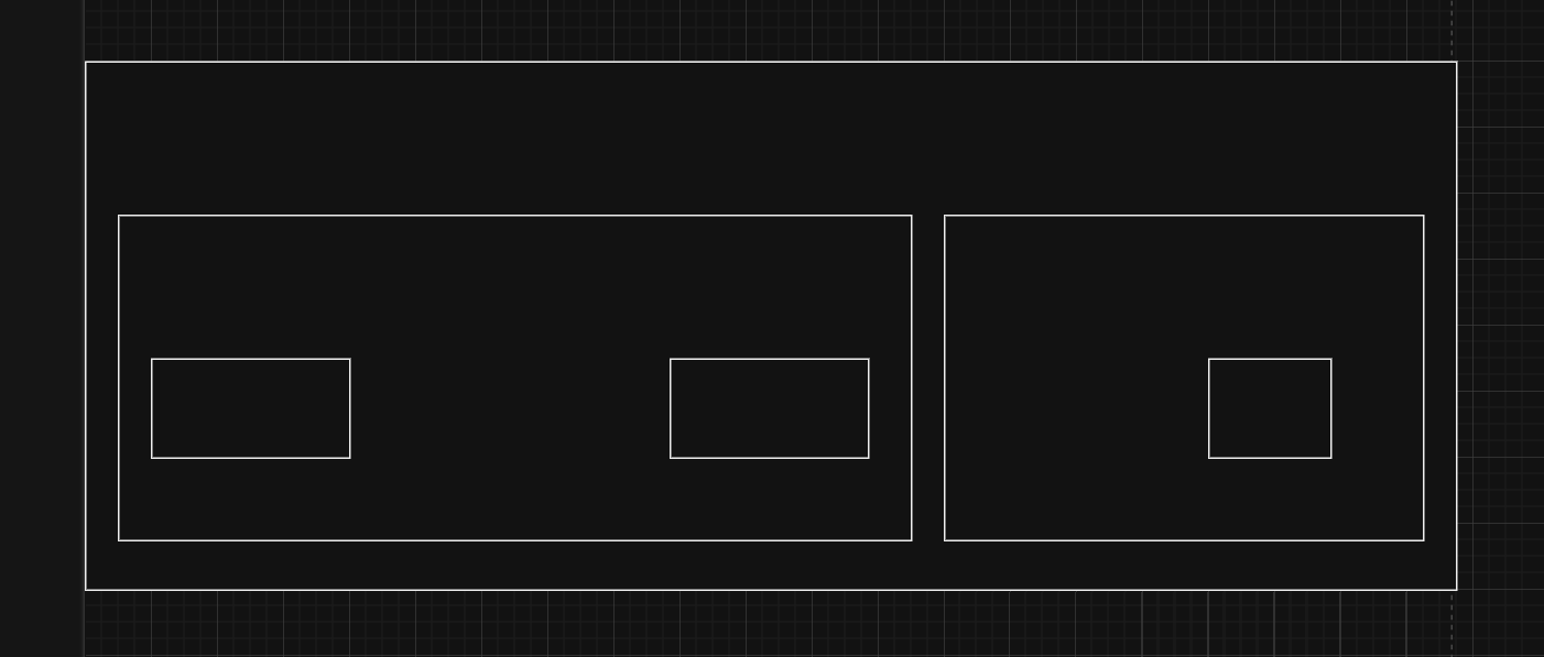
(as shown in this figure)
Figure1: result image that I want to make
(diagram when elements are deleted)
Figure2: diagram when elements are deleted
Below is the actual code I created.
.container {
  display: flex;
  width: 100%;
}

.left {
  flex: 6;
  display: flex;
}

.right {
  flex: 4;
  display: flex;
}

.text-box {
  margin: 5px;
  padding: 10px;
  border: 1px solid black;
  flex-grow: 1;
  width: calc(100% / 3 - 10px);
}

.button {
  margin: 5px;
  padding: 10px;
  border: 1px solid black;
  flex-grow: 1;
  width: calc(100% / 2 - 10px);
}
<div class="container">
<div class="left">
<input class="text-box" placeholder="Text Box 1">
<input class="text-box" placeholder="Text Box 2">
<input class="text-box" placeholder="Text Box 3">
</div>
<div class="right">
<button class="button">Button 1</button>
<button class="button">Button 2</button>
</div>
</div>If Text Box2 is deleted, Text Box1 and 3 will be extended, and if Button1 is deleted, Button2 will be extended by that amount.
I want to leave Text Box1, Text Box3, and Button2 in their original positions, without stretching either element.
I am not a native English speaker, so I am using a translator and it may be difficult to read. Thanks.
2
Answers
Flex is not a good solution for this problem. Flex defines how a bunch of elements relate to each other, but there is no way of defining spaces independently of elements.
Grids allow you to do this. A grid’s structure is defined independently of its content elements.
In this case you want an outer
gridcontaining two inner grids.I would put each
text-boxin a<div>then Those<div>will have a basis of 100% so that it stretches the<div class="text-box-wrapper">and dividing theleftcolumn into 3 columns of the same length, so in this case, if you want to have 3 columns, you should have 3 different<div class="text-box-wrapper">, and if you want to remove atext-box, you should only remove thetext-boxinside of the wrapping<div class="text-box-wrapper">Below I show an example, with the left
div, you could do the same thing to the rightdivto achieve the same results.This is if you really have to use
flexbox, if not, I would suggest usinggridinstead as it’s more suitable for your use case.