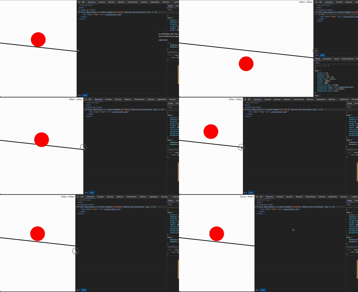
I have an HTML page with a background (white background and black line coming across tilted). I have an of a red ball. As you see in the gif below, I’d like when the window gets resized for the ball to stay right on top of the line (the way it is at the beginning of the gif)
Is there a way to do this in HTML/CSS? I’m open to using Javascript if there’s an easy JS solution.
Here’s my current code:
HTML:
<html>
  <body>
    <img class="image" src="./assets/ball.png">
  </body>
</html>
and the CSS:
    body {
      margin: 0;
      padding: 0;
      display: flex;
      align-items: center;
      height: 100vh;
      width: 100%;
      flex-direction: column;
      background-image: url('./assets/bg.png');
      background-repeat: no-repeat;
      background-size: cover;
    }

    .image {
      margin-top: 42%;
    }


2
Answers
If you want the ball to stay on the line, you’ll need to render them both together. At the moment you’re rendering them separately: the ball in HTML and the line in CSS.
The solution I would suggest is to use SVG to render them both.
After you run this snippet, click the full page link to properly test the responsiveness.
Consider adding the ball to your image so that it always stays above the line! 🙂
You can open your background image in Ms Paint and add a red ball and then save it as a new image.
But if you insist that the ball must not become a part of the image then try this…
Create a red ball in an SVG and give it the fixed coordinates you desire: