skip to Main Content

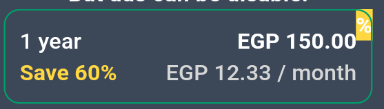
I’m trying to achieve three radio buttons or outlined buttons for buying plans from my app

that’s what I want to make

enter image description here

and that’s the code that I tried before but It didn’t work very well as you can see at the next screenshot anyone can help me, please?

                SizedBox(
                  width: 250.0,
                  height: 60.0,
                  child: Stack(
                    children: [
                      const Positioned(
                        top: 0,
                        right: 0,
                        child: Text(
                          "%",
                          style: TextStyle(
                            color: Colors.white,
                            backgroundColor: Colors.amberAccent,
                            fontWeight: FontWeight.bold,
                          ),
                        ),
                      ),
                      OutlinedButton(
                          style: OutlinedButton.styleFrom(
                            padding: const EdgeInsets.symmetric(
                                horizontal: 5, vertical: 5),
                            shape: RoundedRectangleBorder(
                                borderRadius: BorderRadius.circular(10.0)),
                            side: const BorderSide(
                              color: mainColor,
                            ),
                          ),
                          onPressed: () {},
                          child: Container(
                            padding: const EdgeInsets.symmetric(
                                horizontal: 5, vertical: 5),
                            child: Column(
                              children: [
                                const Row(
                                  mainAxisAlignment:
                                      MainAxisAlignment.spaceBetween,
                                  children: [
                                    Text(
                                      "1 year",
                                      style: TextStyle(
                                        color: Colors.white,
                                      ),
                                    ),
                                    Text(
                                      "EGP 150.00",
                                      style: TextStyle(
                                        color: Colors.white,
                                        fontWeight: FontWeight.bold,
                                      ),
                                    ),
                                  ],
                                ),
                                Row(
                                  mainAxisAlignment:
                                      MainAxisAlignment.spaceBetween,
                                  children: [
                                    const Text(
                                      "Save 60%",
                                      style: TextStyle(
                                        color: Colors.amberAccent,
                                        fontWeight: FontWeight.bold,
                                      ),
                                    ),
                                    Text(
                                      "EGP 12.33 / month",
                                      style: TextStyle(
                                        color: Colors.grey[350],
                                      ),
                                    ),
                                  ],
                                ),
                              ],
                            ),
                          ))
                    ],
                  ),
                ),

but that’s what I got I don’t know how to complete my code or how that top right corner position is made with its image.

enter image description here

2

Answers


  1. You can use a ClipPath to achieve that effect on the % in the corner.

    Here is the code for the delegate:

    class CustomClipperCornerTab extends CustomClipper<Path> {
      final double radius;
    
      CustomClipperCornerTab({super.reclip, required this.radius});
    
      @override
      Path getClip(Size size) {
        return Path()
          ..moveTo(0, 0)
          ..lineTo(size.width, size.height)
          ..lineTo(size.width, radius)
          ..arcToPoint(
            Offset(size.width - radius, 0),
            radius: Radius.circular(radius),
            clockwise: false,
          )
          ..lineTo(0, 0)
          ..close();
      }
    
      @override
      bool shouldReclip(covariant CustomClipper<Path> oldClipper) {
        return oldClipper is! CustomClipperCornerTab || oldClipper.radius != radius;
      }
    }
    

    You can then use it in the widget tree like so:

    ClipPath(
      clipper: CustomClipperCornerTab(radius: radius),
      child: Container(
        color: Colors.amberAccent,
        clipBehavior: Clip.none,
        alignment: Alignment.topRight,
        padding: const EdgeInsets.only(right: 1.5),
        child: Text(
          "%",
          style: TextStyle(
            color: mainColor,
            fontWeight: FontWeight.bold,
          ),
        ),
      ),
    )
    

    I would also recommend moving the Stack into the OutlinedButton.child so that corner widget along with any other layers you add don’t block gestures and will be covered by the inkwell effect on long press.

    Full dartpad example.

    ClipPath docs.

    Login or Signup to reply.
  2. You can try the ribbon_widget package

    Ribbon(
      nearLength: 1.0,
      farLength: 1.0,
      title: '%',
      titleStyle: TextStyle(
        color: Colors.white,
        fontSize: 10,
        fontWeight: FontWeight.bold),
      color: Colors.amberAccent,
      location: RibbonLocation.topEnd,
      child: OutlinedButton(...),
    )
    
    Login or Signup to reply.
Please signup or login to give your own answer.
Back To Top
Search