skip to Main Content

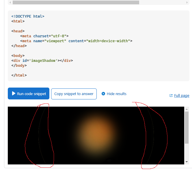
I want to insert an image with a box-shadow that "opens" when you hover over with the mouse. The problem is that a ghost border is appearing and I am not sure how I can deal with it.

I tried setting a border with black color, also to set the background-color of the div containing the image to black, but it’s not helping.
Is there another approach I could take here?

body {
    background-color: black;
}

#imageShadow {
    height: 400px;
    width: 400px;
    position: absolute;
    top: 0;
    left: 0;
    right: 0;
    bottom: 0;
    margin: auto;
    border-radius: 50%;
    box-shadow: 0px 0px 40px 140px rgb(0, 0, 0) inset;
    transition: box-shadow 1s;
    background-image: url('https://images.freeimages.com/images/large-previews/866/butterfly-1-1535829.jpg');
}


#imageShadow:hover {
    box-shadow: 0 0 20px 20px rgb(0, 0, 0) inset;
}
<!DOCTYPE html>
<html>

<head>
    <meta charset="utf-8">
    <meta name="viewport" content="width=device-width">  
</head>

<body>
<div id='imageShadow'></div>
</body>

</html>

After seeing some comments, I will add an image of what I can see. Is that a "me" problem and has nothing to do with the solution itself?

enter image description here

enter image description here

2

Answers


  1. Here is a different idea using mask instead of box-shadow

    #imageShadow {
      height: 400px;
      width: 400px;
      position: absolute;
      inset: 0;
      margin: auto;
      -webkit-mask: radial-gradient(#000 50%, #0000 72%) 50%/40% 40% no-repeat;
      transition: 1s;
      background-image: url('https://images.freeimages.com/images/large-previews/866/butterfly-1-1535829.jpg');
    }
    
    #imageShadow:hover {
      -webkit-mask-size: 100% 100%;
    }
    
    body {
      background:linear-gradient(90deg, black,blue);
    }
    <div id='imageShadow'></div>
    Login or Signup to reply.
  2. According to MDN, a box-shadow automatically picks the border-radius of the element itself. If a border-radius is specified on the element with a box shadow, the box shadow takes on the same rounded corners. https://developer.mozilla.org/en-US/docs/Web/CSS/box-shadow

    So i suggest a patch in the form of "outline + offset":

    body {
        background-color: black;
    }
    
    #imageShadow {
        height: 400px;
        width: 400px;
        position: absolute;
        top: 0;
        left: 0;
        right: 0;
        bottom: 0;
        margin: auto;
        outline:10px solid black;
        outline-offset:-5px;
        border-radius: 50%;
        box-shadow: 0px 0px 40px 140px rgb(0, 0, 0) inset;
        transition: box-shadow 1s;
        background-image: url('https://images.freeimages.com/images/large-previews/866/butterfly-1-1535829.jpg');
    }
    
    
    #imageShadow:hover {
        outline:10px solid black;
        outline-offset:-5px;
        border-radius: 50%;
        box-shadow: 0 0 20px 20px rgb(0, 0, 0) inset;
    }
    <!DOCTYPE html>
    <html>
    
    <head>
        <meta charset="utf-8">
        <meta name="viewport" content="width=device-width">  
    </head>
    
    <body>
    <div id='imageShadow'></div>
    </body>
    
    </html>
    Login or Signup to reply.
Please signup or login to give your own answer.
Back To Top
Search