 Question posted in


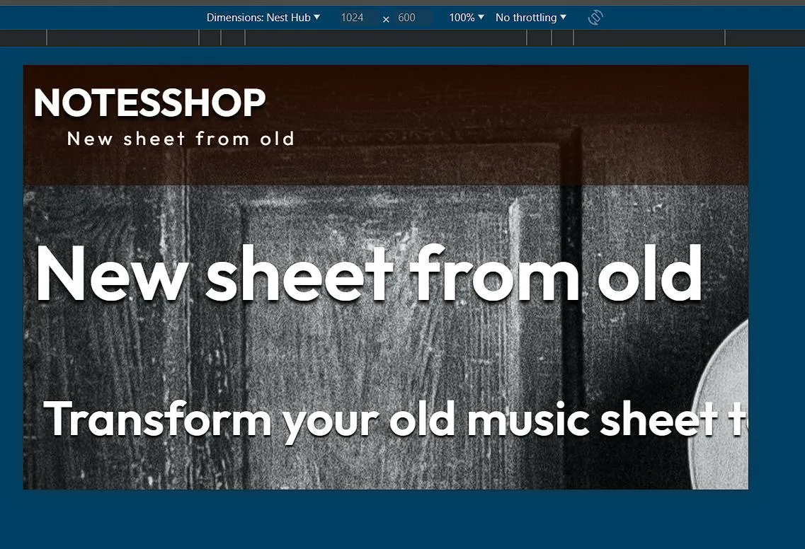
So I got a problem with fitting the webpage on mobile devices. On PC it works without single problem, but when I’m trying on mobile device it will not fit fully on screen but is somehow overflowing? It creates white space on right side. I’m using basic html/css and developing website with Asp.Net. But this is on 99% problem with html/css. What is important to say none of the content is overflowing the actual window size, it is only blank space.
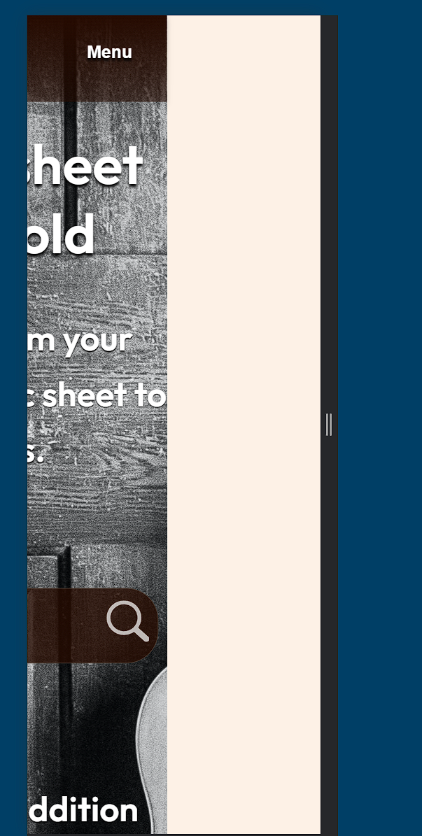
On different setting it is not even fitting the header.
html page
<!DOCTYPE html>

<html>
<head>
    <meta charset="utf-8" />
    <meta name="viewport" content="width=device-width, initial-scale=1">
    <title>@ViewBag.Title</title>
    <link rel="preconnect" href="https://fonts.googleapis.com">
    <link rel="preconnect" href="https://fonts.gstatic.com" crossorigin>
    <link href="https://fonts.googleapis.com/css2?family=Outfit:[email protected]&display=swap" rel="stylesheet">
    <link rel="stylesheet" href="~/styles/header.css">
    <link rel="stylesheet" href="~/styles/footer.css>
    <link rel="stylesheet" href="~/styles/general_index.css">
    <link rel="stylesheet" href="~/styles/index_page.css">
</head>
 <body>
    <div class="background-container">
    </div>
 </body>
</html>
general_index.css
body {
    margin: 0;
    padding: 0;
    position: relative;
    background-color: #FDF1E6;
    font-family: Outfit, Arial, Helvetica, sans-serif;
    font-style: normal;
    color: #FFFFFF;
    width: 100%; /* take full browser width */
    height: 100%;
}

.background-container {
    background-image: url("../background.jpg");
    background-size: cover;
    background-position: center;
    background-attachment: fixed;

    display: flex;
    flex-direction: column;
    position: relative;
    padding-bottom: 650px;
}


body::before {
  content: "";
  position: absolute;
  top: 0px;
  right: 0px;
  bottom: 0px;
  left: 0px;
  background-color: rgba(0,0,0,0.0);
  z-index: -1;
}
2
Answers
Thank you very much for tips. I found out that the problem was that in navbar a set position:absolute, but did not set the specifics(like right:0) and this was creating this weird behaviour. Really thank you for tips.
The issues might be the padding-bottom: 650px; that you are using.
Consider using a percentage or viewport-based height (vh) instead to ensure the issue is not reoccurring.