skip to Main Content

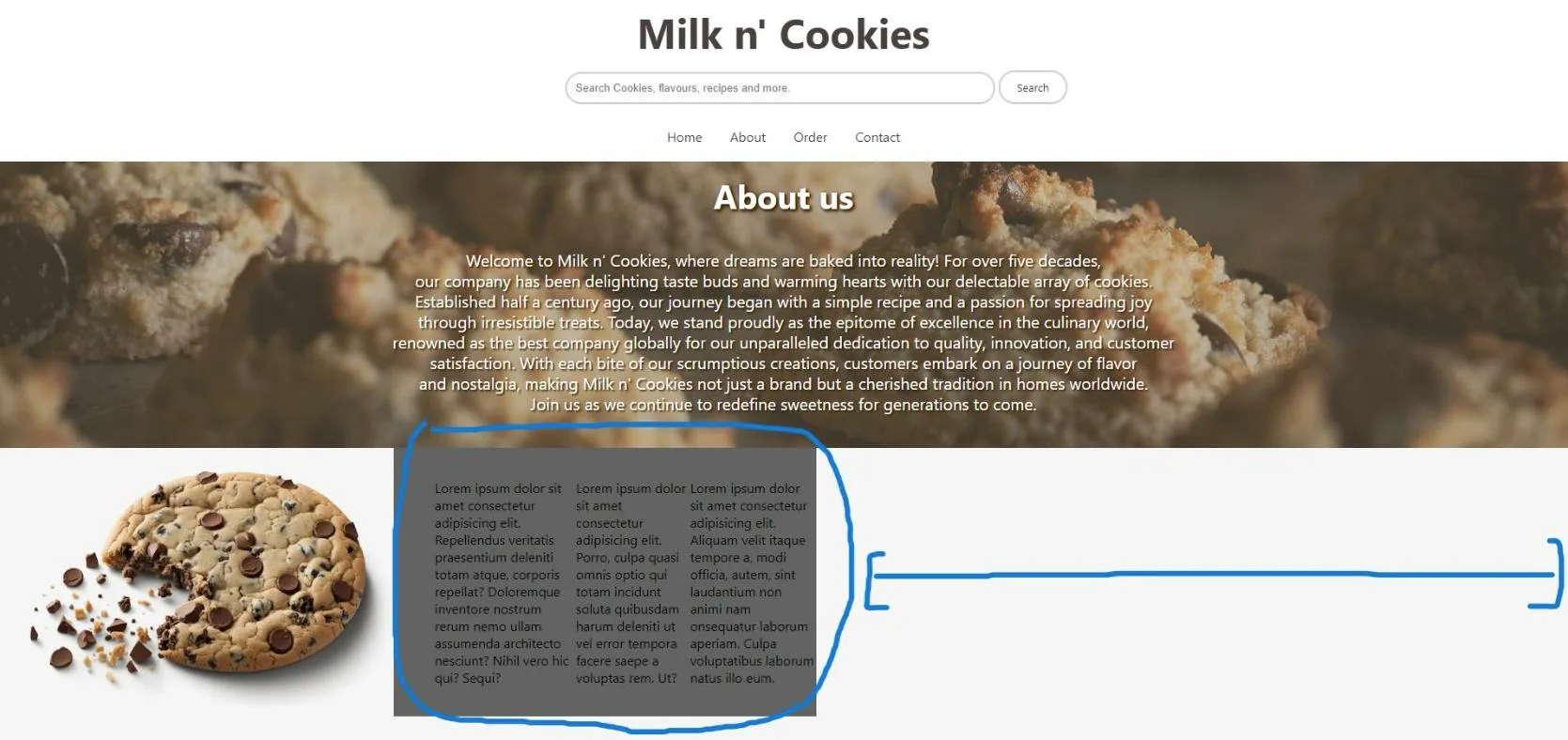
I’m learning web dev, and I’ve encountered this puzzle where I can’t find a way to increase the width of the background of my paragraph text that’s next to an image of a cookie, could you help me please?, I’ve tried increasing the width but it just rezises the whole thing.

Here’s an image
enter image description here

header {
    position: fixed;
    top: 0;
    left: 0;
    width: 100%;
    z-index: 1000;
    padding: 5px 0;
    background-color: #ffffff;
  }

h1 {
    font-family: 'Segoe UI', Tahoma, Geneva, Verdana, sans-serif;
    font-size: 50px;
    color: #ffffff;
    text-align: center;
    background-color: #ffffff;
    height: 105px;
    padding-top: 30px;
    margin: -25px;
    transition: 0.3s;
    z-index: 1000;
}

#Cookieland {
    text-decoration: none;
    color: #49403f;
}

body {
    background-color: #f6f6f6;
    overflow-x: hidden;
    overflow-y: auto;
    padding: 0px;
    margin: 0px;
    display: grid;
    margin-top: 0px;
}

.search-container {
    text-align: center;
    padding: 0;
    margin: -20px;
    background-color: #ffffff;
    height: 55px;
}

.search-input {
    padding: 10px;
    border-radius: 20px;
    border: 2px solid #ccc;
    width: 500px;
    margin-left: 80px;
}

.search-button {
    padding: 10px 20px;
    border-radius: 20px;
    border: 2px solid #ccc;
    background-color: #ffffff;
    color: #333;
    cursor: pointer;
    transition: background-color 0.3s;
    font-family: 'Segoe UI', Tahoma, Geneva, Verdana, sans-serif;
}

.search-button:hover {
    background-color: #e0e0e0;
}

.navbar {
    margin-top: 20px;
}

.navbar ul {
    list-style-type: none;
    background-color: #ffffff;
    padding: 0;
    margin: 0;
    overflow: hidden;
    text-align: center;
}

.navbar li {
    display: inline-block;
}

.navbar a {
    color: #49403f;
    font-family: 'Segoe UI', Tahoma, Geneva, Verdana, sans-serif;
    text-decoration: none;
    padding: 15px;
    display: block;
    text-align: center;
}

.navbar a:hover {
    background-color: #49403f;
    color: #ffffff;
}

/*Body section begins here*/

.banner-header {
    background-image: url("https://i.ibb.co/GMkdz66/cookiess.jpgg");
    background-size: cover;
    background-position: center center;
    top: 150px;
    height: 400px;
    width: 100%;
    position: relative;
    transition: 0.8s;
    animation: parallax linear;
    animation-timeline: scroll();
}
.banner-header:after {
    content: "";
    position: absolute;
    top: 0;
    margin-top: 0px;
    left: 0;
    display: block;
    width: 100%;
    height: 100%;
    background-color: #92836c;
    opacity: .4;
    z-index: .1;
}

.cookie-heading {
    font-family: 'Segoe UI', Tahoma, Geneva, Verdana, sans-serif;
    font-size: 40px;
    color: #ffffff;
    text-shadow: 2px 2px 4px #352000, 2px 2px 4px #352000;
    margin-bottom: 30px;
    text-align: center;
    line-height: 3;
    position: relative;
    z-index: 1;
}
.description {
    font-family: 'Segoe UI', Tahoma, Geneva, Verdana, sans-serif;
    font-size: 20px;
    color: #ffffff;
    text-shadow: 2px 2px 2px #352000;
    text-align: center;
    display: block;
    margin-bottom: 20px;
    margin-top: -25px;
    line-height: 25px;
    position: relative;
    z-index: 1;
}
@keyframes parallax {
    to {
        transform: translateY(100px);
    }
}

/*Second row begins here*/
.row {
    width: 1000px;
    display: grid;
    grid-template-columns: repeat(2, 1fr);
    grid-gap: 50px 30px;
    background-color: #636363; /*#f6f6f6*/
    font-family: 'Segoe UI', Tahoma, Geneva, Verdana, sans-serif;
    margin-top: 150px;
    z-index: 0;
}
.row .left {
    overflow: hidden;
}
.row .left img {
    width: 100%;
    height: 100%;
    object-fit: cover;

}
.row .right {
    display: flex;
    align-items: center;
}
.row .right .content {
    padding-left: 20px;

}
.row .right .content p {
    font-size: 16px;
    line-height: 26px;
    padding-bottom: 15px;

}
@media (max-width: 991px) {
    .row .right .content {
        padding-left: 0px;
    
    }
}
@media (max-width: 768px) {
    .row {
        width: 90%;
        grid-template-columns: 1fr;
        background-color: #f6f6f6;
    }
}
<!DOCTYPE html>
<html lang="en">
<head>
    <meta charset="UTF-8">
    <meta name="viewport" content="width=device-width, initial-scale=1.0">
    <title>Milk n' Cookies: Buy the best flavoured cookies!</title>
    <link href="style.css" rel="stylesheet" type="text/css">
</head>
<body>
    
    <!--Header sections including navigation bar-->
    <header>
        <h1><a href="index.html" id="Cookieland">Milk n' Cookies</a></h1>
       
        <form class="search-container" action="#">
            <input type="text" class="search-input" placeholder="Search Cookies, flavours, recipes and more.">
            <button type="submit" class="search-button">Search</button>
        </form>
        
    <!--Navigation bar of the header-->
        <nav class="navbar">
            <ul>
                <li><a href="index.html">Home</a></li>
                <li><a href="about.html">About</a></li>
                <li><a href="order.html">Order</a></li>
                <li><a href="contact.html">Contact</a></li>
            </ul>
        </nav>
    </header>

    <!--Banner of the header section, it includes an about text with paragraph-->
    <section class="banner-header">
        <h2 class="cookie-heading">About us</h2>
        
        <p><span class="description">Welcome to Milk n' Cookies, where dreams are baked into reality! For over five decades,<br>our company has been delighting taste buds and warming hearts with our delectable array of cookies.</br> Established half a century ago, our journey began with a simple recipe and a passion for spreading joy</br> through irresistible treats. Today, we stand proudly as the epitome of excellence in the culinary world,</br> renowned as the best company globally for our unparalleled dedication to quality, innovation, and customer</br> satisfaction. With each bite of our scrumptious creations, customers embark on a journey of flavor</br> and nostalgia, making Milk n' Cookies  not just a brand but a cherished tradition in homes worldwide.</br> Join us as we continue to redefine sweetness for generations to come.</span></p>
    </section>

        <!--Second section, it includes an image and text-->
        <div class="row">
            <div class="left">
                <img src="https://img.freepik.com/premium-photo/chocolate-chip-cookie-with-bite-taken-out-it_899894-8209.jpg" alt="https://img.freepik.com/premium-photo/chocolate-chip-cookie-with-bite-taken-out-it_899894-8209.jpg">
            </div>
            <div class="right">
                <div class="content"></div>
                <p>Lorem ipsum dolor sit amet consectetur adipisicing elit. Repellendus 
                    veritatis praesentium deleniti totam atque, corporis repellat? 
                    Doloremque inventore nostrum rerum nemo ullam assumenda architecto 
                    nesciunt? Nihil vero hic qui? Sequi?</p>
    
                <p>Lorem ipsum dolor sit amet consectetur adipisicing elit. 
                    Porro, culpa quasi omnis optio qui totam incidunt soluta quibusdam 
                    harum deleniti ut vel error tempora facere saepe a voluptas rem. Ut?</p>
    
                <p>Lorem ipsum dolor sit amet consectetur adipisicing elit. Aliquam velit 
                    itaque tempore a, modi officia, autem, sint laudantium non animi nam 
                    onsequatur laborum aperiam. Culpa voluptatibus laborum natus illo eum.</p>
                    
            </div>
        </div>
</body>
</html>

3

Answers


  1. Your current setup limits the size of your row (which is a grid) to give the cookie a particular size. You should change the individual widths of the elements you don’t want stretching to the full bounds of a row.

    For the row to cover the whole screen I recommend having the row cover the entirety of the width (setting .row ‘s width property to 100% instead of 1000px)

    After that, define fixed sizes for the column template inside .row:

    grid-template-columns: repeat(2, 1fr);
    

    to

    grid-template-columns: xx 1fr;
    

    where xx is the fixed size you want the cookie in the row to be (even percentages). After you do that, change your .row .right .content‘s width to be fixed as well, and to keep the paragraph’s vertical-ish layout, make its display be flex.

    .row .right .content {
        padding-left: 20px;
        max-width: yy;
        display: flex;
    }
    

    where yy is the width of your paragraphs.

    header {
      position: fixed;
      top: 0;
      left: 0;
      width: 100%;
      z-index: 1000;
      padding: 5px 0;
      background-color: #ffffff;
    }
    
    h1 {
      font-family: 'Segoe UI', Tahoma, Geneva, Verdana, sans-serif;
      font-size: 50px;
      color: #ffffff;
      text-align: center;
      background-color: #ffffff;
      height: 105px;
      padding-top: 30px;
      margin: -25px;
      transition: 0.3s;
      z-index: 1000;
    }
    
    #Cookieland {
      text-decoration: none;
      color: #49403f;
    }
    
    body {
      background-color: #f6f6f6;
      overflow-x: hidden;
      overflow-y: auto;
      padding: 0px;
      margin: 0px;
      display: grid;
      margin-top: 0px;
    }
    
    .search-container {
      text-align: center;
      padding: 0;
      margin: -20px;
      background-color: #ffffff;
      height: 55px;
    }
    
    .search-input {
      padding: 10px;
      border-radius: 20px;
      border: 2px solid #ccc;
      width: 500px;
      margin-left: 80px;
    }
    
    .search-button {
      padding: 10px 20px;
      border-radius: 20px;
      border: 2px solid #ccc;
      background-color: #ffffff;
      color: #333;
      cursor: pointer;
      transition: background-color 0.3s;
      font-family: 'Segoe UI', Tahoma, Geneva, Verdana, sans-serif;
    }
    
    .search-button:hover {
      background-color: #e0e0e0;
    }
    
    .navbar {
      margin-top: 20px;
    }
    
    .navbar ul {
      list-style-type: none;
      background-color: #ffffff;
      padding: 0;
      margin: 0;
      overflow: hidden;
      text-align: center;
    }
    
    .navbar li {
      display: inline-block;
    }
    
    .navbar a {
      color: #49403f;
      font-family: 'Segoe UI', Tahoma, Geneva, Verdana, sans-serif;
      text-decoration: none;
      padding: 15px;
      display: block;
      text-align: center;
    }
    
    .navbar a:hover {
      background-color: #49403f;
      color: #ffffff;
    }
    
    
    /*Body section begins here*/
    
    .banner-header {
      background-image: url("https://i.ibb.co/GMkdz66/cookiess.jpgg");
      background-size: cover;
      background-position: center center;
      top: 150px;
      height: 400px;
      width: 100%;
      position: relative;
      transition: 0.8s;
      animation: parallax linear;
      animation-timeline: scroll();
    }
    
    .banner-header:after {
      content: "";
      position: absolute;
      top: 0;
      margin-top: 0px;
      left: 0;
      display: block;
      width: 100%;
      height: 100%;
      background-color: #92836c;
      opacity: .4;
      z-index: .1;
    }
    
    .cookie-heading {
      font-family: 'Segoe UI', Tahoma, Geneva, Verdana, sans-serif;
      font-size: 40px;
      color: #ffffff;
      text-shadow: 2px 2px 4px #352000, 2px 2px 4px #352000;
      margin-bottom: 30px;
      text-align: center;
      line-height: 3;
      position: relative;
      z-index: 1;
    }
    
    .description {
      font-family: 'Segoe UI', Tahoma, Geneva, Verdana, sans-serif;
      font-size: 20px;
      color: #ffffff;
      text-shadow: 2px 2px 2px #352000;
      text-align: center;
      display: block;
      margin-bottom: 20px;
      margin-top: -25px;
      line-height: 25px;
      position: relative;
      z-index: 1;
    }
    
    @keyframes parallax {
      to {
        transform: translateY(100px);
      }
    }
    
    
    /*Second row begins here*/
    
    .row {
      width: 100%;
      display: grid;
      grid-template-columns: 30% 1fr;
      grid-gap: 50px 30px;
      background-color: #636363;
      /*#f6f6f6*/
      font-family: 'Segoe UI', Tahoma, Geneva, Verdana, sans-serif;
      margin-top: 150px;
      z-index: 0;
    }
    
    .row .left {
      overflow: hidden;
    }
    
    .row .left img {
      width: 100%;
      height: 100%;
      object-fit: cover;
    }
    
    .row .right {
      display: flex;
      align-items: center;
      width: 100%;
    }
    
    .row .right .content {
      padding-left: 20px;
      max-width: 40%;
      display: flex;
    }
    
    .row .right .content p {
      font-size: 16px;
      line-height: 26px;
      padding-bottom: 15px;
    }
    
    @media (max-width: 991px) {
      .row .right .content {
        padding-left: 0px;
      }
    }
    
    @media (max-width: 768px) {
      .row {
        width: 90%;
        grid-template-columns: 1fr;
        background-color: #f6f6f6;
      }
    }
    <!DOCTYPE html>
    <html lang="en">
    
    <head>
      <meta charset="UTF-8">
      <meta name="viewport" content="width=device-width, initial-scale=1.0">
      <title>Milk n' Cookies: Buy the best flavoured cookies!</title>
      <link href="style.css" rel="stylesheet" type="text/css">
    </head>
    
    <body>
    
      <!--Header sections including navigation bar-->
      <header>
        <h1><a href="index.html" id="Cookieland">Milk n' Cookies</a></h1>
    
        <form class="search-container" action="#">
          <input type="text" class="search-input" placeholder="Search Cookies, flavours, recipes and more.">
          <button type="submit" class="search-button">Search</button>
        </form>
    
        <!--Navigation bar of the header-->
        <nav class="navbar">
          <ul>
            <li><a href="index.html">Home</a></li>
            <li><a href="about.html">About</a></li>
            <li><a href="order.html">Order</a></li>
            <li><a href="contact.html">Contact</a></li>
          </ul>
        </nav>
      </header>
    
      <!--Banner of the header section, it includes an about text with paragraph-->
      <section class="banner-header">
        <h2 class="cookie-heading">About us</h2>
    
        <p><span class="description">Welcome to Milk n' Cookies, where dreams are baked into reality! For over five decades,<br>our company has been delighting taste buds and warming hearts with our delectable array of cookies.</br> Established half a century ago, our journey began with a simple recipe and a passion for spreading joy</br> through irresistible treats. Today, we stand proudly as the epitome of excellence in the culinary world,</br> renowned as the best company globally for our unparalleled dedication to quality, innovation, and customer</br> satisfaction. With each bite of our scrumptious creations, customers embark on a journey of flavor</br> and nostalgia, making Milk n' Cookies  not just a brand but a cherished tradition in homes worldwide.</br> Join us as we continue to redefine sweetness for generations to come.</span></p>
      </section>
    
      <!--Second section, it includes an image and text-->
      <div class="row">
        <div class="left">
          <img src="https://img.freepik.com/premium-photo/chocolate-chip-cookie-with-bite-taken-out-it_899894-8209.jpg" alt="https://img.freepik.com/premium-photo/chocolate-chip-cookie-with-bite-taken-out-it_899894-8209.jpg">
        </div>
        <div class="right">
          <div class="content"><p>Lorem ipsum dolor sit amet consectetur adipisicing elit. Repellendus veritatis praesentium deleniti totam atque, corporis repellat? Doloremque inventore nostrum rerum nemo ullam assumenda architecto nesciunt? Nihil vero hic qui? Sequi?</p>
    
          <p>Lorem ipsum dolor sit amet consectetur adipisicing elit. Porro, culpa quasi omnis optio qui totam incidunt soluta quibusdam harum deleniti ut vel error tempora facere saepe a voluptas rem. Ut?</p>
    
          <p>Lorem ipsum dolor sit amet consectetur adipisicing elit. Aliquam velit itaque tempore a, modi officia, autem, sint laudantium non animi nam onsequatur laborum aperiam. Culpa voluptatibus laborum natus illo eum.</p></div>
          
    
        </div>
      </div>
    </body>
    
    </html>

    I have put your lorem ipsum inside the div with the content class inside the right part of your row, since I assumed that you merely misplaced the text.

    Login or Signup to reply.
  2. The first thing that you could do is to remove the width: 1000px; on your .row (this is what restricting you)

    Make it like this :

    .row {
        width: 1000px; //REMOVED
        display: grid;
        grid-template-columns: repeat(2, 1fr);
        grid-gap: 50px 30px;
        background-color: #636363;
        font-family: 'Segoe UI', Tahoma, Geneva, Verdana, sans-serif;
        margin-top: 150px;
        z-index: 0;
    }
    

    Now the next thing that you could do is to give your .row .right width so his container (the one with the background) will be able to spread and take all the space available but not the texts section itself :

    .row .right {
        display: flex;
        align-items: center;
        width: 30%;
    }
    

    And it will look like this :

    enter image description here

    header {
        position: fixed;
        top: 0;
        left: 0;
        width: 100%;
        z-index: 1000;
        padding: 5px 0;
        background-color: #ffffff;
      }
    
    h1 {
        font-family: 'Segoe UI', Tahoma, Geneva, Verdana, sans-serif;
        font-size: 50px;
        color: #ffffff;
        text-align: center;
        background-color: #ffffff;
        height: 105px;
        padding-top: 30px;
        margin: -25px;
        transition: 0.3s;
        z-index: 1000;
    }
    
    #Cookieland {
        text-decoration: none;
        color: #49403f;
    }
    
    body {
        background-color: #f6f6f6;
        overflow-x: hidden;
        overflow-y: auto;
        padding: 0px;
        margin: 0px;
        display: grid;
        margin-top: 0px;
    }
    
    .search-container {
        text-align: center;
        padding: 0;
        margin: -20px;
        background-color: #ffffff;
        height: 55px;
    }
    
    .search-input {
        padding: 10px;
        border-radius: 20px;
        border: 2px solid #ccc;
        width: 500px;
        margin-left: 80px;
    }
    
    .search-button {
        padding: 10px 20px;
        border-radius: 20px;
        border: 2px solid #ccc;
        background-color: #ffffff;
        color: #333;
        cursor: pointer;
        transition: background-color 0.3s;
        font-family: 'Segoe UI', Tahoma, Geneva, Verdana, sans-serif;
    }
    
    .search-button:hover {
        background-color: #e0e0e0;
    }
    
    .navbar {
        margin-top: 20px;
    }
    
    .navbar ul {
        list-style-type: none;
        background-color: #ffffff;
        padding: 0;
        margin: 0;
        overflow: hidden;
        text-align: center;
    }
    
    .navbar li {
        display: inline-block;
    }
    
    .navbar a {
        color: #49403f;
        font-family: 'Segoe UI', Tahoma, Geneva, Verdana, sans-serif;
        text-decoration: none;
        padding: 15px;
        display: block;
        text-align: center;
    }
    
    .navbar a:hover {
        background-color: #49403f;
        color: #ffffff;
    }
    
    /*Body section begins here*/
    
    .banner-header {
        background-image: url("https://i.ibb.co/GMkdz66/cookiess.jpgg");
        background-size: cover;
        background-position: center center;
        top: 150px;
        height: 400px;
        width: 100%;
        position: relative;
        transition: 0.8s;
        animation: parallax linear;
        animation-timeline: scroll();
    }
    .banner-header:after {
        content: "";
        position: absolute;
        top: 0;
        margin-top: 0px;
        left: 0;
        display: block;
        width: 100%;
        height: 100%;
        background-color: #92836c;
        opacity: .4;
        z-index: .1;
    }
    
    .cookie-heading {
        font-family: 'Segoe UI', Tahoma, Geneva, Verdana, sans-serif;
        font-size: 40px;
        color: #ffffff;
        text-shadow: 2px 2px 4px #352000, 2px 2px 4px #352000;
        margin-bottom: 30px;
        text-align: center;
        line-height: 3;
        position: relative;
        z-index: 1;
    }
    .description {
        font-family: 'Segoe UI', Tahoma, Geneva, Verdana, sans-serif;
        font-size: 20px;
        color: #ffffff;
        text-shadow: 2px 2px 2px #352000;
        text-align: center;
        display: block;
        margin-bottom: 20px;
        margin-top: -25px;
        line-height: 25px;
        position: relative;
        z-index: 1;
    }
    @keyframes parallax {
        to {
            transform: translateY(100px);
        }
    }
    
    /*Second row begins here*/
    .row {
        display: grid;
        grid-template-columns: repeat(2, 1fr);
        grid-gap: 50px 30px;
        background-color: #636363; /*#f6f6f6*/
        font-family: 'Segoe UI', Tahoma, Geneva, Verdana, sans-serif;
        margin-top: 150px;
        z-index: 0;
    }
    .row .left {
        overflow: hidden;
    }
    .row .left img {
        width: 100%;
        height: 100%;
        object-fit: cover;
    
    }
    .row .right {
        display: flex;
        align-items: center;
        width: 40%;
    }
    .row .right .content {
        padding-left: 20px;
    
    }
    .row .right .content p {
        font-size: 16px;
        line-height: 26px;
        padding-bottom: 15px;
    
    }
    @media (max-width: 991px) {
        .row .right .content {
            padding-left: 0px;
        
        }
    }
    @media (max-width: 768px) {
        .row {
            width: 90%;
            grid-template-columns: 1fr;
            background-color: #f6f6f6;
        }
    }
    <!DOCTYPE html>
    <html lang="en">
    <head>
        <meta charset="UTF-8">
        <meta name="viewport" content="width=device-width, initial-scale=1.0">
        <title>Milk n' Cookies: Buy the best flavoured cookies!</title>
        <link href="style.css" rel="stylesheet" type="text/css">
    </head>
    <body>
        
        <!--Header sections including navigation bar-->
        <header>
            <h1><a href="index.html" id="Cookieland">Milk n' Cookies</a></h1>
           
            <form class="search-container" action="#">
                <input type="text" class="search-input" placeholder="Search Cookies, flavours, recipes and more.">
                <button type="submit" class="search-button">Search</button>
            </form>
            
        <!--Navigation bar of the header-->
            <nav class="navbar">
                <ul>
                    <li><a href="index.html">Home</a></li>
                    <li><a href="about.html">About</a></li>
                    <li><a href="order.html">Order</a></li>
                    <li><a href="contact.html">Contact</a></li>
                </ul>
            </nav>
        </header>
    
        <!--Banner of the header section, it includes an about text with paragraph-->
        <section class="banner-header">
            <h2 class="cookie-heading">About us</h2>
            
            <p><span class="description">Welcome to Milk n' Cookies, where dreams are baked into reality! For over five decades,<br>our company has been delighting taste buds and warming hearts with our delectable array of cookies.</br> Established half a century ago, our journey began with a simple recipe and a passion for spreading joy</br> through irresistible treats. Today, we stand proudly as the epitome of excellence in the culinary world,</br> renowned as the best company globally for our unparalleled dedication to quality, innovation, and customer</br> satisfaction. With each bite of our scrumptious creations, customers embark on a journey of flavor</br> and nostalgia, making Milk n' Cookies  not just a brand but a cherished tradition in homes worldwide.</br> Join us as we continue to redefine sweetness for generations to come.</span></p>
        </section>
    
            <!--Second section, it includes an image and text-->
            <div class="row">
                <div class="left">
                    <img src="https://img.freepik.com/premium-photo/chocolate-chip-cookie-with-bite-taken-out-it_899894-8209.jpg" alt="https://img.freepik.com/premium-photo/chocolate-chip-cookie-with-bite-taken-out-it_899894-8209.jpg">
                </div>
                <div class="right">
                    <div class="content"></div>
                    <p>Lorem ipsum dolor sit amet consectetur adipisicing elit. Repellendus 
                        veritatis praesentium deleniti totam atque, corporis repellat? 
                        Doloremque inventore nostrum rerum nemo ullam assumenda architecto 
                        nesciunt? Nihil vero hic qui? Sequi?</p>
        
                    <p>Lorem ipsum dolor sit amet consectetur adipisicing elit. 
                        Porro, culpa quasi omnis optio qui totam incidunt soluta quibusdam 
                        harum deleniti ut vel error tempora facere saepe a voluptas rem. Ut?</p>
        
                    <p>Lorem ipsum dolor sit amet consectetur adipisicing elit. Aliquam velit 
                        itaque tempore a, modi officia, autem, sint laudantium non animi nam 
                        onsequatur laborum aperiam. Culpa voluptatibus laborum natus illo eum.</p>
                        
                </div>
            </div>
    </body>
    </html>
    Login or Signup to reply.
  3. It’s because you’ve set 1000px width to the parent (.row)

    .row {width: 1000px;}
    

    Try to change this value to 100%. It allows the div to take up the full width of its container.

    .row {width: 100%;}
    

    Don’t hesitate to inspect your project with the dev tools within your browser to see how DOM’s elements behave with each other.

    To open your browser’s inspector: Ctrl + Maj + I (Windows/Linux) or Cmd + Option + I) MacOS

    Login or Signup to reply.
Please signup or login to give your own answer.
Back To Top
Search