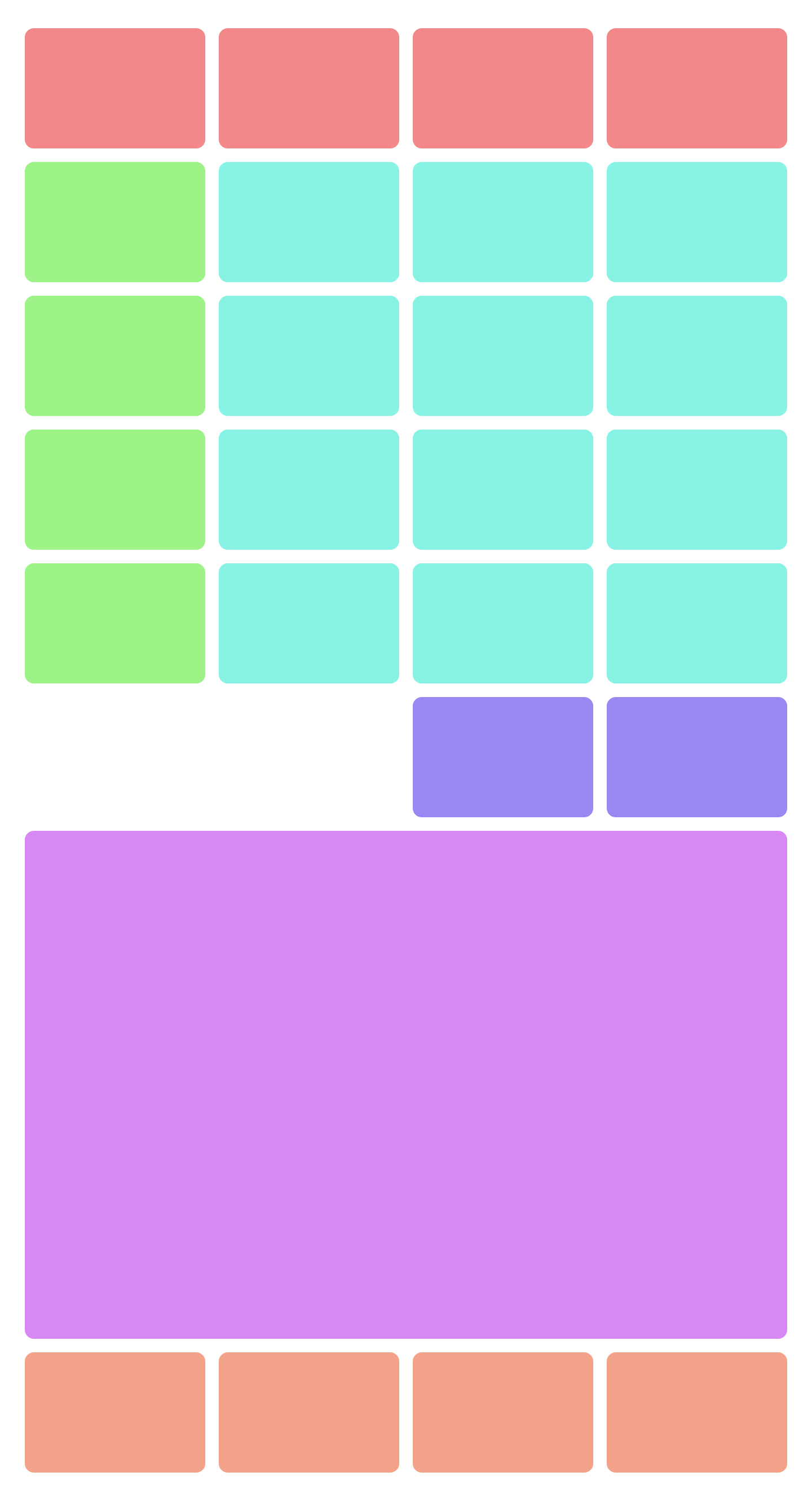
im trying to build a layout of colored blocks for an exercise but i dont see how to get it done. for now i have 6 rows of blocks the same size. however, the next div called violet i would want to be the full width and 4 rows as size. this is how i want it to be:
Here is the html + css code right now. it should be done with grid template areas but i cant really manage how to use them the right way.
body, html {
    height: 100vh;
}

body {
    margin: 0;
    display: flex;
    justify-content: center;
    align-items: center;
}

.container {
    width: 800px;
    height: 800px;
    display: grid;
    grid-template-columns: repeat(4, 1fr);
    grid-template-rows: repeat(6, 1fr);
    gap: 15px;
}

.container div {
    border-radius: 20px;
}

.red {
    background-color: rgb(199, 48, 48);
}

.lightblue {
    background-color: rgb(55, 207, 245);
}

.lightgreen {
    background-color: greenyellow;
}

.blue {
    background-color: rgb(35, 35, 121);
}
<!DOCTYPE html>
<html lang="en">
<head>
<meta charset="UTF-8">
<meta name="viewport" content="width=device-width, initial-scale=1.0">
<link rel="stylesheet" href="style.css">
<title>Grid</title>
</head>
<body>
<div class="container">
<!-- Row 1 -->
<div class="red"></div>
<div class="red"></div>
<div class="red"></div>
<div class="red"></div>
<!-- Row 2 -->
<div class="lightgreen"></div>
<div class="lightblue"></div>
<div class="lightblue"></div>
<div class="lightblue"></div>
<!-- Row 3 -->
<div class="lightgreen"></div>
<div class="lightblue"></div>
<div class="lightblue"></div>
<div class="lightblue"></div>
<!-- Row 4 -->
<div class="lightgreen"></div>
<div class="lightblue"></div>
<div class="lightblue"></div>
<div class="lightblue"></div>
<!-- Row 5 -->
<div class="lightgreen"></div>
<div class="lightblue"></div>
<div class="lightblue"></div>
<div class="lightblue"></div>
<!-- Row 6 -->
<div></div>
<div></div>
<div class="blue"></div>
<div class="blue"></div>
</div>
</body>
</html>Anyone has an idea on how to get it done that involves it being built mainly by grid template areas? Would be appreciated!

 Question posted in


2
Answers
Personally i use https://cssgrid-generator.netlify.app/ , give it a try, it is usefull !
You can specify each grid element in its place using
grid-template/grid-area.Or you can simply "extend"
div.purplewithgrid-column: