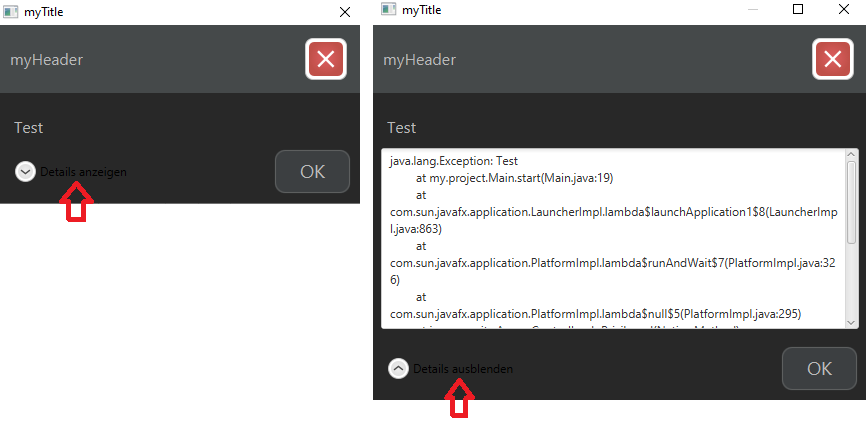
I’m encountering a problem while attempting to change the text color within a Hyperlink object embedded in a JavaFX Alert (with ExpandableContent).
Furthermore, I’d like to highlight that the CSS file is added to the DialogPane (indeed, background color and other formatting are correctly recognized).
My CSS class: alert_001
Despite several attempts I have been unable to achieve the desired outcome.
The text color of the Hyperlink remains unchanged within the Alert object.
DialogPane (dialog-pane)
+- ButtonBar (button-bar)
+--- HBox (container)
+------ Hyperlink (details-button more)(pseudo class state: visited)
+--------- LabeledText (text)
.alert_001 .dialog-pane .button-bar .container .details-button .more .text {
    -fx-text-fill: #bbbbbb;
    -fx-font-size: 12.0pt;
}
Thank you in advance
Minimal reproducible example
Create a new Java project (Java 8, no Gradle)
Main class (Directory: src, Package: my.project, File: Main.java)
package my.project;

import javafx.application.Application;
import javafx.stage.Stage;

public class Main extends Application {

    public static void main(String[] args) {
        launch(args);
    }

    @Override
    public void start(Stage stage) {

        final AlertComposer alertComposer = new AlertComposer();

        try {

            throw new Exception("Test");

        } catch (Exception e) {

            alertComposer.exception(e);
            throw new RuntimeException(e);

        }
    }
}
Alert composer class (Directory: src, Package: my.project, File: AlertComposer.java)
package my.project;

import javafx.scene.control.Alert;
import javafx.scene.control.DialogPane;
import javafx.scene.control.TextArea;
import javafx.scene.layout.GridPane;
import javafx.scene.layout.Priority;
import javafx.scene.layout.Region;

import java.io.PrintWriter;
import java.io.StringWriter;

public class AlertComposer {

    public void exception(Exception e) {

        String content = e.getMessage();
        Alert alert = this.build(Alert.AlertType.ERROR, "myTitle", "myHeader", content);

        GridPane expContent = buildExceptionGridPane(e);

        alert.getDialogPane().setExpandableContent(expContent);
        alert.showAndWait();
    }

    private GridPane buildExceptionGridPane(Exception e) {

        StringWriter sw = new StringWriter();
        PrintWriter pw = new PrintWriter(sw);
        e.printStackTrace(pw);
        String exceptionText = sw.toString();

        TextArea textArea = new TextArea(exceptionText);
        textArea.setEditable(false);
        textArea.setWrapText(true);

        textArea.setMaxWidth(Double.MAX_VALUE);
        textArea.setMaxHeight(Double.MAX_VALUE);
        GridPane.setVgrow(textArea, Priority.ALWAYS);
        GridPane.setHgrow(textArea, Priority.ALWAYS);

        GridPane expContent = new GridPane();
        expContent.setMaxWidth(Double.MAX_VALUE);
        expContent.add(textArea, 0, 0);

        return expContent;
    }

    public Alert build(Alert.AlertType type, String title, String header, String content) {

        Alert alert = build(type);

        alert.setTitle(title);
        alert.setHeaderText(header);
        alert.setContentText(content);

        return alert;
    }

    private Alert build(Alert.AlertType type) {

        Alert alert = new Alert(type);

        DialogPane dialogPane = alert.getDialogPane();
        dialogPane.setMinHeight(Region.USE_PREF_SIZE);

        dialogPane.getStylesheets().add(Main.class.getResource("/theme.css").toExternalForm());
        dialogPane.getStyleClass().add("alert_001");

        return alert;
    }
}
Theme CSS (Directory: resources, File: theme.css)
.alert_001 {
    -fx-background-color: #282828;
}

.alert_001 .header-panel {
    -fx-background-color: #45494a;
}

.alert_001 .label {
    -fx-text-fill: #bbbbbb;
    -fx-font-size: 12.0pt;
}

.alert_001 .button {
    -fx-border-color: #5e6060;
    -fx-border-radius: 10.0 10.0 10.0 10.0;
    -fx-background-color: #3c3f41;
    -fx-background-radius: 10.0 10.0 10.0 10.0;
    -fx-text-fill: #bbbbbb;
    -fx-font-size: 14.0pt;
}

 Question posted in


2
Answers
You can style the color of the more or less details link text like this:
Default styling rules are in modena.css. This answer looked at those then added an additional rule to customize them.
The selector for the is incorrect, for multiple reasons.
Generally, if you have two selectors separated by whitespace, it will match any node for the second selector which is a descendant node of a node matching the first selector. "Descendant node" for JavaFX typically means nodes that have the other node as a parent, or as a parent of a parent, etc (though there are some exceptions to this).
So your selector
will match a node with style class
textthat is a descendant of a node with style classmore, that is a descendant of a node with style classdetails-button, that is a descendant of a node with style classcontainer, etc.As you note, the
morestyle class is applied to the hyperlink that also has style classdetails-button. So there is no node with style classmorethat is contained in a node with style classdetails-button(there is just a single node with both style classes).Similarly, you add the style class
alert_001to the dialog pane. So there is no node with style classdialog-panethat is contained in a node with style classalert_001(there is just a single node, the dialog pane, that has both style classes).Also note that the
.textselector will select theTextnode that is used to display the text of the hyperlink.Textnodes do not have a-fx-text-fillproperty (see the documentation), but have a-fx-fillproperty that is inherited fromShape.If you want to select a single node that matches two different selection nodes, you can concatenate the selection rules with no whitespace. So the following will select a node with both style class
dialog-paneand style classalert_001:and similarly the selector
will select a node with both style class
details-buttonand style classmore.So if you want to be really specific in your CSS, you can select the text in the "more" hyperlink with
I don’t think you need to be this specific (and it usually makes more sense to style the control (i.e. the hyperlink), not its underlying rendering). So I would simply do
if you want to specifically select the expand (but not the collapse) button, or
to style the collapse (but not the expand) button, or
to style the button in either state.
Note also that since the style here is exactly the same as the style you apply to labels in the dialog pane, you can combine these into a single rule:
So the following style sheet achieves what I think you want:
The one caveat here is that the details button CSS style class is not documented, so there is no particular guarantee it will continue to work in future JavaFX releases. The JavaFX team do seem to be quite good about preserving back-compatibility in CSS style names (even for undocumented functionality) when releasing new versions, and there is really no other way to get at these elements anyway.