skip to Main Content

How can I achieve the same alignment with <img/> as I do with background-image?

Screenshot

Link to sandbox

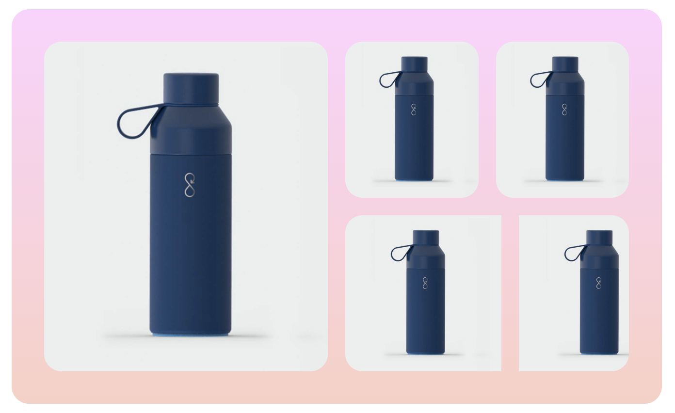
The two bottles in the upper right corner are aligned the way I want:

  • Fill the height
  • Get clipped to fit the width
  • Don’t overflow

They’re not <img/> elements, but divs with background-image.

The problem: The two bottles in the lower right corner use <img/> elements (which is what I want), but they don’t behave the same.

I can of course set the width of the images explicitly (like 50%), but the images might be different sizes, or there might be more of them. Therefore I’d like to avoid explicitly setting the width.

How can I fix this?

Never mind the image on the left.

Here’s the code:

.app {
  padding: 5%;
}
.app > * {
  max-width: 900px;
  margin: 0px auto;
}
.box {
  display: flex;
  flex-direction: row;
  flex: 1;
  gap: 18px;
  max-width: 100%;
  max-height: 100%;
  overflow: hidden;
  border-radius: 18px;
  background-size: cover !important;
  background-repeat: no-repeat !important;
  background-position: center !important;
}
.box.column {
  flex-direction: column;
}
.box.hasBackground {
  padding: 5%;
}
.box img {
  object-fit: cover;
  max-height: 100%;
  max-width: 100%;
}
<div class="app">
  <div class="box row hasBackground" style="background-image: linear-gradient(to top, rgb(250, 208, 196) 0%, rgb(255, 209, 255) 100%);">
    <div class="box row ">
      <img src="https://velgnorsk.no/wp-content/uploads/2020/01/Ocean-bottle_VN_marinebla%CC%8A.jpg">
    </div>
    <div class="box column ">
      <div class="box row ">
        <div class="box row hasBackground" style="background-image: url(&quot;https://velgnorsk.no/wp-content/uploads/2020/01/Ocean-bottle_VN_marinebla%CC%8A.jpg&quot;);"></div>
        <div class="box row hasBackground" style="background-image: url(&quot;https://velgnorsk.no/wp-content/uploads/2020/01/Ocean-bottle_VN_marinebla%CC%8A.jpg&quot;);"></div>
      </div>
      <div class="box row ">
        <img src="https://velgnorsk.no/wp-content/uploads/2020/01/Ocean-bottle_VN_marinebla%CC%8A.jpg">
        <img src="https://velgnorsk.no/wp-content/uploads/2020/01/Ocean-bottle_VN_marinebla%CC%8A.jpg">
      </div>
    </div>
  </div>
</div>

2

Answers


  1. There you go, the trick here is using aspect-ratio: 1, I’ve done other tweaks, see snippet below

    .app {
      padding: 5%;
      max-width: 900px;
      margin-inline: auto;
    }
    
    .box {
      display: flex;
      flex: 1;
      gap: 18px;
      max-width: 100%;
      max-height: 100%;
    }
    
    .column {
      flex-direction: column;
    }
    
    .hasBackground {
      padding: 5%;
      background-image: linear-gradient(to top, rgb(250, 208, 196) 0%, rgb(255, 209, 255) 100%);
    }
    
    .box img {
      object-fit: cover;
      height: 100%;
      width: 100%;
      aspect-ratio: 1;
      border-radius: 18px;
    }
    <div class="app">
      <div class="box row hasBackground">
        <div class="box row">
          <img src="https://velgnorsk.no/wp-content/uploads/2020/01/Ocean-bottle_VN_marinebla%CC%8A.jpg">
        </div>
        <div class="box column">
          <div class="box row">
            <img src="https://velgnorsk.no/wp-content/uploads/2020/01/Ocean-bottle_VN_marinebla%CC%8A.jpg">
            <img src="https://velgnorsk.no/wp-content/uploads/2020/01/Ocean-bottle_VN_marinebla%CC%8A.jpg">
          </div>
          <div class="box row">
            <img src="https://velgnorsk.no/wp-content/uploads/2020/01/Ocean-bottle_VN_marinebla%CC%8A.jpg">
            <img src="https://velgnorsk.no/wp-content/uploads/2020/01/Ocean-bottle_VN_marinebla%CC%8A.jpg">
          </div>
        </div>
      </div>
    </div>
    Login or Signup to reply.
  2. <!DOCTYPE html>
    <html lang="en">
    
    <head>
        <meta charset="UTF-8">
        <meta name="viewport" content="width=device-width, initial-scale=1.0">
        <title>Document</title>
        <style>
            .background-container {
                background: linear-gradient(to top, rgb(250, 208, 196) 0%, rgb(255, 209, 255) 100%);
                display: flex;
            }
    
            .left-image {
                width: 50%;
                padding: 30px;
            }
    
            .right-images {
                display: flex;
                flex-direction: column;
                width: 50%;
                height: 100%;
            }
    
            .row1,
            .row2 {
                display: flex;
                margin: 5px;
                padding: 30px;
            }
    
    
            .left-image img {
                width: 100%;
                height: 100%;
                border-radius: 15px;
            }
    
            .right-images img {
                width: 100%;
                height: 100%;
                border-radius: 15px;
            }
    
            .row1-image2, .row2-image2{
                margin-left: 15px;
            }
    
        </style>
    </head>
    
    <body>
        <div class="app">
            <div class="background-container">
                <div class="left-image">
                    <img src="https://velgnorsk.no/wp-content/uploads/2020/01/Ocean-bottle_VN_marinebla%CC%8A.jpg"
                        alt="image">
                </div>
                <div class="right-images">
                    <div class="row1">
                        <div class="row1-image1">
                            <img src="https://velgnorsk.no/wp-content/uploads/2020/01/Ocean-bottle_VN_marinebla%CC%8A.jpg"
                                alt="">
                        </div>
                        <div class="row1-image2">
                            <img src="https://velgnorsk.no/wp-content/uploads/2020/01/Ocean-bottle_VN_marinebla%CC%8A.jpg"
                                alt="">
                        </div>
                    </div>
                    <div class="row2">
                        <div class="row2-image1">
                            <img src="https://velgnorsk.no/wp-content/uploads/2020/01/Ocean-bottle_VN_marinebla%CC%8A.jpg"
                                alt="">
                        </div>
                        <div class="row2-image2">
                            <img src="https://velgnorsk.no/wp-content/uploads/2020/01/Ocean-bottle_VN_marinebla%CC%8A.jpg"
                                alt="">
                        </div>
                    </div>
                </div>
            </div>
    
    </body>
    
    </html>

    Your class name looks too confusing for me so I did it on my own.
    I did not use any hard values and also I did not use background image. I use Flexbox to replicate your layout. But it is more convenient to use grid in this kind of layout.
    here the gap looks too much but when you open it on the large screen it seems to be just what you want

    Login or Signup to reply.
Please signup or login to give your own answer.
Back To Top
Search