skip to Main Content

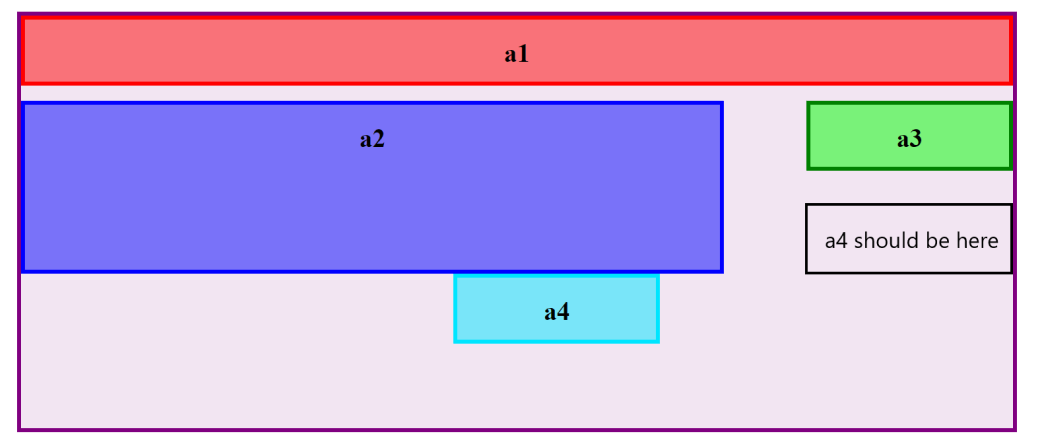
Hello All I am trying to move a4 to the area shown in the img but i cant find how or any related posts on how to get 2 divs to the right of the 1 div, Any and all help is appreciated. Thanks!

This is what it should look like:
What It Should Look Like:

Here is the code that I have tried:

.post-background {
    width: 100%;
    text-align: center;
    padding-top: 100px;
    padding-bottom: 100px;
    display: flex;
    align-items: center;
    justify-content: center;
    
}


.post-area {
    width: 80%;
    height: 500px;
    background: rgba(128, 0, 128, 0.1);
    display: block;
    border: 5px solid purple;

}

.a1 {
    text-align: center;
    width: 99.2%;
    height: 75px;
    background: rgba(255, 0, 0, 0.5);
    border: 5px solid red;
    display: block;
}

.a2 {
    text-align: center;
    width: 70%;
    height: 200px;
    background: rgba(0 0, 255, 0.5);
    border: 5px solid blue;
    display: inline-block;

}

.a3 {
    text-align: center;
    width: 20%;
    height: 75px;
    background: rgba(0 255, 0, 0.5);
    border: 5px solid green;
    display: inline-block;
    margin-left: 8%;
}

.a4 {
    text-align: center;
    width: 20%;
    height: 75px;
    background: rgba(0, 229, 255, 0.5);
    border: 5px solid rgb(0, 229, 255);
    display: inline-block;
    margin-left: 8%;

}
<div class="post-background">
<div class="post-area">

<div class="a1">
<h1>a1</h1>
</div>

<div class="a2">
<h1>a2</h1>
</div>

<div class="a3">
<h1>a3</h1>
</div>

<div class="a4">
<h1>a4</h1>
</div>

</div>
</div>

3

Answers


  1. Grid is best for two-dimensional layouts.

    .post-background {
      text-align: center;
      font-family: sans-serif;
    }
    
    .post-area {
      background: rgb(128 0 128 / 0.1);
      border: 5px solid purple;
      display: grid;
      grid-template-columns: 3fr 1fr;
      gap: 0.5em 5%;
    }
    
    .a1 {
      background: rgb(255 0 0 / 0.5);
      border: 5px solid red;
      grid-column: 1 / span 2;
    }
    
    .a2 {
      background: rgb(0 0 255 / 0.5);
      border: 5px solid blue;
      grid-row: 2 / span 2;
    }
    
    .a3 {
      background: rgba(0 255 0 / 0.5);
      border: 5px solid green;
    }
    
    .a4 {
      background: rgba(0 229 255 / 0.5);
      border: 5px solid rgb(0, 229, 255);
    }
    
    h1 {
      font-size: 1.25em;
      margin: 0.5rem 0;
    }
    <div class="post-background">
    <div class="post-area">
    
    <div class="a1">
    <h1>a1</h1>
    </div>
    
    <div class="a2">
    <h1>a2</h1>
    </div>
    
    <div class="a3">
    <h1>a3</h1>
    </div>
    
    <div class="a4">
    <h1>a4</h1>
    </div>
    
    </div>
    </div>
    Login or Signup to reply.
  2.    .post-background {
            width: 100%;
            text-align: center;
            padding-top: 100px;
            padding-bottom: 100px;
            display: flex;
            align-items: center;
            justify-content: center;
        }
        
        .post-area {
            width: 100%;
            height: 500px;
            background: rgba(128, 0, 128, 0.1);
            display: block;
            border: 5px solid purple;
        
        }
        
        .a234 {
          width: 100%;
          display: flex;
          margin-top: 1.5%;
        }
        
        .a34 {
          width: 30%;
        }
        
        .a1 {
            text-align: center;
            width: 99.5%;
            height: 75px;
            background: rgba(255, 0, 0, 0.5);
            border: 5px solid red;
            display: block;
        }
        
        .a2 {
            display: block;
            text-align: center;
            width: 70%;
            height: 200px;
            background: rgba(0 0, 255, 0.5);
            border: 5px solid blue;
        }
        
        .a3 {
            display: block;
            height: 75px;
            background: rgba(0 255, 0, 0.5);
            border: 5px solid green;
            margin-left: 40%;
            margin-bottom: 9%;
        }
        
        .a4 {
            display: block;
            height: 75px;
            background: rgba(0, 229, 255, 0.5);
            border: 5px solid rgb(0, 229, 255);
            margin-left: 40%;
        }
    <div class="post-background">
          <div class="post-area">
            <div class="a1">
              <h1>a1</h1>
            </div>
        
            <div class="a234">
              <div class="a2">
                <h1>a2</h1>
              </div>
              
              <div class="a34">
                <div class="a3">
                  <h1>a3</h1>
                </div>
        
                <div class="a4">
                  <h1>a4</h1>
                </div>
               </div>
             </div>
          </div>
        </div>
    Login or Signup to reply.
  3. You can try this approach :

    <html>
    <head>
        <style>
            .row1{
                border: 3px solid red;
                padding: 10px 0;
                text-align: center;
                background-color: rgb(240, 136, 136);
            }
            .container{
                margin : auto;
                border: 2px solid rgb(137, 137, 248);
                max-width: 60%;
            }
            .first-section{
                text-align: center;
                width: 60%;
                min-height: 100px;
                background-color: rgb(131, 131, 177);
                border: 3px solid blue;
                margin-top: 5px;
            }
            .row2{
                display: flex;
            }
            .a3{
                width:20%;
                background-color: rgb(140, 238, 140);
                border: 3px solid green;
            }
            .a4{
                width:20%;
                background-color: rgb(140, 238, 140);
                border: 3px solid green;
            }
            .second-section{
                margin-top: 5px;
                display: flex;
                flex-direction: column;
                align-items: flex-end;
                justify-content: space-between;
                width:40%;
            }
        </style>
    </head>
    <body>
        <div class="container">
            <div class="row1">
                a1
            </div>
            <div class="row2">
                <div class="first-section">
                    a2
                </div>
                <div class="second-section">
                    <div class="a3">
                        a3
                    </div>
                    <div class="a4">
                        a4
                    </div>
                </div>
            </div>
    
        </div>
    </body>
    
    Login or Signup to reply.
Please signup or login to give your own answer.
Back To Top
Search