skip to Main Content

I am creating quiz-like application. My aim is to open each question from separate button (box). The number of buttons is not constant, so I generate them dynamically.
However I have a problem to unify their size (each should have same width and height) and set spaces between them and screen.

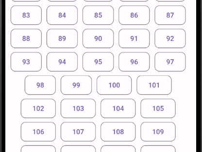
I would like to achieve something similar to this, but as you can see, width of the buttons varies and it is differently padded to each side of the screen.

enter image description here

So buttons should be organized like this:

[dynamic space to edge][button][button space][button][buttons space][…..][button][dynamic space to edge].

I’ve tried like this:

Widget getSectionBoxes(String id, num j) {
  List<Widget> boxes = [];

  for (int i = 0; i < questions[id].length; i++) {
    j++;
    String questionId = questions[id][i];
    
    boxes.add(OutlinedButton(
        onPressed: () {
          debugPrint(questionId);
        },
        style: ButtonStyle(
            shape: MaterialStateProperty.all<RoundedRectangleBorder>(
                RoundedRectangleBorder(
          borderRadius: BorderRadius.circular(10),
        ))),
        child: Text(j.toString())));
        boxes.add(const SizedBox(width: 10));
  }

  return Wrap(
    alignment: WrapAlignment.center,
    children: boxes,
  );
}

I’ve tried using Wrap widget, which orders boxes the way I want, but then there is no spaces. If I add sizedBox widget (width: 10) between buttons, then I have additional space to left or right edge. It is especially visible in a first row.


2

Answers


  1. Try below code hope its help to you, I have used padLeft method for single digit ID

    declaration:

     List<Map<String, dynamic>> jsonList = [];
        for (int i = 1; i < 100; i++) {
          jsonList.add({"Id": i});
        }
    

    UI:

    Padding(
        padding: EdgeInsets.symmetric(horizontal: 5),
        child: Wrap(
          spacing: 10.0,
          runSpacing: 10.0,
          alignment: WrapAlignment.center,
          children: List.generate(
            jsonList.length,
            (index) => OutlinedButton(
              onPressed: () {},
              style: ButtonStyle(
                shape: MaterialStateProperty.all<RoundedRectangleBorder>(
                  RoundedRectangleBorder(
                    borderRadius: BorderRadius.circular(10),
                  ),
                ),
              ),
              child: Text(
                jsonList[index]['Id'].toString().padLeft(2, "0"),
              ),
            ),
          ),
        ),
      ),
    

    Result Screen- image

    Login or Signup to reply.
  2. You can use staggered grid view to get this result

    Builder(builder: (context) {
        var noOfItem = 50;
        var screenWidth = MediaQuery.of(context).size.width;
        int itemsIn1Row =
            (screenWidth / 101).floor(); //to get the max no of items in row
        var paddingWidth = (screenWidth - itemsIn1Row * 101) / 2;
        return AlignedGridView.extent(
          physics: AlwaysScrollableScrollPhysics(),
          shrinkWrap: true,
          itemCount: noOfItem,
          maxCrossAxisExtent: 100, //or whatever you want to pass
          mainAxisSpacing: 20,
          crossAxisSpacing: 20,
          padding: EdgeInsets.symmetric(horizontal: paddingWidth),
          itemBuilder: (context, index) {
            return Container(
              width: 100,
              height: 40,
              decoration: BoxDecoration(
                  border: Border.all(color: Colors.red, width: 1.0),
                  borderRadius: BorderRadius.circular(15)),
              child: Center(
                child: Text((index + 1).toString()),
              ),
            );
          },
        );
      }
    

    enter image description here

    Login or Signup to reply.
Please signup or login to give your own answer.
Back To Top
Search