skip to Main Content

It’s basic css, but I just can’t get it right.

I’m building an e-commerce website, so I need many flexboxes to display the products. I’m also using bootstrap in my project.
This is my code:

<link href="https://cdnjs.cloudflare.com/ajax/libs/twitter-bootstrap/4.1.3/css/bootstrap.min.css" rel="stylesheet"/>
<div class="row" style="display: flex; flex-wrap: wrap;">
  <div class="col-sm-6 col-md-3" style="cursor:pointer; transition: border .2s ease-in-out; margin:15px; border: 1px solid #ddd; border-radius: 4px; height:auto; box-shadow: 0 2px 3px rgba(0,0,0,.075);">
    <img style="vertical-align: middle;" class="img-responsive" src="https://i.dell.com/das/xa.ashx/global-site-design%20web/00000000-0000-0000-0000-000000000000/1/LargePNG?id=Dell/Product_Images/Dell_Client_Products/Notebooks/Latitude_Notebooks/12_7275/global_spi/notebook-latitude-12-7275-black-left-windows-hero-504x350.psd"
      alt="...">
    <div>
      <h4 style="overflow-wrap: break-word; word-wrap: break-word;" class="text-center">Laptop Dell XPS 9250 12.5" (m56Y57/8GB/256GB/ HD)</h4>
    </div>
    <div class="text-center" style="margin-top:auto;">
      <span style="color:yellow;background-color:red;font-size:18px;">-67% OFF NOW!</span>
    </div>
    <div>
      <h5 class="text-center" style="margin-right:5px; font-size:18px;"><span style="text-decoration: line-through; color:black; font-size:22px;"><span style="color:red; font-size:20px">$2499.99</span></span> $1499.99</h5>
    </div>
    <div class="text-center" style="margin-top:auto;">
      <button class="btn btn-success add_to_cart" style="margin-bottom:5px;">Add to cart</button>
    </div>
  </div>

  <div class="col-sm-6 col-md-3" style="cursor:pointer; transition: border .2s ease-in-out; margin:15px; border: 1px solid #ddd; border-radius: 4px; height:auto; box-shadow: 0 2px 3px rgba(0,0,0,.075);">
    <img style="vertical-align: middle;" class="img-responsive" src="https://external.webstorage.gr/Product-Images/1312102/quest-slimbook-convertible-1000-1312102.jpg" alt="...">
    <div>
      <h4 style="overflow-wrap: break-word; word-wrap: break-word;" class="text-center">Laptop Quest Slimbook 360 Convertible - 13.3" (Celeron N3350/4GB/32GB/HD)</h4>
    </div>
    <div class="text-center" style="margin-top:auto;">
      <span style="color:yellow;background-color:red;font-size:18px;">-40% OFF NOW!</span>
    </div>
    <div>
      <h5 class="text-center" style="margin-right:5px; font-size:18px;"><span style="text-decoration: line-through; color:black; font-size:22px;"><span style="color:red; font-size:20px">$349</span></span> $249</h5>
    </div>
    <div class="text-center">
      <button class="btn btn-success add_to_cart" style="margin-bottom:5px;">Add to cart</button>
    </div>
  </div>
</div>

And this is how it looks like:
How it currently looks like

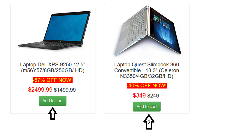
I want the “-67% off” and all the elements below it in the first flexbox to match the same elements height in the second flexbox. As you can see, I am already using style="margin-top:auto;" in the divs that contain the offers(67% OFF NOW & 40% OFF NOW), but it doesn’t align at the bottom.

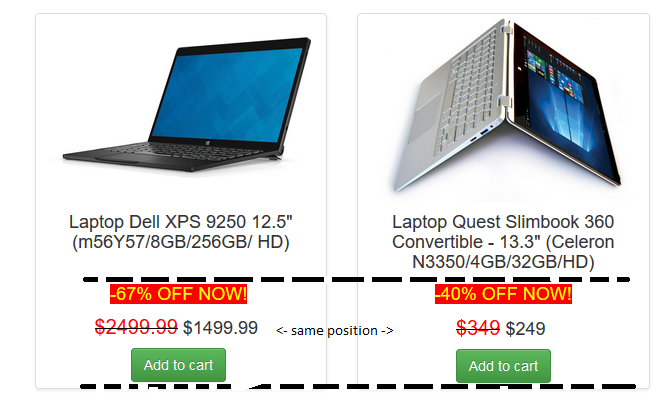
And this is how I want it to look:
end result

What is more, when viewing this code in mobile or by making the browser window smaller the three divs are aligned at the bottom successfully.
What am I missing?

2

Answers


  1. There are two ways to go about it.

    1. The general way

      Wrap the image product and title in a wrapper with min-height. Obviously, the min-height should be sufficient for the tallest of them.

    2. The specific way

      This is generally better because instead of hard-coding a min-width of all products on the page, it simply makes them adjusts to the height of the tallest in the row. You still need a wrapper around the image and product title but, instead of the min-height, you give the entire product

    display:flex;
    flex-direction: column;
    

    … and give the said wrapper flex-grow: 1. This will make all products in the row grow to match the tallest and the extra height is given to the only child element with flex-grow: 1 (which is your wrapper).

    Working example:

    .products {
      display: flex; 
      flex-wrap: wrap;
    }
    .product {
      cursor:pointer; 
      transition: border .2s ease-in-out; 
      margin:15px; 
      border: 1px solid #ddd; 
      border-radius: 4px; 
      height:auto; 
      box-shadow: 0 2px 3px rgba(0,0,0,.075);
    }
    .product img {
      vertical-align: middle;
      width: 100%;
      height: auto;
    }
    .product h4 {
      overflow-wrap: break-word; 
      word-wrap: break-word;
    }
    .product h5 {
      margin-right:5px; 
      font-size:18px;
    }
    .add_to_cart {
      margin-bottom:5px;
    }
    
    /* here's the magic */
    
    .product {
      display: flex;
      flex-direction: column;
    }
    .product-body {
      flex-grow: 1;
    }
    <link href="https://cdnjs.cloudflare.com/ajax/libs/twitter-bootstrap/4.1.3/css/bootstrap.min.css" rel="stylesheet"/>
    <div class="container">
      <div class="row products">
        <div class="col-sm-6 col-md-3 product">
          <div class="product-body">
            <img style="" class="img-responsive" src="https://i.dell.com/das/xa.ashx/global-site-design%20web/00000000-0000-0000-0000-000000000000/1/LargePNG?id=Dell/Product_Images/Dell_Client_Products/Notebooks/Latitude_Notebooks/12_7275/global_spi/notebook-latitude-12-7275-black-left-windows-hero-504x350.psd"
              alt="...">
            <div>
              <h4 class="text-center">Laptop Dell XPS 9250 12.5" (m56Y57/8GB/256GB/ HD)</h4>
            </div>
          </div>
          <div class="text-center" style="margin-top:auto;">
            <span style="color:yellow;background-color:red;font-size:18px;">-67% OFF NOW!</span>
          </div>
          <div>
            <h5 class="text-center">
              <span style="text-decoration: line-through; color:black; font-size:22px;">
                <span style="color:red; font-size:20px">$2499.99</span>
              </span>
              $1499.99
            </h5>
          </div>
          <div class="text-center" style="margin-top:auto;">
            <button class="btn btn-success add_to_cart">Add to cart</button>
          </div>
        </div>
    
        <div class="col-sm-6 col-md-3 product">
          <div class="product-body">
            <img class="img-responsive" src="https://external.webstorage.gr/Product-Images/1312102/quest-slimbook-convertible-1000-1312102.jpg" alt="...">
            <div>
              <h4 class="text-center">Laptop Quest Slimbook 360 Convertible - 13.3" (Celeron N3350/4GB/32GB/HD)</h4>
            </div>
          </div>
          <div class="text-center" style="margin-top:auto;">
            <span style="color:yellow;background-color:red;font-size:18px;">-40% OFF NOW!</span>
          </div>
          <div>
            <h5 class="text-center">
              <span style="text-decoration: line-through; color:black; font-size:22px;">
                <span style="color:red; font-size:20px">$349</span>
              </span>
              $249
            </h5>
          </div>
          <div class="text-center">
            <button class="btn btn-success add_to_cart">Add to cart</button>
          </div>
        </div>
      </div>
    </div>
    Login or Signup to reply.
  2. you can make each box a flex container too and remove margin:auto to the button, you may add a min-height to h5 if prices have to wrap on 2 lines.

    img {max-width:100%;}/* avoids image stretching*/
    h5.text-center {min-height:2.8em;}/* about 2 line height */
    <link href="https://cdnjs.cloudflare.com/ajax/libs/twitter-bootstrap/4.1.3/css/bootstrap.min.css" rel="stylesheet"/>
    <div class="container">
      <div class="row flex-wrap" style>
      <div class="col-sm-6 col-md-3 d-flex flex-column" style="cursor:pointer; transition: border .2s ease-in-out; margin:15px; border: 1px solid #ddd; border-radius: 4px; height:auto; box-shadow: 0 2px 3px rgba(0,0,0,.075);">
        <img style="vertical-align: middle;" class="img-responsive" src="https://i.dell.com/das/xa.ashx/global-site-design%20web/00000000-0000-0000-0000-000000000000/1/LargePNG?id=Dell/Product_Images/Dell_Client_Products/Notebooks/Latitude_Notebooks/12_7275/global_spi/notebook-latitude-12-7275-black-left-windows-hero-504x350.psd"
          alt="...">
        <div>
          <h4 style="overflow-wrap: break-word; word-wrap: break-word;" class="text-center">Laptop Dell XPS 9250 12.5" (m56Y57/8GB/256GB/ HD)</h4>
        </div>
        <div class="text-center" style="margin-top:auto;">
          <span style="color:yellow;background-color:red;font-size:18px;">-67% OFF NOW!</span>
        </div>
        <div>
          <h5 class="text-center" style="margin-right:5px; font-size:18px;"><span style="text-decoration: line-through; color:black; font-size:22px;"><span style="color:red; font-size:20px">$2499.99</span></span> $1499.99</h5>
        </div>
        <div class="text-center" style="">
          <button class="btn btn-success add_to_cart" style="margin-bottom:5px;">Add to cart</button>
        </div>
      </div>
    
      <div class="col-sm-6 col-md-3  d-flex flex-column" style="cursor:pointer; transition: border .2s ease-in-out; margin:15px; border: 1px solid #ddd; border-radius: 4px; height:auto; box-shadow: 0 2px 3px rgba(0,0,0,.075);">
        <img style="vertical-align: middle;" class="img-responsive" src="https://external.webstorage.gr/Product-Images/1312102/quest-slimbook-convertible-1000-1312102.jpg" alt="...">
        <div>
          <h4 style="overflow-wrap: break-word; word-wrap: break-word;" class="text-center">Laptop Quest Slimbook 360 Convertible - 13.3" (Celeron N3350/4GB/32GB/HD)</h4>
        </div>
        <div class="text-center" style="margin-top:auto;">
          <span style="color:yellow;background-color:red;font-size:18px;">-40% OFF NOW!</span>
        </div>
        <div>
          <h5 class="text-center" style="margin-right:5px; font-size:18px;"><span style="text-decoration: line-through; color:black; font-size:22px;"><span style="color:red; font-size:20px">$349</span></span> $249</h5>
        </div>
        <div class="text-center">
          <button class="btn btn-success add_to_cart" style="margin-bottom:5px;">Add to cart</button>
        </div>
      </div>  <div class="col-sm-6 col-md-3 d-flex flex-column" style="cursor:pointer; transition: border .2s ease-in-out; margin:15px; border: 1px solid #ddd; border-radius: 4px; height:auto; box-shadow: 0 2px 3px rgba(0,0,0,.075);">
        <img style="vertical-align: middle;" class="img-responsive" src="https://i.dell.com/das/xa.ashx/global-site-design%20web/00000000-0000-0000-0000-000000000000/1/LargePNG?id=Dell/Product_Images/Dell_Client_Products/Notebooks/Latitude_Notebooks/12_7275/global_spi/notebook-latitude-12-7275-black-left-windows-hero-504x350.psd"
          alt="...">
        <div>
          <h4 style="overflow-wrap: break-word; word-wrap: break-word;flex:1;" class="text-center">Laptop Dell XPS 9250 12.5" (m56Y57/8GB/256GB/ HD)</h4>
        </div>
        <div class="text-center" style="margin-top:auto;">
          <span style="color:yellow;background-color:red;font-size:18px;">-67% OFF NOW!</span>
        </div>
        <div>
          <h5 class="text-center" style="margin-right:5px; font-size:18px;"><span style="text-decoration: line-through; color:black; font-size:22px;"><span style="color:red; font-size:20px">$2499.99</span></span> $1499.99</h5>
        </div>
        <div class="text-center" style="">
          <button class="btn btn-success add_to_cart" style="margin-bottom:5px;">Add to cart</button>
        </div>
      </div>
    
      <div class="col-sm-6 col-md-3  d-flex flex-column" style="cursor:pointer; transition: border .2s ease-in-out; margin:15px; border: 1px solid #ddd; border-radius: 4px; height:auto; box-shadow: 0 2px 3px rgba(0,0,0,.075);">
        <img style="vertical-align: middle;" class="img-responsive" src="https://external.webstorage.gr/Product-Images/1312102/quest-slimbook-convertible-1000-1312102.jpg" alt="...">
        <div>
          <h4 style="overflow-wrap: break-word; word-wrap: break-word;" class="text-center">Laptop Quest Slimbook 360 Convertible - 13.3 Laptop Quest Slimbook 360 Convertible - 13.3Laptop Quest Slimbook 360 Convertible - 13.3" (Celeron N3350/4GB/32GB/HD)</h4>
        </div>
        <div class="text-center" style="margin-top:auto;">
          <span style="color:yellow;background-color:red;font-size:18px;">-40% OFF NOW!</span>
        </div>
        <div>
          <h5 class="text-center" style="margin-right:5px; font-size:18px;"><span style="text-decoration: line-through; color:black; font-size:22px;"><span style="color:red; font-size:20px">$349</span></span> $249</h5>
        </div>
        <div class="text-center">
          <button class="btn btn-success add_to_cart" style="margin-bottom:5px;">Add to cart</button>
        </div>
      </div>  <div class="col-sm-6 col-md-3 d-flex flex-column" style="cursor:pointer; transition: border .2s ease-in-out; margin:15px; border: 1px solid #ddd; border-radius: 4px; height:auto; box-shadow: 0 2px 3px rgba(0,0,0,.075);">
        <img style="vertical-align: middle;" class="img-responsive" src="https://i.dell.com/das/xa.ashx/global-site-design%20web/00000000-0000-0000-0000-000000000000/1/LargePNG?id=Dell/Product_Images/Dell_Client_Products/Notebooks/Latitude_Notebooks/12_7275/global_spi/notebook-latitude-12-7275-black-left-windows-hero-504x350.psd"
          alt="...">
        <div>
          <h4 style="overflow-wrap: break-word; word-wrap: break-word;flex:1;" class="text-center">Laptop Dell XPS 9250 12.5" (m56Y57/8GB/256GB/ HD)</h4>
        </div>
        <div class="text-center" style="margin-top:auto;">
          <span style="color:yellow;background-color:red;font-size:18px;">-67% OFF NOW!</span>
        </div>
        <div>
          <h5 class="text-center" style="margin-right:5px; font-size:18px;"><span style="text-decoration: line-through; color:black; font-size:22px;"><span style="color:red; font-size:20px">$2499.99</span></span> $1499.99</h5>
        </div>
        <div class="text-center" style="">
          <button class="btn btn-success add_to_cart" style="margin-bottom:5px;">Add to cart</button>
        </div>
      </div>
    
      <div class="col-sm-6 col-md-3  d-flex flex-column" style="cursor:pointer; transition: border .2s ease-in-out; margin:15px; border: 1px solid #ddd; border-radius: 4px; height:auto; box-shadow: 0 2px 3px rgba(0,0,0,.075);">
        <img style="vertical-align: middle;" class="img-responsive" src="https://external.webstorage.gr/Product-Images/1312102/quest-slimbook-convertible-1000-1312102.jpg" alt="...">
        <div>
          <h4 style="overflow-wrap: break-word; word-wrap: break-word;" class="text-center">Laptop Quest Slimbook 360 Convertible - 13.3 Laptop Quest Slimbook 360 Convertible - 13.3" (Celeron N3350/4GB/32GB/HD)</h4>
        </div>
        <div class="text-center" style="margin-top:auto;">
          <span style="color:yellow;background-color:red;font-size:18px;">-40% OFF NOW!</span>
        </div>
        <div>
          <h5 class="text-center" style="margin-right:5px; font-size:18px;"><span style="text-decoration: line-through; color:black; font-size:22px;"><span style="color:red; font-size:20px">$349</span></span> $249</h5>
        </div>
        <div class="text-center">
          <button class="btn btn-success add_to_cart" style="margin-bottom:5px;">Add to cart</button>
        </div>
      </div>
    </div>
    Login or Signup to reply.
Please signup or login to give your own answer.
Back To Top
Search