skip to Main Content

I have read a lot of posts about this but I still didn’t find an answer.
I have a footer that I want to be at the end of the page, not fixed.
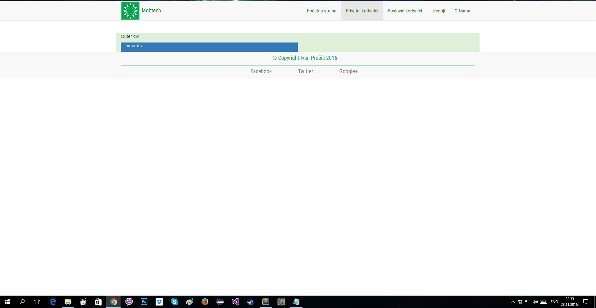
The problem is that the footer is where the content ends. Look at picture.
enter image description here

This is my HTML:

<!DOCTYPE html>
<html>
    <head>
        <meta charset="utf-8"/>
        <title> Mobtech - Privatni korisnici </title>

        <!--Ubaci bootstrap css -->
        <link rel="stylesheet" href="css/bootstrap.min.css">
        <link rel="stylesheet" href="css/style.css">
        <link rel="css/basic-template.css" rel="stylesheet">
        <link href="https://fonts.googleapis.com/css?family=Roboto+Condensed" rel="stylesheet">

    </head>
    <body>
        <!--Navigation bar -->
        <nav class="navbar navbar-default" role="navigation">
            <div class="container">
                <div class="navbar-header">
                    <button type="button" class="navbar-toggle" data-toggle="collapse" data-target="#navbar-container">
                        <span class="sr-only"> Pokazi i sakrij navigaciju </span>
                        <span class="icon-bar"></span>
                        <span class="icon-bar"></span>
                        <span class="icon-bar"></span>
                    </button>
                    <a class="navbar-brand" href="#">
                         <span> <img src="Slike/logo.png" alt="LogoSlika"/> </span>
                        <font face="Roboto Condensed" size="4" color="green"> Mobtech </font>
                    </a>
                </div> 
                <div class="collapse navbar-collapse" id="navbar-container">
                    <ul class="nav navbar-nav navbar-right">
                        <li><a href="index.html"> Početna strana </a> </li>
                        <li class="active"><a href="#"> Privatni korisnici </a> </li>
                        <li><a href="poslovni.html"> Poslovni korisnici </a> </li>
                        <li><a href="uredjaji.html"> Uređaji </a> </li>
                        <li><a href="onama.html"> O Nama </a> </li>
                    </ul>
                </div>
            </div>
        </nav>

        <br />
            <div class="container"> <!--Container -->

                <div class="row">
                    <!-- Kolona na velikom ekranu (lg) prikazuje duzinu jedne kolone, Ekstra small (xs) prikazuje 4 kolone -->
                    <div class="col-lg-12 bg-success"> 
                        <p> Outer div </p>
                        <div class="col-lg-6 bg-primary">
                            <p> Inner div </p>
                        </div>
                    </div>
                </div>
            </div>

            <!-- Footer -->
            <footer class="mojFooter">
                <font face="Roboto Condensed" size="4"> <center>
                <div class="container">
                    <div class="row" style="margin-top: 7px;">
                         <p> &nbsp; &nbsp; &nbsp;  &nbsp; &nbsp; &nbsp; &copy; Copyright Ivan Prošić 2016.</p> 
                    </div>
                    <div class="bottom-footer">
                        <div class="col-md-12"> 
                            <ul class="footer-nav">
                                <li> <a href="https://www.facebook.com/"> Facebook </a> </li>
                                <li> <a href="https://twitter.com/"> Twitter </a> </li>
                                <li> <a href="https://plus.google.com/"> Google+ </a> </li>
                            </ul>
                        </div>
                    </div>
                </div>
                </font> </center>
            </footer>


            <!-- JavaScript fajl -->
            <script src="js/jquery.min.js"></script>
            <!-- Kompresovan JavaScript fajl -->
            <script src="js/bootstrap.min.js"></script>
    </body>
</html>

This is my CSS, for the footer only:

    .mojFooter{
    background-color: #f8f8f8;
    color: #00a651;
    padding-top: 0px;
    border-top: 1px solid #e7e7e7;
    margin-bottom: 0px;
}

.bottom-footer{
    border-top: 1px solid #00a651;
    margin-top: 0px;
    padding-top: 7px;
    color: #00a651;

}

.footer-nav li{
    display: inline;
    padding: 0px 40px;
}

.footer-nav a{
    color: grey;
    text-decoration: none;
}

6

Answers


  1. When using bootstrap 4 or 5, flexbox could be used to achieve desired effect:

    <body class="d-flex flex-column min-vh-100">
        <header>HEADER</header>
        <content>CONTENT</content>
        <footer class="mt-auto"></footer>
    </body>
    

    Please check the examples: Bootstrap 4 Bootstrap 5

    In bootstrap 3 and without use of bootstrap. The simplest and cross browser solution for this problem is to set a minimal height for body object. And then set absolute position for the footer with bottom: 0 rule.

    body {
      min-height: 100vh;
      position: relative;
      margin: 0;
      padding-bottom: 100px; //height of the footer
      box-sizing: border-box;
    }
    
    footer {
      position: absolute;
      bottom: 0;
      height: 100px;
    }
    

    Please check this example:
    Bootstrap 3

    Login or Signup to reply.
  2. You can just add:

    style="min-height:100vh"
    

    to your page content container and place the footer in another container

    Login or Signup to reply.
  3. Use this stylesheet:

    /* Sticky footer styles
    -------------------------------------------------- */
    html {
      position: relative;
      min-height: 100%;
    }
    body {
      /* Margin bottom by footer height */
      margin-bottom: 60px;
    }
    .footer {
      position: absolute;
      bottom: 0;
      width: 100%;
      /* Set the fixed height of the footer here */
      height: 60px;
      line-height: 60px; /* Vertically center the text there */
      background-color: #f5f5f5;
    }
    
    
    /* Custom page CSS
    -------------------------------------------------- */
    /* Not required for template or sticky footer method. */
    
    body > .container {
      padding: 60px 15px 0;
    }
    
    .footer > .container {
      padding-right: 15px;
      padding-left: 15px;
    }
    
    code {
      font-size: 80%;
    }
    Login or Signup to reply.
  4. In my case for Bootstrap4:

    <body class="d-flex flex-column min-vh-100">
        <div class="wrapper flex-grow-1"></div>
        <footer></footer>
    </body>
    
    Login or Signup to reply.
  5. © 2021 Company, Inc

    <a href="/" class="col-md-4 d-flex align-items-center justify-content-center mb-3 mb-md-0 me-md-auto link-dark text-decoration-none">
      <svg class="bi me-2" width="40" height="32"><use xlink:href="#bootstrap"/></svg>
    </a>
    
    <ul class="nav col-md-4 justify-content-end">
      <li class="nav-item"><a href="#" class="nav-link px-2 text-muted">Home</a></li>
      <li class="nav-item"><a href="#" class="nav-link px-2 text-muted">Features</a></li>
      <li class="nav-item"><a href="#" class="nav-link px-2 text-muted">Pricing</a></li>
      <li class="nav-item"><a href="#" class="nav-link px-2 text-muted">FAQs</a></li>
      <li class="nav-item"><a href="#" class="nav-link px-2 text-muted">About</a></li>
    </ul>
    
    Login or Signup to reply.
  6. :root {
        --text: #daf7a6;
        --header: #581845;
        --main: #900c3f;
        --footer: #ff5733;
    }
    
    *,
    *:before,
    *:after {
        box-sizing: border-box;
    }
    
    html,
    body {
        height: 100%;
    }
    
    header,
    main,
    footer {
        color: var(--text);
        height: 100px;
        padding: 1rem;
    }
    
    header {
        background-color: var(--header);
    }
    
    main {
        background-color: var(--main);
    }
    
    footer {
        background-color: var(--footer);
        position: sticky;
        top: 100vh;
    }
    <header>header</header>
    <main>content</main>
    <footer>footer</footer>
    Login or Signup to reply.
Please signup or login to give your own answer.
Back To Top
Search