skip to Main Content

I have a full size page, containing a top toolbar, and below, a container with 2 columns:

  • a right column
  • a left column containing a canvas (centered horizontally and vertically in this column), which has its own coordinates system (typically 4000 x 3000) and should preserve this aspect ratio. This canvas has a "+" button layered on it. (In my real code, there are several canvas for multiple layers, and multiple buttons, but not important here)

enter image description here

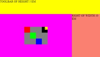
Here it nearly works, but I can’t make the canvas occupy the full available space in the left column.

With all methods that I tried (max-width: 100%, max-height: 100%), either it fails when we zoom in / out in the browser (70% 80% … 150 %), or it fails because the method used prevents the button to stay on top of the canvas, at its right corner.

TL;DR: how to make this canvas take all available space in the left column, keeping its aspect ratio, keeping the layered buttons, without overflow?

Note: I’m looking for a CSS solution, the JS is not for the positioning, but only the drawing.

ctx = document.querySelector("canvas").getContext("2d");
ctx.fillStyle = "#FF0000"; ctx.fillRect(0, 0, 1000, 1000);
ctx.fillStyle = "#00FF00"; ctx.fillRect(1000, 1000, 1000, 1000);
ctx.fillStyle = "#0000FF"; ctx.fillRect(2000, 2000, 1000, 1000);
ctx.fillStyle = "#000000"; ctx.fillRect(3000, 0, 1000, 1000);
* {
  padding: 0;
  margin: 0;
}

.page {
  display: flex;
  flex-direction: column;
  height: 100vh;
}

.toolbar {
  background-color: yellow;
  flex: 0 0 5em;
}

.container {
  background-color: orange;
  flex: 1 0 0;
  display: flex;
}

.left {
  background-color: magenta;
  flex: 1 0 0;
  display: flex;
  align-items: center;
  justify-content: center;
}

.right {
  background-color: salmon;
  flex: 0 0 10em;
}

.canvas-wrapper {
  background-color: grey;
  display: flex;
  position: relative;
}

canvas {
  height: 100px;
  background-color: white;
}

.button {
  background-color: yellow;
  position: absolute;
  top: 0;
  right: 0;
  width: 1em;
  height: 1em;
}
<div class="page">
  <div class="toolbar">
    TOOLBAR OF HEIGHT 5 EM
  </div>
  <div class="container">
    <div class="left">
      <div class="canvas-wrapper">
        <canvas width="4000" height="3000"></canvas>
        <div class="button">+</div>
      </div>
    </div>
    <div class="right">
      RIGHT OF WIDTH 10 EM
    </div>
  </div>
</div>

PS: you have to open the snippet in "Full page" to see the browser zoom in / zoom out feature (CTRL + , CTRL -).

4

Answers


  1. Chosen as BEST ANSWER

    Here is an answer based on RokBenko's answer which seems to work, without the secondary wrapper and the secondary flex:

    ctx = document.querySelector("canvas").getContext("2d");
    ctx.fillStyle = "#FF0000";
    ctx.fillRect(0, 0, 1000, 1000);
    ctx.fillStyle = "#00FF00";
    ctx.fillRect(1000, 1000, 1000, 1000);
    ctx.fillStyle = "#0000FF";
    ctx.fillRect(2000, 2000, 1000, 1000);
    ctx.fillStyle = "#000000";
    ctx.fillRect(3000, 0, 1000, 1000);
    * {
      padding: 0;
      margin: 0;
    }
    
    .page {
      display: flex;
      flex-direction: column;
      height: 100vh;
    }
    
    .toolbar {
      background-color: yellow;
      flex: 0 0 5em;
    }
    
    .container {
      background-color: orange;
      flex: 1 0 0;
      display: flex;
    }
    
    .left {
      background-color: magenta;
      flex: 1 0 0;
      display: flex;
      align-items: center;
      justify-content: center;
    }
    
    .right {
      background-color: salmon;
      flex: 0 0 10em;
    }
    
    .canvas-wrapper {
      background-color: #aaa;
      position: relative;
    }
    
    canvas {
      background-color: white;
      width: 100%;
      max-height: calc(100vh - 5em);
    }
    
    .button {
      background-color: yellow;
      position: absolute;
      top: 0;
      right: 0;
      width: 1em;
      height: 1em;
    }
    <div class="page">
      <div class="toolbar">
        TOOLBAR OF HEIGHT 5 EM
      </div>
      <div class="container">
        <div class="left">
          <div class="canvas-wrapper">
            <canvas width="4000" height="3000"></canvas>
            <div class="button">+</div>
          </div>
        </div>
        <div class="right">
          RIGHT OF WIDTH 10 EM
        </div>
      </div>
    </div>


  2. You need to change some alignments, widths, heights, flex-grows and add an HTML wrapper (i.e., <div class="canvas-wrapper-inner">).

    See the snippet below.

    ctx = document.querySelector("canvas").getContext("2d");
    ctx.fillStyle = "#FF0000";
    ctx.fillRect(0, 0, 1000, 1000);
    ctx.fillStyle = "#00FF00";
    ctx.fillRect(1000, 1000, 1000, 1000);
    ctx.fillStyle = "#0000FF";
    ctx.fillRect(2000, 2000, 1000, 1000);
    ctx.fillStyle = "#000000";
    ctx.fillRect(3000, 0, 1000, 1000);
    * {
      padding: 0;
      margin: 0;
    }
    
    .page {
      display: flex;
      flex-direction: column;
      height: 100vh;
    }
    
    .toolbar {
      background-color: yellow;
      flex: 0 0 5em;
    }
    
    .container {
      background-color: orange;
      flex: 1 0 0;
      display: flex;
    }
    
    .left {
      background-color: magenta;
      flex: 1 0 0;
      display: flex;
      align-items: center;
      justify-content: center;
    }
    
    .right {
      background-color: salmon;
      flex: 0 0 10em;
    }
    
    .canvas-wrapper {
      background-color: grey;
      display: flex;
      position: relative;
      flex-grow: 1; /* Added */
      align-self: stretch; /* Added */
      align-items: center; /* Added */
      justify-content: center; /* Added */
    }
    
    canvas {
      width: 100%; /* Added */
      flex-grow: 1; /* Added */
      object-fit: contain; /* Added */
      max-height: calc(100vh - 5em); /* Added */
    }
    
    .button {
      background-color: yellow;
      position: absolute;
      top: 0;
      right: 0;
      width: 1em;
      height: 1em;
    }
    
    /* Added */
    .canvas-wrapper-inner {
      position: relative;
    }
    <div class="page">
      <div class="toolbar">
        TOOLBAR OF HEIGHT 5 EM
      </div>
      <div class="container">
        <div class="left">
          <div class="canvas-wrapper">
            <div class="canvas-wrapper-inner">
              <canvas width="4000" height="3000"></canvas>
              <div class="button">+</div>
            </div>
          </div>
        </div>
        <div class="right">
          RIGHT OF WIDTH 10 EM
        </div>
      </div>
    </div>
    Login or Signup to reply.
  3. There’s a handy unit size called cqmin which is the lowest size of the inline or block sizes. Set container wrapper as a container of type size so the content responds to both block and inline dimesions then set the width of the canvas to 100cqmin. Use aspect-ratio to maintain the, er, aspect ratio. See example below. I’ve put a codepen of it here too.

    ctx = document.querySelector("canvas").getContext("2d");
    ctx.fillStyle = "#FF0000"; ctx.fillRect(0, 0, 1000, 1000);
    ctx.fillStyle = "#00FF00"; ctx.fillRect(1000, 1000, 1000, 1000);
    ctx.fillStyle = "#0000FF"; ctx.fillRect(2000, 2000, 1000, 1000);
    ctx.fillStyle = "#000000"; ctx.fillRect(3000, 0, 1000, 1000);
    * {
      padding: 0;
      margin: 0;
    }
    
    .page {
      display: flex;
      flex-direction: column;
      height: 100vh;
    }
    
    .toolbar {
      background-color: yellow;
      flex: 0 0 5em;
    }
    
    .container {
      background-color: orange;
      flex: 1 0 0;
      display: flex;
    }
    
    .left {
      container-type: size;
      background-color: magenta;
      flex: 1 0 0;
      display: flex;
      align-items: center;
      justify-content: center;
    }
    
    .right {
      background-color: salmon;
      flex: 0 0 10em;
    }
    
    .canvas-wrapper {
      position: relative;
      width: 100cqmin;
    }
    
    .button {
      background-color: yellow;
      position: absolute;
      top: 0;
      right: 0;
      width: 1em;
      height: 1em;
    }
    
    canvas {
      width: 100%;
      aspect-ratio: 4/3;
      background-color: white;
    }
    <div class="page">
      <div class="toolbar">
        TOOLBAR OF HEIGHT 5 EM
      </div>
      <div class="container">
        <div class="left">
          <div class="canvas-wrapper">
            <canvas width="4000" height="3000"></canvas>
            <div class="button">+</div>
          </div>
        </div>
        <div class="right">
          RIGHT OF WIDTH 10 EM
        </div>
      </div>
    </div>
    Login or Signup to reply.
  4. This is based on my other answer on the related question. The idea is:

    • Use Flexbox to create fixed + fluid layout
    • Place the canvas inside the fluid section
    • Use relative + absolute positioning to scale and center the canvas element
    ctx = document.querySelector("canvas").getContext("2d");
    ctx.fillStyle = "#FF0000";
    ctx.fillRect(0, 0, 1000, 1000);
    ctx.fillStyle = "#00FF00";
    ctx.fillRect(1000, 1000, 1000, 1000);
    ctx.fillStyle = "#0000FF";
    ctx.fillRect(2000, 2000, 1000, 1000);
    ctx.fillStyle = "#000000";
    ctx.fillRect(3000, 0, 1000, 1000);
    body {
      margin: 0;
    }
    
    .page {
      height: 100vh;
      display: flex;
      flex-direction: column;
    }
    
    .toolbar {
      background-color: yellow;
      flex: 0 0 5em;
    }
    
    .container {
      background-color: orange;
      flex: 1 1 auto;
      /* make it the wrapper for two column layout */
      display: flex;
      flex-direction: row;
    }
    
    .left {
      background-color: magenta;
      flex: 1 1 auto;
      /* make it the wrapper for canvas */
      position: relative;
    }
    
    .right {
      background-color: salmon;
      flex: 0 0 10em;
      align-self: center;
    }
    
    canvas {
      background-color: gray;
      position: absolute;
      left: 0;
      right: 0;
      top: 0;
      bottom: 0;
      margin: auto;
      width: auto;
      height: auto;
      max-width: 100%;
      max-height: 100%;
    }
    <div class="page">
      <div class="toolbar">
        TOOLBAR OF HEIGHT 5 EM
      </div>
      <div class="container">
        <div class="left">
          <canvas width="4000" height="3000"></canvas>
        </div>
        <div class="right">
          RIGHT OF WIDTH 10 EM
        </div>
      </div>
    </div>

    To handle the + button, I suggest a similar solution where you wrap the canvas and the button inside a wrapper element which is forced to act like an inline-replaced element:

    ctx = document.querySelector("canvas").getContext("2d");
    ctx.fillStyle = "#FF0000";
    ctx.fillRect(0, 0, 1000, 1000);
    ctx.fillStyle = "#00FF00";
    ctx.fillRect(1000, 1000, 1000, 1000);
    ctx.fillStyle = "#0000FF";
    ctx.fillRect(2000, 2000, 1000, 1000);
    ctx.fillStyle = "#000000";
    ctx.fillRect(3000, 0, 1000, 1000);
    body {
      margin: 0;
    }
    
    .page {
      height: 100vh;
      display: flex;
      flex-direction: column;
    }
    
    .toolbar {
      background-color: yellow;
      flex: 0 0 5em;
    }
    
    .container {
      background-color: orange;
      flex: 1 1 auto;
      /* make it the wrapper for two column layout */
      display: flex;
      flex-direction: row;
    }
    
    .left {
      background-color: magenta;
      flex: 1 1 auto;
      /* make it the wrapper for canvas */
      position: relative;
    }
    
    .right {
      background-color: salmon;
      flex: 0 0 10em;
      align-self: center;
    }
    
    .canvas-wrapper {
      background-color: gray;
      position: absolute;
      left: 0;
      right: 0;
      top: 0;
      bottom: 0;
      margin: auto;
      max-width: 100%;
      max-height: 100%;
    }
    
    canvas {
      display: block;
      width: 100%;
      height: 100%;
    }
    
    .button {
      background-color: yellow;
      position: absolute;
      top: 0;
      right: 0;
      width: 1em;
    }
    <div class="page">
      <div class="toolbar">
        TOOLBAR OF HEIGHT 5 EM
      </div>
      <div class="container">
        <div class="left">
          <div class="canvas-wrapper" style="aspect-ratio: 4000 / 3000;">
            <canvas width="4000" height="3000"></canvas>
            <div class="button">+</div>
          </div>
        </div>
        <div class="right">
          RIGHT OF WIDTH 10 EM
        </div>
      </div>
    </div>
    Login or Signup to reply.
Please signup or login to give your own answer.
Back To Top
Search