skip to Main Content

I am trying to build my first calculator can anyone explain to me why the green circle doesn’t display on the background like the red and orange ones.

Code:

@import url('https://fonts.googleapis.com/css2?family=Quicksand:wght@300;400;500&display=swap');
* {
  box-sizing: border-box;
  font-family: 'Quicksand', sans-serif;
  /* font-weight: 400; */
  /* font-size: 62.5%; */
}

body {
  display: flex;
  height: 100vh;
  justify-content: center;
  align-items: center;
  min-height: 100vh;
  background: linear-gradient( 189.7deg, rgba(0, 0, 0, 1) -10.7%, rgba(53, 92, 125, 1) 90.8%);
}

body::before {
  content: "";
  position: absolute;
  top: 0;
  left: 0;
  height: 100%;
  width: 100%;
  justify-content: center;
  align-items: center;
  background: linear-gradient(#b91372 10%, #6b0f1a 90%);
  clip-path: circle(18% at 28% 34%);
}

body::after {
  content: "";
  position: absolut;
}
<!DOCTYPE html>
<html lang="en">

<head>
  <meta charset="UTF-8" />
  <meta http-equiv="X-UA-Compatible" content="IE=edge" />
  <meta name="viewport" content="width=device-width, initial-scale=1.0" />
  <link rel="stylesheet" href="/css/style.css" />
  <title>Calculator By B-4C</title>
</head>

<body>
  <div class="container">
    <div class="ball-1"></div>
    <div class="ball-2"></div>
    <form class="calculator" name="calc">
      <div class="screen">
        <input type="text" name="txt" id="value" />
        <div class="previous-operand"></div>
        <div class="current-operand"></div>
      </div>
      <span class="num" onclick="document.calc.txt.value"></span>
    </form>
  </div>
  <script src="app.js"></script>
</body>

</html>

enter image description here

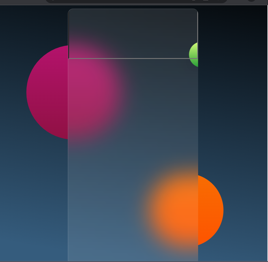
I am trying to create a design where a green circle appears in the background behind a red and an orange circle. I have attempted to use the z-index property in CSS to achieve this, but it does not seem to be working as expected.

2

Answers


  1. You have green ball i.e. .ball-1 inside .container which has overflow: hidden property, which is hiding the ball.

    To fix this, move <div class="ball-1"></div> outside of <div class="container">

    here is the jsfiddle.

    Login or Signup to reply.
  2. It may solve your problem.

    @import url('https://fonts.googleapis.com/css2?family=Quicksand:wght@300;400;500&display=swap');
    
    
    * {
      box-sizing: border-box;
      font-family: 'Quicksand', sans-serif;
    }
    
    body {
      display: flex;
      height: 100vh;
      justify-content: center;
      align-items: center;
      min-height: 100vh;
      background: linear-gradient(189.7deg,
          rgba(0, 0, 0, 1) -10.7%,
          rgba(53, 92, 125, 1) 90.8%);
    }
    
    body::before {
      content: "";
      position: absolute;
      top: 0;
      left: 0;
      height: 100%;
      width: 100%;
      justify-content: center;
      align-items: center;
      background: linear-gradient(#b91372 10%, #6b0f1a 90%);
      clip-path: circle(18% at 28% 34%);
    }
    
    body::after {
      content: "";
      position: absolute;
      background: linear-gradient(#ec9f05 10%, #ff4e00 100%);
      top: 0;
      left: 0;
      height: 100%;
      width: 100%;
      justify-content: center;
      align-items: center;
      clip-path: circle(14% at 70% 80%);
    }
    
    .container {
      position: relative;
      display: flex;
      justify-content: center;
      align-items: center;
      background-color: rgba(255, 255, 255, 0.1);
      border-radius: 12px;
      color: white;
      overflow: hidden;
      height: 100vh;
      backdrop-filter: blur(25px);
      border-top: 1px solid rgba(255, 255, 255, 0.2);
      border-left: 1px solid rgba(255, 255, 255, 0.2);
      z-index: 5;
    }
    
    .ball-1 {
      height: 60px;
      position: absolute;
      width: 60px;
      border-radius: 50%;
      background: linear-gradient(#d4fc79 0%, #259d35 100%);
      transform: translate(159px, -90px);
      box-shadow: -15px 17px 17px rgba(10, 10, 10, 0.025);
      backdrop-filter: blur(25px);
      z-index: -5;
    }
    
    .container .calculator {
      display: grid;
      justify-content: center;
      align-content: center;
      max-width: 100vw;
      grid-template-columns: repeat(4, 75px);
      grid-template-rows: minmax(120px, auto) repeat(5, 100px);
      background: transparent;
    }
    
    #value {
      grid-column: span 4;
      grid-row: span 4;
      height: 140px;
      width: 300px;
      text-align: right;
      outline: none;
      padding: 10px;
      font-size: 30px;
      background: transparent;
    }
    
    .calculator>button {
      font-size: 3.2rem;
      cursor: pointer;
      border: 1px solid rgba(255, 255, 255, 0.03);
      color: white;
      transition: 0.25s;
      outline: none;
    }
    
    
    .calculator>button:hover {
      transition: 0s;
      background: rgba(255, 255, 255, 0.06);
    }
    
    .calculator>button:active {
      background: rgba(0, 0, 0, 0.2);
    }
    <div class="ball-1"></div>
    <div class="container">
      <div class="ball-2"></div>
      <form class="calculator" name="calc">
        <div class="screen">
          <input type="text" name="txt" id="value" />
          <div class="previous-operand"></div>
          <div class="current-operand"></div>
        </div>
        <span class="num" onclick="document.calc.txt.value"></span>
      </form>
    </div>
    Login or Signup to reply.
Please signup or login to give your own answer.
Back To Top
Search