 Question posted in


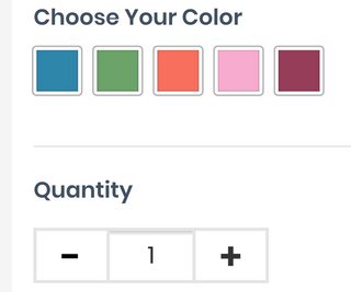
something strange is happening in my css.
I’m working on a custom view for the Quantity Box on a WooCommerce product page. It renders fine on Chrome Developer tools for both mobile/desktop but when I look on my actual phone I get a strange shadow near the top border above the quantity number.
This is my code
#smntcswcb{
        height:35px;
        width:60px;
        padding: 8px 18px 8px 18px !important;
        border:2px solid !important;
        border-radius: 0px !important;
        color:#333 !important;
        font-size: 15px !important;
        border-color: #e5e5e5 !important;
}
When I remove the border color line it goes away, but I would like to keep the gray border without the shadow. Please help.
Edit:
Here is the HTML code for the elements
<div class="quantity">
    <label class="screen-reader-text" for="smntcswcb">Quantity </label>
    <input class="minus" type="button" value="-">
    <input type="number" id="smntcswcb" step="1" min="1" name="quantity" value="1" title="Qty" class="input-text qty text" inputmode="numeric">
    <input class="plus" type="button" value="+">
</div>
Here is the CSS code for class=”minus”
.minus{
    background: none;
    text-align: center;
    width:48px !important;
    height:35px;
    padding: 2px 0px 0px 0px !important;
    background-color: #fff !important;
    border:2px solid transparent !important;
    border-radius: 0px !important;
    border-color: #e5e5e5 !important;
    color:#333 !important;
    margin-right: -4px;
    color:#000 !important;
    font-size: 24px !important;
    font-weight:900 !important;
    position: relative;
}
Here is the CSS code for the class “plus”
.plus{
    height:35px !important;
    width:48px !important;
    padding: 2px 0px 0px 0px !important;
    background-color: #fff !important;
    border:2px solid transparent !important;
    border-radius: 0px !important;
    border-color: #e5e5e5 !important;
    color:#333 !important;
    margin-left: -4px;
    font-size: 24px !important;
    font-weight:900 !important;
}
Here is the code for the parent class “quantity”. I am using flex to make the items on the same height
.single_variation_wrap .quantity{
    display: flex;
}
2
Answers
I found a solution. For anyone else who experiences this it seems that Iphone does not display shadows correctly.
The answer was found on this post
iPhone iOS will not display box-shadow properly
The fix was to add
It must be that your phone’s OS UI engine renders the component according to its standards and it ends up adding that shadow, try to force disable the shadow. See last 3 lines of the css selectors: