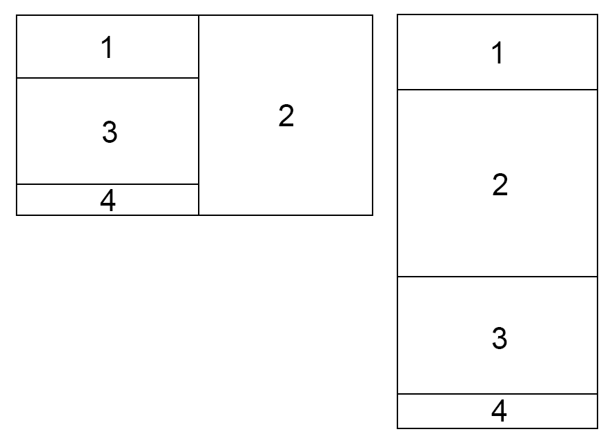
This is an example of the desktop version on the left and the mobile version on the right.
On desktop I want to put the div 2 on the right and separating the parent div into two sections, I have tried flexbox (shrink, grow, directions…) but I was unable to achieve this result.
Is it even possible to do?
Thank you!


2
Answers
You can achieve that by combining
flexandgridalongside tailwindbreakpoints. So on mobile devices is just flex column and on desktop is grid with 2 columns and 3 rows where second element spans across the three rows:Here’s a link to test: https://stackblitz.com/edit/react-epcw4d?file=src%2FApp.js,src%2Findex.js
Like this