skip to Main Content

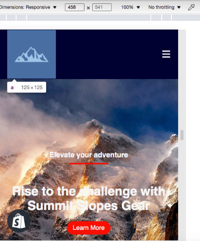
I want to center the logo when it meets the media screen size (See Photo Here):

My code is:

.logo img {
  padding: 15px;
  width: 125px;
}
<nav>
  <ul class='nav-bar'>
    <li class='logo'>
      <a href="#" style="float: left;"><img src="{{ section.settings.logo | img_url }}"></a>
    </li>
    <ul>
      <nav>

2

Answers


  1. To center the logo when the screen size meets the media query breakpoint, you can use CSS Flexbox. Here’s an example code:

        .logo {
      display: flex;
      justify-content: center;
      align-items: center;
    }
    
    .logo img {
      padding: 15px;
      width: 125px;
    }
    
    @media screen and (max-width: 750px) {
      .logo {
        justify-content: center;
      }
    }
    
    Login or Signup to reply.
  2. remove float from the anchor and then simply center the anchor by using text-align: center on the wrapping li (.logo):

    .logo img {
      padding: 15px;
      width: 125px;
    }
    
    .logo {
      text-align: center;
    }
    <nav>
      <ul class='nav-bar'>
        <li class='logo'>
          <a href="#"><img src="https://via.placeholder.com/125.jpg"></a>
        </li>
      </ul>
    </nav>
    Login or Signup to reply.
Please signup or login to give your own answer.
Back To Top
Search