skip to Main Content

large screen layout
This is what it looks like on a smaller screensize (576px)

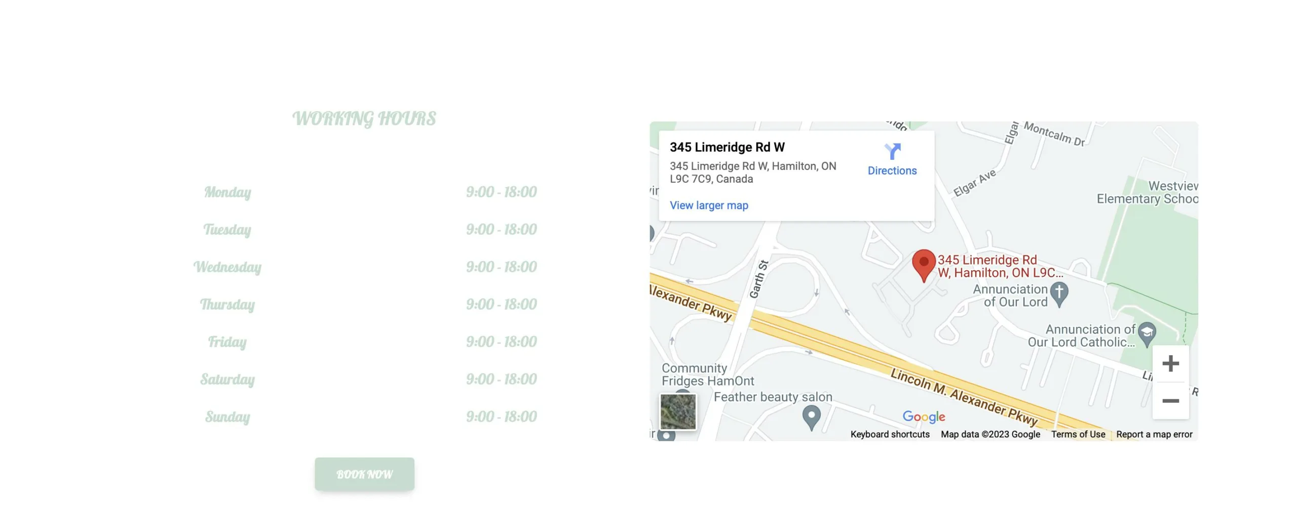
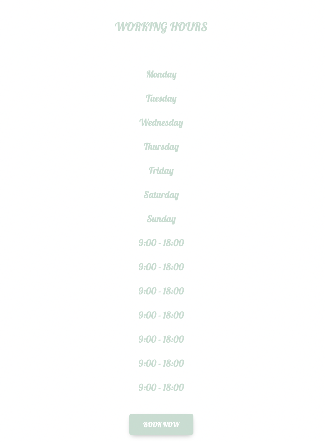
I am trying to make my code responsive so the layout on a smaller screen matches that of the larger screen where the times are side by side with the days.

Here is a snippet of my code:

<section class="maps-link">
      <div class="container-fluid">
        <div class="row align-items-center justify-content-center" > <!--justify-content-center-->
          <div class="col-md-5 text-center" id="operating-hours">
            <h5 class="text-uppercase py-5"> Working hours</h5>
            <div class="row">

              <div class="col-md-6">
                <p>Monday</p>
                <p>Tuesday</p>
                <p>Wednesday</p>
                <p>Thursday</p>
                <p>Friday</p>
                <p>Saturday</p>
                <p>Sunday</p>
              </div>
              <div class="col-md-6">
                <P>9:00 - 18:00</P>
                <P>9:00 - 18:00</P>
                <P>9:00 - 18:00</P>
                <P>9:00 - 18:00</P>
                <P>9:00 - 18:00</P>
                <P>9:00 - 18:00</P>
                <P>9:00 - 18:00</P>
              </div>
              <div class="operation-footer">
                <a href="#" class="btn float-center my-3">Book Now</a>
              </div>
            </div>
          </div>
          <div class="col-md-5">
            <iframe src="https://www.google.com/maps/embed?pb=!1m18!1m12!1m3!1d2907.301070286598!2d-79.90350282363299!3d43.22414697112562!2m3!1f0!2f0!3f0!3m2!1i1024!2i768!4f13.1!3m3!1m2!1s0x882c9ade812413cd%3A0xbfa94fb004dc6200!2s345%20Limeridge%20Rd%20W%2C%20Hamilton%2C%20ON%20L9C%207C9%2C%20Canada!5e0!3m2!1sen!2suk!4v1684233996645!5m2!1sen!2suk" width="600" height="450" style="border:0;" allowfullscreen="" loading="lazy" referrerpolicy="no-referrer-when-downgrade"></iframe>
          </div>
        </div>
      </div>
    </section>

2

Answers


  1. The HTML structure is a bit wrong, you want to logically match the text and structure as best as possible so you avoid these issues from the get-go and avoid having to fix them with the CSS.
    Since you want these to be rows it would be best to change it to something like:

    <div class="row">
      <div class="col-md-6">Monday</div>
      <div class="col-md-6">9:00 - 18:00</div>
    </div>
    <div class="row">
      <div class="col-md-6">Tuesday</div>
      <div class="col-md-6">9:00 - 18:00</div>
    </div>
    <div class="row">
      <div class="col-md-6">Wednesday</div>
      <div class="col-md-6">9:00 - 18:00</div>
    </div>
    <div class="row">
      <div class="col-md-6">Thursday</div>
      <div class="col-md-6">9:00 - 18:00</div>
    </div>
    <div class="row">
      <div class="col-md-6">Friday</div>
      <div class="col-md-6">9:00 - 18:00</div>
    </div>
    <div class="row">
      <div class="col-md-6">Saturday</div>
      <div class="col-md-6">9:00 - 18:00</div>
    </div>
    <div class="row">
      <div class="col-md-6">Sunday</div>
      <div class="col-md-6">9:00 - 18:00</div>
    </div>
    

    Bootstrap has nice documentation that you can check out with proper examples for columns (https://getbootstrap.com/docs/5.0/layout/columns/), and how to use the col and sizes with the breakpoints correctly.

    At the https://getbootstrap.com/docs/5.0/layout/breakpoints/ they have this size reference table which always helps when building responsive layouts:

    Breakpoint  Class infix Dimensions
    X-Small     None        <576px
    Small       sm          ≥576px
    Medium      md          ≥768px
    Large       lg          ≥992px
    Extra large xl          ≥1200px
    Extra extra large xxl   ≥1400px
    
    Login or Signup to reply.
  2. If you want days and working hours to be side by side, you need to change col-md-6 to col-6.

    Changing col-md-6 to col-6 makes the columns take up half the available width on all screen sizes instead of just medium-sized screens and larger. See the official Bootstrap documentation.

    See the snippet below.

    <!doctype html>
    <html lang="en">
    
    <head>
      <meta charset="utf-8">
      <meta name="viewport" content="width=device-width, initial-scale=1">
      <title>Bootstrap demo</title>
      <link href="https://cdn.jsdelivr.net/npm/[email protected]/dist/css/bootstrap.min.css" rel="stylesheet" integrity="sha384-rbsA2VBKQhggwzxH7pPCaAqO46MgnOM80zW1RWuH61DGLwZJEdK2Kadq2F9CUG65" crossorigin="anonymous">
    </head>
    
    <body>
      <section class="maps-link">
        <div class="container-fluid">
          <div class="row align-items-center justify-content-center">
            <div class="col-md-5 text-center" id="operating-hours">
              <h5 class="text-uppercase py-5"> Working hours</h5>
              <div class="row">
    
                <div class="col-6">
                  <p>Monday</p>
                  <p>Tuesday</p>
                  <p>Wednesday</p>
                  <p>Thursday</p>
                  <p>Friday</p>
                  <p>Saturday</p>
                  <p>Sunday</p>
                </div>
                <div class="col-6">
                  <P>9:00 - 18:00</P>
                  <P>9:00 - 18:00</P>
                  <P>9:00 - 18:00</P>
                  <P>9:00 - 18:00</P>
                  <P>9:00 - 18:00</P>
                  <P>9:00 - 18:00</P>
                  <P>9:00 - 18:00</P>
                </div>
                <div class="operation-footer">
                  <a href="#" class="btn float-center my-3">Book Now</a>
                </div>
              </div>
            </div>
            <div class="col-md-5">
              <iframe src="https://www.google.com/maps/embed?pb=!1m18!1m12!1m3!1d2907.301070286598!2d-79.90350282363299!3d43.22414697112562!2m3!1f0!2f0!3f0!3m2!1i1024!2i768!4f13.1!3m3!1m2!1s0x882c9ade812413cd%3A0xbfa94fb004dc6200!2s345%20Limeridge%20Rd%20W%2C%20Hamilton%2C%20ON%20L9C%207C9%2C%20Canada!5e0!3m2!1sen!2suk!4v1684233996645!5m2!1sen!2suk"
                width="600" height="450" style="border:0;" allowfullscreen="" loading="lazy" referrerpolicy="no-referrer-when-downgrade"></iframe>
            </div>
          </div>
        </div>
      </section>
    
      <script src="https://cdn.jsdelivr.net/npm/[email protected]/dist/js/bootstrap.bundle.min.js" integrity="sha384-kenU1KFdBIe4zVF0s0G1M5b4hcpxyD9F7jL+jjXkk+Q2h455rYXK/7HAuoJl+0I4" crossorigin="anonymous"></script>
    </body>
    
    </html>

    If you want the layout to be identical on desktop and mobile, change also col-md-5 to col-5.

    See the snippet below.

    <!doctype html>
    <html lang="en">
    
    <head>
      <meta charset="utf-8">
      <meta name="viewport" content="width=device-width, initial-scale=1">
      <title>Bootstrap demo</title>
      <link href="https://cdn.jsdelivr.net/npm/[email protected]/dist/css/bootstrap.min.css" rel="stylesheet" integrity="sha384-rbsA2VBKQhggwzxH7pPCaAqO46MgnOM80zW1RWuH61DGLwZJEdK2Kadq2F9CUG65" crossorigin="anonymous">
    </head>
    
    <body>
      <section class="maps-link">
        <div class="container-fluid">
          <div class="row align-items-center justify-content-center">
            <div class="col-5 text-center" id="operating-hours">
              <h5 class="text-uppercase py-5"> Working hours</h5>
              <div class="row">
    
                <div class="col-6">
                  <p>Monday</p>
                  <p>Tuesday</p>
                  <p>Wednesday</p>
                  <p>Thursday</p>
                  <p>Friday</p>
                  <p>Saturday</p>
                  <p>Sunday</p>
                </div>
                <div class="col-6">
                  <P>9:00 - 18:00</P>
                  <P>9:00 - 18:00</P>
                  <P>9:00 - 18:00</P>
                  <P>9:00 - 18:00</P>
                  <P>9:00 - 18:00</P>
                  <P>9:00 - 18:00</P>
                  <P>9:00 - 18:00</P>
                </div>
                <div class="operation-footer">
                  <a href="#" class="btn float-center my-3">Book Now</a>
                </div>
              </div>
            </div>
            <div class="col-5">
              <iframe src="https://www.google.com/maps/embed?pb=!1m18!1m12!1m3!1d2907.301070286598!2d-79.90350282363299!3d43.22414697112562!2m3!1f0!2f0!3f0!3m2!1i1024!2i768!4f13.1!3m3!1m2!1s0x882c9ade812413cd%3A0xbfa94fb004dc6200!2s345%20Limeridge%20Rd%20W%2C%20Hamilton%2C%20ON%20L9C%207C9%2C%20Canada!5e0!3m2!1sen!2suk!4v1684233996645!5m2!1sen!2suk"
                width="600" height="450" style="border:0;" allowfullscreen="" loading="lazy" referrerpolicy="no-referrer-when-downgrade"></iframe>
            </div>
          </div>
        </div>
      </section>
    
      <script src="https://cdn.jsdelivr.net/npm/[email protected]/dist/js/bootstrap.bundle.min.js" integrity="sha384-kenU1KFdBIe4zVF0s0G1M5b4hcpxyD9F7jL+jjXkk+Q2h455rYXK/7HAuoJl+0I4" crossorigin="anonymous"></script>
    </body>
    
    </html>
    Login or Signup to reply.
Please signup or login to give your own answer.
Back To Top
Search