


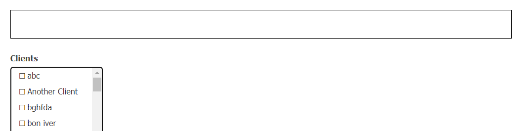
Part of my code is creating something that is similar to when you’re composing an email in gmail or outlook. There is a search bar, you can choose the people who should receive the email, then the chosen people get collected in the search bar. Here’s how it looks like when you haven’t selected any recipients yet:
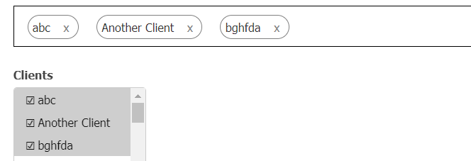
When you start selecting recipients, this is how it looks like (each of those recipients are stored in their own divs):
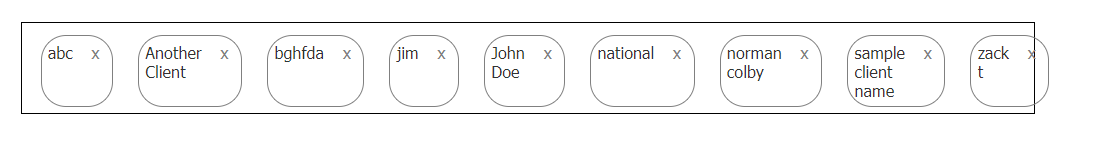
which looks fine. however at a certain point when i start selecting more recipients, things start getting crowded and cramped:

Ideally what I want to happen is for the main div to have a fixed width, and when the recipients start to crowd up, the next recipients should go on the next line, which means that the main div also gets bigger in height to accommodate the content. Something like how gmail does it:
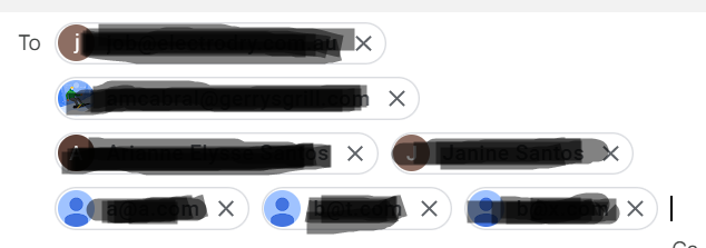
Notice how there could be just one person per row if their email is too long, or up to three if their emails are shorter.
2
Answers
You can use css flexbox wrap for this.
In this example, we have a container with five items inside. The container has a display: flex property to enable flexbox layout, and a flex-wrap: wrap property to wrap the items to a second row when there isn’t enough space.
Each item has a fixed width and height, and some margin and border for visualization purposes.
You can adjust the width, height, and margin of the items to fit your needs.
If you use CSS Flex, this is really simple, see below. I highly recommend this page for leaning more about Flexbox: https://css-tricks.com/snippets/css/a-guide-to-flexbox/