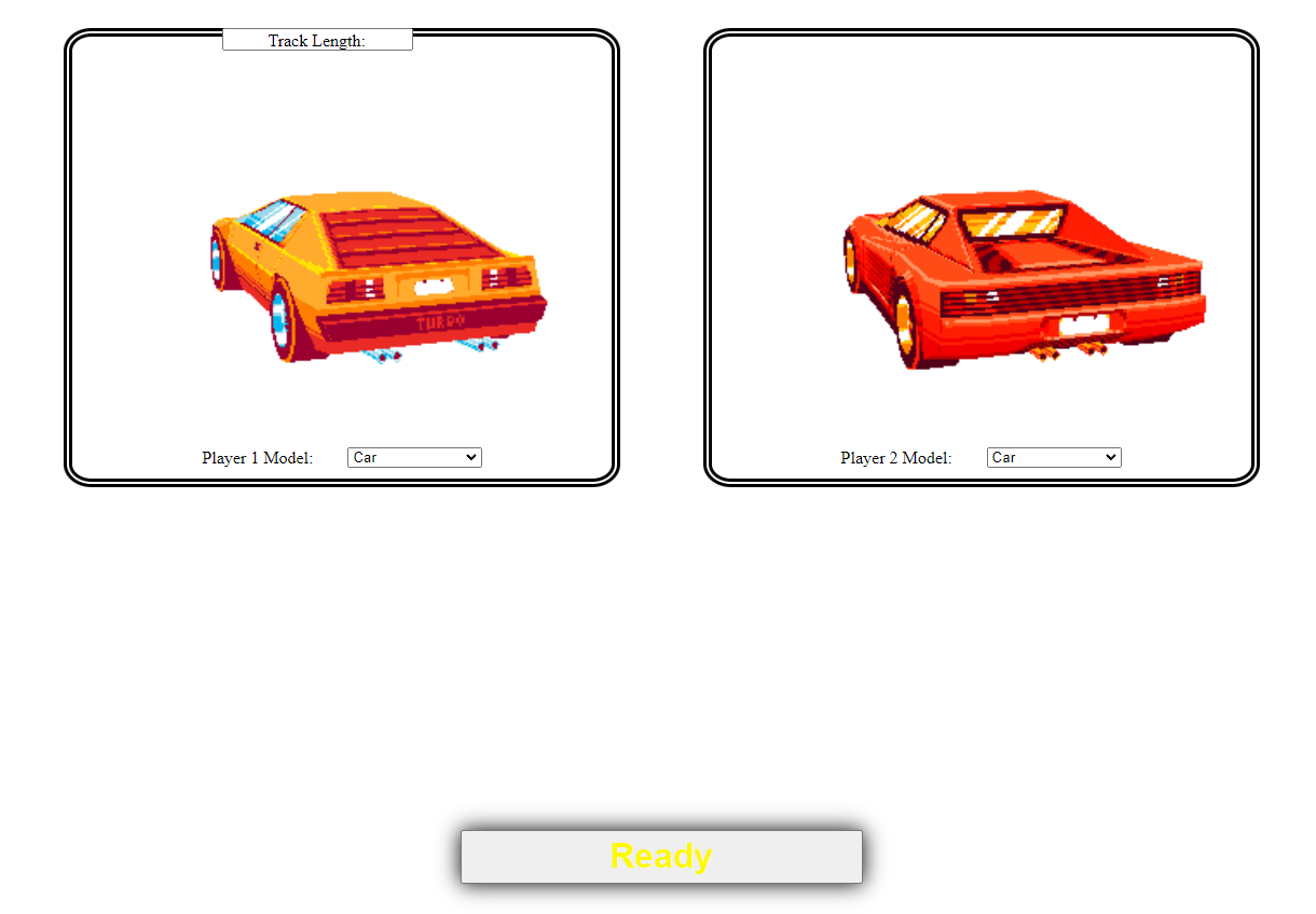
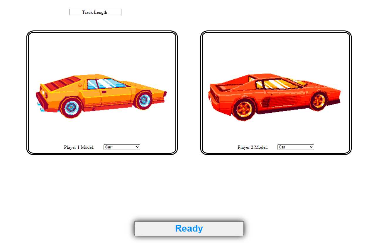
I have a div for each image and select box, the div itself is relatively positioned while the select/labels are absolute positioned inside of the div. When I create a new input, a number box and label, it either goes over the images or on a line before them. I know I could manually move the label and the input but I want it to be more natural.
CSS:
div.player1Select, div.player2Select {
    display: inline-flex;
    position: relative;
    justify-content: center;
    width: 400px;
    height: 400px;
    padding-left: 50px;
    padding-right: 50px;
    padding-bottom: 10px;
    border-style: double;
    border-color: black;
    border-width: 8px;
    border-radius: 5%;
}

#player1Img, #player2Img {
    height: 400px;
    width: auto;
}

#readyButton {
    animation: color-change 2.5s infinite;
    font-size: 200%;
    font-weight: bolder;
    box-shadow: 0 0 20px 0 black;
    display: inline-block;
    position: absolute;
    left: 40%;
    right: 40%;
    bottom: 5%;
    height: 50px;
}

.player2Select { float: right; right: 20%;}

.player1Select { float: left; left: 20%;}

label { position: absolute; white-space: nowrap; align-self: flex-end; left: 24%; clear: both; }

#player1Model, #player2Model {
    position: absolute;
    align-self: flex-end;
    width: 25%;
    right: 24%;
}

.trackLength {
    float: left;
    display: inline-flex;
    position: sticky;
}
HTML:
<form>
    <div class="player1Select">
        <img src="carselect1.gif" id="player1Img" alt="car">
        <label for="player1Model">Player 1 Model: </label>
        <select id="player1Model">
            <option value="car">Car</option>
            <option value="horse">Horse</option>
            <option value="rocket">Rocket</option>
        </select>
    </div>

    <div class="player2Select">
        <img src="carselect2.gif"id="player2Img" alt="car">
        <label for="player2Model">Player 2 Model: </label>
        <select id="player2Model">
            <option value="car">Car</option>
            <option value="horse">Horse</option>
            <option value="rocket">Rocket</option>
        </select>
    </div>

    <div class="trackLength">
        <label for="trackInput">Track Length: </label>
        <input type="number" id="trackInput">
    </div>

    <input type="submit" value="Ready" id="readyButton" name="readyButton">
</form>
Original Issue:
Example 2:
Additionally, the label does not respect the input number box. If I use a div to position them, the label will go over the number box, as seen in the image. The only way I was able to fix this, as I did in the select lists, was after them overlapping in the center I manually moved the label and select box away from each other with absolute positioning, but it doesn’t feel natural. Is there any other way to do this? Thanks!


2
Answers
Putting the inputs and labels into a shared parent class
attributesunder the "master class"wrapper, who's height isautoand able to expand, I made theattributesclass position itself at the bottom usingabsolutepositioning.Inline-Flexallows the contents of theattributesclass to be on the same line.Link to the resulting image: https://imgur.com/a/HOrCqij
HTML:
CSS:
You can try this code:
CSS: