


I’m trying to create a landing page with a background image and a white rectangle with a "window".
I can’t get the css right. In figma, Im using the "window" rectangle as a mask on the white rectangle to show the page background, however I don’t know, how/if that same masking technique works in html css (I imagine it needs to be more hacky, like line up the background image and window background image so it looks like its transparent?).
I’ve tried a few things implementations with little success.
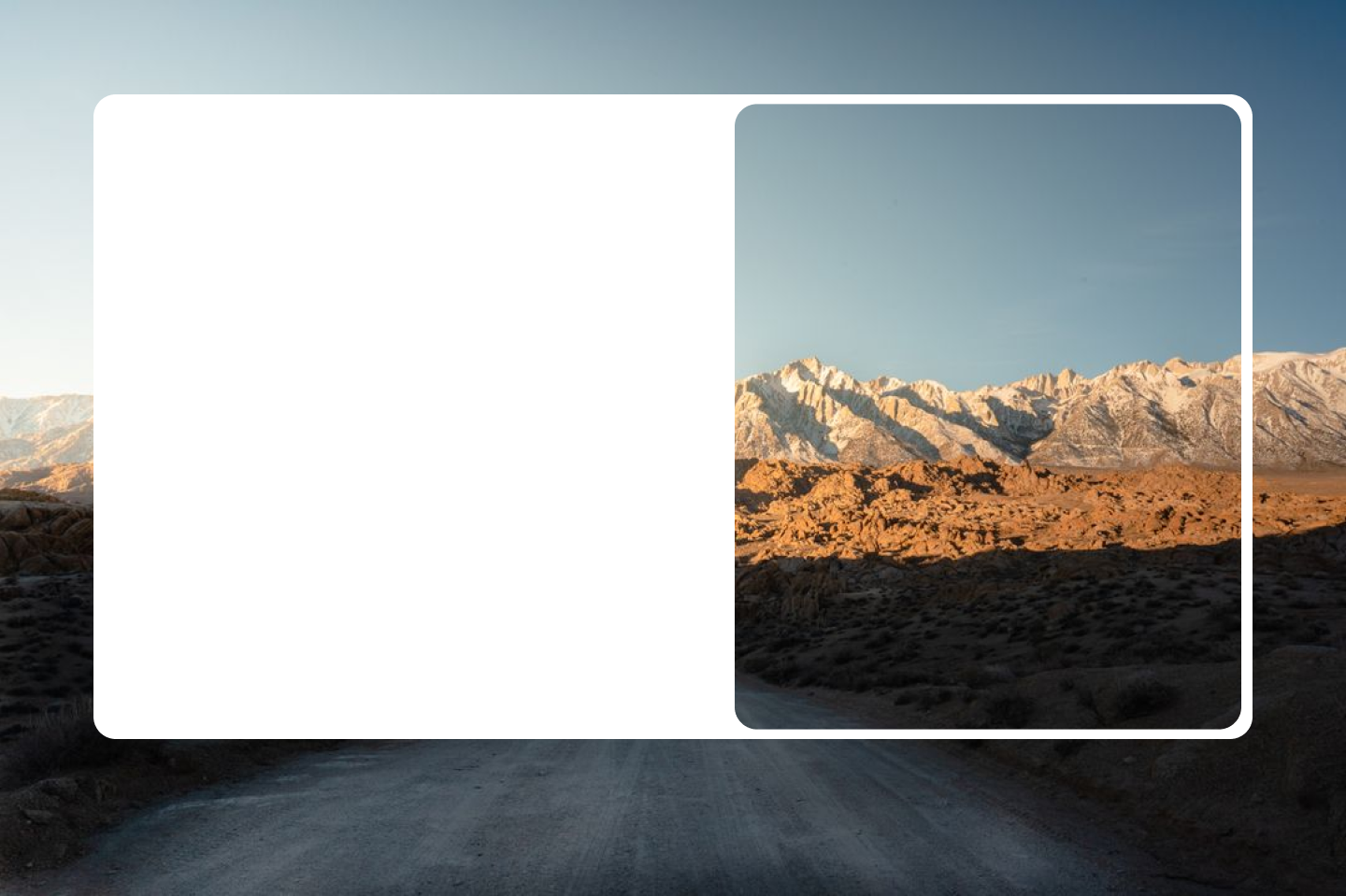
Right now it looks like:
which is close, but you’ll see the image in the "window" is ceneterd, and I’d like it to line up with the page background.
The page needs to be responsive, and the image should maintain its aspect ratio.
.backgroundImage {
  background-image: url('../../public/alabama-hills.jpg');
  background-size: cover;
  background-position: center;
  background-repeat: no-repeat;
  background-attachment: fixed;
  position: absolute;
  top: 0;
  left: 0;
  width: 100%;
  height: 100%;
}


/* Create the white rectangle */

.whiteRectangle {
  position: absolute;
  border-radius: $border-radius;
  top: 50%;
  left: 50%;
  transform: translate(-50%, -50%);
  background-color: white;
  width: 80%;
  height: 80%;
  display: flex;
  align-items: center;
  padding: 1rem;
  justify-content: space-between;
}


/* Create the nested rectangle acting as a mask */

.mask {
  position: relative;
  width: 50%;
  height: 100%;
  border-radius: $border-radius;
  overflow: hidden;
}


/* Position the pseudo-element to match the background image */

.mask::before {
  content: "";
  background-image: url('../../public/alabama-hills.jpg');
  background-size: cover;
  background-position: center;
  background-repeat: no-repeat;
  background-attachment: fixed;
  position: absolute;
  top: 0%;
  right: 0%;
  width: 100%;
  height: 100%;
}
<div className={styles.backgroundImage}></div>
<div className={styles.whiteRectangle}>
<div />
<div className={styles.mask}></div>
</div>
3
Answers
A rounded box and some
box-shadowcan do it:Or with some pseudo elements if you want better control of the width of the window
I think this work better with flex as you can have content one side and photo other side anything possible if you want to use media query that also easy with flex. You can try with grid also.
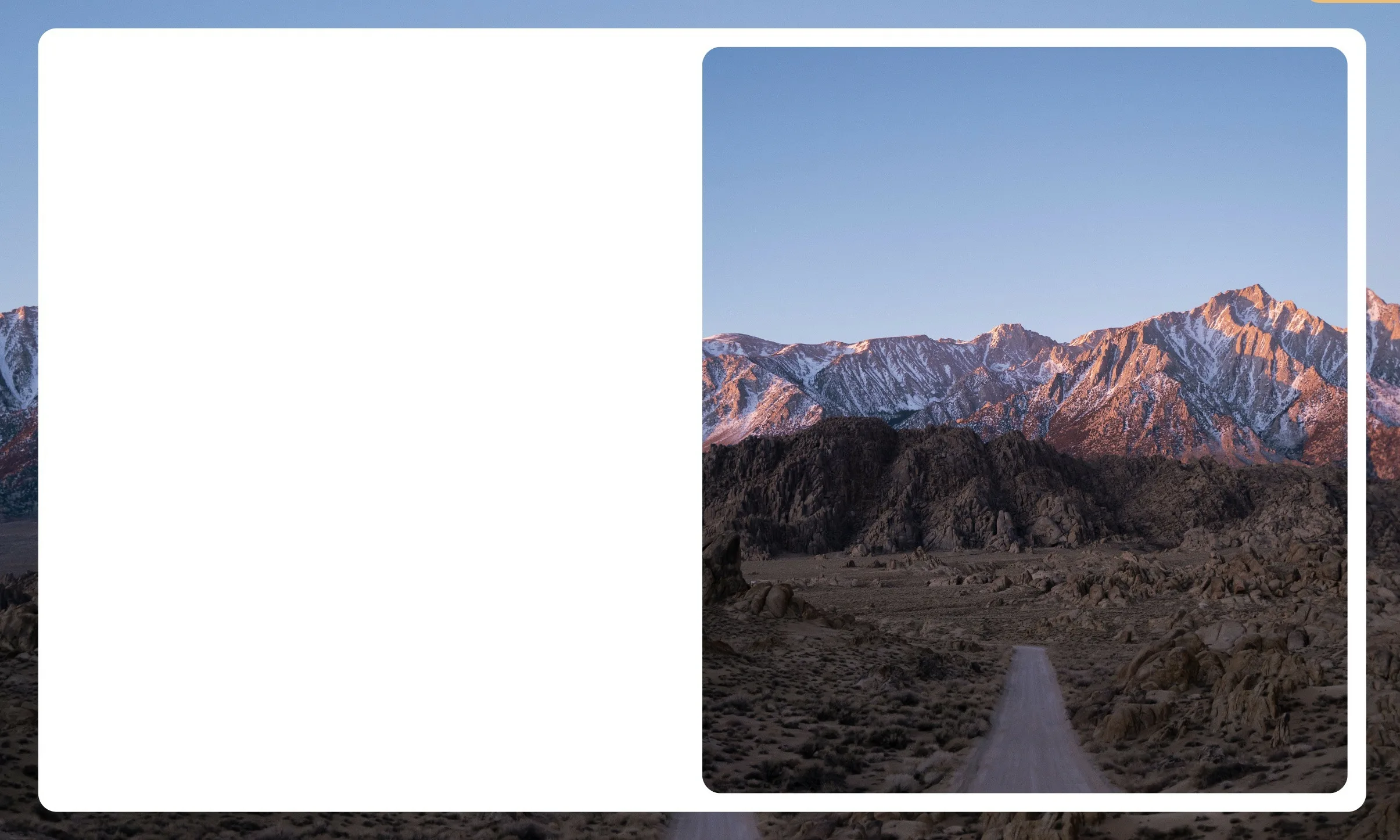
I made this codepen to solve the issue: https://codepen.io/JW-Based/pen/bGmojNo
so you have the wrapper ‘backer’ that has the background image applied to it. the div with class ‘hero’ will be the parent div that will hold your opaque ‘hero_left’ and transparent ‘hero_right’ divs.’hero’ itself will have a transparent background applied to it while ‘hero_left’ will have a background color ‘white’ assigned to it. ‘hero_right’ will have the child ‘hero_right_window’ within it. this is structured so that we can have the border radii balanced between the parent and children.
you can see that we have opposing border radii set here and
here we set an outline to not add more height to the child div, ‘hero_right_window’ and set the radii accordingly. you may have to tweak the outline thickness to avoid a clear ‘deadzone’ between the outline and the parent div.
Anyway, small amount of added css here to achieve what you wanted. let me know if you need an update.