


I’m adding a toolbar to an application with multiple levels of flex elements.
 <div class="toolbar">
   <div class="button">Button1</div>
   <div class="button">Button2</div>
   <div class="button">Button3</div>
   ...
 </div>
It’s gonna take up the whole width of the parent and use horizontal scrolling on overflow.
.toolbar {
  display: flex;
  flex-direction: row;
  overflow: scroll;
  width: 100%;
}
This works swimmingly in an empty document. However, because the application itself uses display: flex, toolbar’s width: 100% becomes the width of the whole document, not the width of its immediate parent. width: 100% affects the outside flex layout! But having a fixed width, e.g. width: 300px works perfectly fine.
A demo: https://jsfiddle.net/6s23o7Lf/
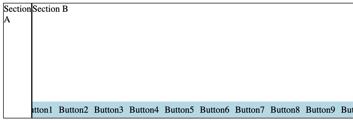
Basically, I’m trying to get this:
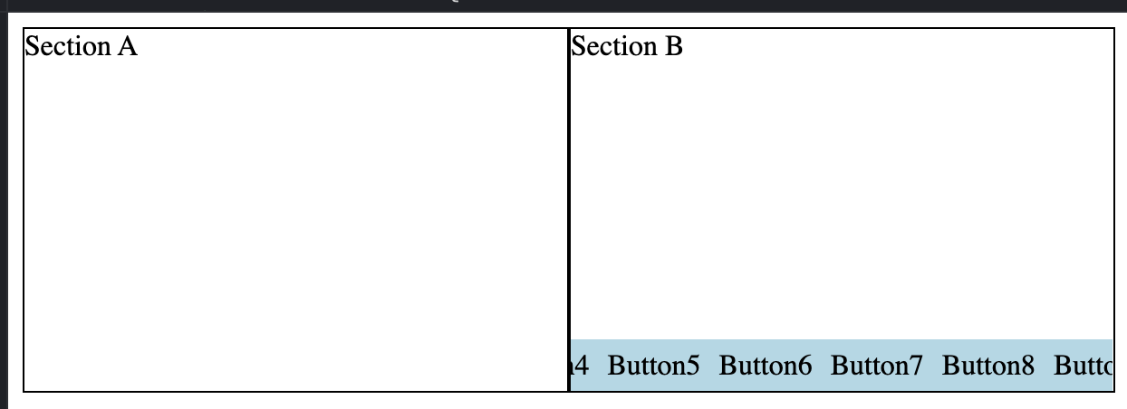
But get this instead:
Is there a way to say that a flex item should take up all of the parent’s width (all of its space along the secondary axis) without affecting its layout? Like align-items: stretch, but also cut off contents on overflow.
I tried making toolbar not a flex element (using display: block on it and display: inline-block on the buttons, with white-space: nowrap and all that jazz), but the width still comes from up the DOM tree.
For context, my end goal is similar to what you see at the bottom of an Excel document (left/right arrows are used for scrolling there):

3
Answers
as you are in your own text "secondary axis".
flex is more 1 axis, grid is 2 axis
try that:
the repeat 14 is based on button number you have.
it could be done other ways.
the css of section has "width: 100%", your sectionA and section B all have the section class. The sectionA’s parent is div of class everything, the sectionB’s parent also is div of class everything. It is same to "width: auto".
If you want get right, you can replace the css section class of this:
There’s a quick fix for this. Add
min-width: 50%;to.section:This will prevent either section from shrinking to less than half the width but allow them to grow to fill the full width.
NOTE: This is a simple fix that may not work if there are more sections!
UPDATE:
For more columns don’t use the min-width property as shown above.
You should instead add
overflow: hidden;to.sectionto prevent their children from forcing the width to increase.