


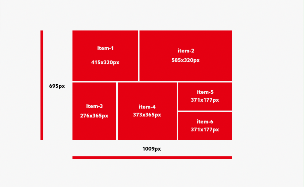
I’m trying to achieve the effect shown in the attached image, where each grid cell will have the appropriate width and height in pixels and will be exactly the same size and layout, where the whole grid is 1009px wide and 695px high. Each cell will contain an image and text.
I’ve tried to achieve this based on documentation (https://css-tricks.com/), YouTube tutorials, and with the help of CSS grid generators, but the biggest problem I’m facing is that item4 is in a somewhat irregular layout and overlapping item1.
I would appreciate any help or guidance.
P.S: I usually work more with flexbox, my knowledge of grid is much weaker when it comes to complex layouts, but unfortunately in this case I have to use grid to arrange everything.
MY CODE:
.grid-container {
    display: grid;
    grid-template-columns: 276px 139px repeat(3, 195px);
    grid-template-rows: 320px repeat(2, 177px);
    grid-column-gap: 10px;
    grid-row-gap: 10px;

    width: 1009px;
    height: 695px;
}

.item-1 {
    grid-area: 1 / 1 / 2 / 3;
}

.item-2 {
    grid-area: 1 / 3 / 2 / 6;
}

.item-3 {
    grid-area: 2 / 1 / 4 / 2;
}

.item-4 {
    grid-area: 2 / 2 / 4 / 4;
}

.item-5 {
    grid-area: 2 / 4 / 3 / 6;
    text-align: right;
}

.item-6 {
    grid-area: 3 / 4 / 4 / 6;
    text-align: right;
}

.item-1 img {
    width: 415px;
    height: 320px;
}

.item-2 img {
    width: 585px;
    height: 320px;
}

.item-3 img {
    width: 276px;
    height: 365px;
}

.item-4 img {
    width: 373px;
    height: 365px;
}

.item-5 img {
    width: 371px;
    height: 177px;
}

.item-6 img {
    width: 371px;
    height: 177px;
}
<div class="grid-container">
<div class="item-1">
<img src="https://nissangtr35.pl/item-1.jpg" alt="">
</div>
<div class="item-2">
<img src="https://nissangtr35.pl/item-2.jpg" alt="">
</div>
<div class="item-3">
<img src="https://nissangtr35.pl/item-3.jpg" alt="">
</div>
<div class="item-4">
<img src="https://nissangtr35.pl/item-4.jpg" alt="">
</div>
<div class="item-5">
<img src="https://nissangtr35.pl/item-5.jpg" alt="">
</div>
<div class="item-6">
<img src="https://nissangtr35.pl/item-6.jpg" alt="">
</div>
</div>
2
Answers
The layout itself appears to be correctly built, the issue may be in the images themselves. Since images are not provided, it may be hard to debug at this point. Maybe you could try to limit each item’s image width and height accordingly?
Example:
It can be easier to implement this layout without using grid.