 Question posted in


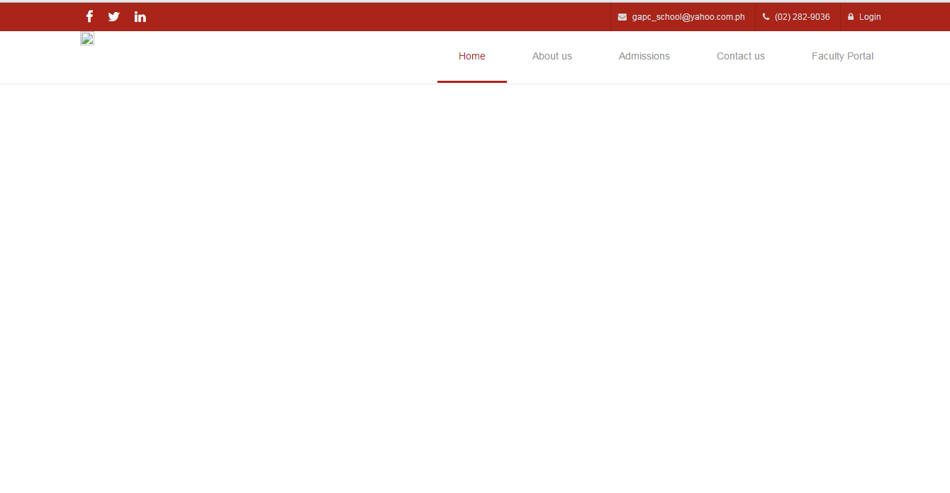
I want my nav bar to look like this site.
http://bootstraplovers.com/templates/assan-v2.3/main-template/index.html
When I’m scrolling, the nav bar of that template becomes transparent and becomes fixed to the top. I want my nav bar to do the same. I’m new to HTML and CSS and also to bootstrap. Can someone give me ideas how to do it or any clues?
This is my nav bar:
.navbar-header{
	  height: 74px;
	}

	.navbar-toggle{
	  position: relative;
	  top: 15px;
	}
	.navbar-default .navbar-nav > li > a {
	 font-weight: 590;
	 color: #949494;
	 display: block;
	 padding: 5px 35px 2px 45px;
	 border-bottom: 3px solid transparent;
	 line-height: 70px;
	 text-decoration: none;
	 transition: border-bottom-color 0.5s ease-in-out;
	 -webkit-transition: border-bottom-color 0.5s ease-in-out;
	 }
	 .nav.navbar-nav > li > a:hover, .nav.navbar-nav > li.active a{
		color:#a92419;
		border-bottom-color: #a92419;
	  }
	  .navbar-default .navbar-nav>.active>a, .navbar-default .navbar-nav>.active>a:focus, .navbar-default .navbar-nav>.active>a:hover {
		color: #a92419;
		background-color: white;
	}
	 .navbar-default{
	 background-color:#fff;
	 margin: 0;

	 }
	 .nav>li>a {
	 position: relative;
	 }
	.navbar-default .navbar-right > li > a {
	padding: 0 30px;
	margin-right:6px;
	 }
	 .nav.navbar-nav > li{
	 display: :inline-block;
	 }
	 .nav.navbar-nav{
	 list-style-type:none;
	 }
	 .nav.navbar-nav > li > a:hover{
		color:#a92419;
	   border-bottom-color: #a92419;
	  }
	  .navbar-default .navbar-toggle .icon-bar {
	  background-color:#a92419;
	  margin:0 0 4px;
	  width: 25px;
	  height: 5px;
	  margin-right: 13px;
	  }
	  .navbar-default .navbar-toggle:focus, .navbar-default .navbar-toggle:hover{
	  background: none;
	  }
	  button.navbar-toggle{
	  background:none;
	  border:none;
	  color:#000;
	  margin: 0px;
	}
	.dropdown:hover .dropdown-menu {
	  display: block;
	}

	.dropdown-menu>li>a:hover {
		color:#a92419;
	}
	.dropdown-menu>li>a {
		display: block;
		padding: 3px 20px;
		clear: both;
		font-weight: 400;
		line-height: 3em;
		color: #333;
		white-space: nowrap;
	}
	.dropdown:hover a.dropdown-toggle {
	  border-bottom-color: #a92419;
	  color:#a92419;
	}
	.top-bar-dark {
	  background-color: #a92419;
	}

	.top-bar-light {
	  background-color: #f3f3f3;
	}
	.top-bar-light .top-dark-right li {
	  border-color: #ddd;
	}

	.top-bar-light .top-dark-right li a:hover {
	  color: #32c5d2;
	}
	.top-bar-socials {
	  line-height: 30px;
	  padding-top: 5px;
	}
	.top-bar-socials:after {
	  display: table;
	  clear: both;
	  content: "";
	}
	.top-bar-socials a {
	  margin: 0px 8px;
	  text-decoration: none;
	  font-size:18px;
	  color: #fff;
	}

	.top-dark-right {
	  margin: 0px;
	  padding: 0px;
	}

	.top-dark-right li {
	  line-height: 40px;
	  border-left: 1px solid #932015;
	  padding: 0px 10px;

	}

	.top-dark-right li, .top-dark-right li a {
	  color: #d7d7d7;
	  font-size: 12px;
	}

	.top-dark-right li i {
	  margin-right: 5px;
	}

	.top-dark-right li a:hover {
	  color: #fff;
	}
	a.login{
	  text-decoration: none;
	}
	.fa-facebook:hover{
	  color:#3b5998;
	}
	.fa-twitter:hover{
	  color:#1dcaff;
	}
	.fa-linkedin:hover{
	  color:#007bb5;
	}
<link href="https://opensource.keycdn.com/fontawesome/4.6.3/font-awesome.min.css" rel="stylesheet"/>
<script src="https://ajax.googleapis.com/ajax/libs/jquery/1.11.1/jquery.min.js"></script>
<link href="https://maxcdn.bootstrapcdn.com/bootstrap/3.3.6/css/bootstrap.min.css" rel="stylesheet"/>
<div class="top-bar-dark">
<div class="container">
<div class="row">
<div class="col-sm-4 col-xs-7">
<div class="top-bar-socials">
<a href="https://www.facebook.com/pages/Governor-Andres-Pascual-CollegeNavotas-City/344134628983014?fref=ts">
<i class="fa fa-facebook"></i>
</a>
<a href="https://twitter.com/official_gapc">
<i class="fa fa-twitter"></i>
</a>
<a href="https://www.linkedin.com/company/governor-andres-pascual-college-in-navotas-city">
<i class="fa fa-linkedin"></i>
</a>
</div>
</div>
<div class="col-sm-8 col-xs-5 text-right">
<ul class="list-inline top-dark-right">
<li class="hidden-sm hidden-xs"><i class="fa fa-envelope"></i> [email protected]</li>
<li class="hidden-sm hidden-xs"><i class="fa fa-phone"></i> (02) 282-9036</li>
<li><a href="#" class="login"><i class="fa fa-lock"></i> Login</a>
</li>
</ul>
</div>
</div>
</div>
</div>
<nav class="navbar navbar-default navbar-static-top">
<div class="container">
<div class="navbar-header">
<button type="button" class="navbar-toggle" data-toggle="collapse" data-target="#nav-collapse">
<span class="icon-bar"></span>
<span class="icon-bar"></span>
<span class="icon-bar"></span>
</button>
<img class="img-responsive" src="images/brandz.png">
</div>
<div class="collapse navbar-collapse" id="nav-collapse">
<ul class="nav navbar-nav navbar-right">
<li class="active"><a href="#">Home</a>
</li>
<li class="dropdown">
<a href="#" class="dropdown-toggle" data-toggle="dropdown" role="button" aria-haspopup="true" aria-expanded="false">About us</a>
<ul class="dropdown-menu">
<li><a href="#">History</a>
</li>
<li><a href="#">Mission and Vision</a>
</li>
</ul>
<li><a href="#">Admissions</a>
</li>
<li><a href="#">Contact us</a>
</li>
<li><a href="#">Faculty Portal</a>
</li>
</ul>
</div>
</div>
</nav>
3
Answers
Here you go, just set the ‘XXXXX’ data with your values.
$navDiv is the jQuery Object of the navigation container div, e.g. $(‘#nav’), ‘YOUR_TOP_OFFSET’ is the offset of your pinned navbar, so in your case ‘0’.
‘YOU_TOP_VAL’ is the value in pixels to scroll, thatnavbar should be fix, so in your case the height of the div above the navbar, you can do it automatically of course with $(‘.top-bar-socials’).height(), or with the original offset of the “navDiv”.
With CSS:
Here is some idea. If only Chrome and Firefox will be fine for you.
HTML:
CSS:
You can do that using bootstrap’s inbuild tool
affixby addingdata-spyto your navbar like this:And add this to your CSS:
P.S. Replace
150with height of thetop-bar-blackdiv.