skip to Main Content

I’m using React-Bootstrap in my React app. It is causing margin on the left and right side. I’m using the following code:

import React, { Component } from "react";
import "react-bootstrap/dist/react-bootstrap.min.js";
import "bootstrap/dist/css/bootstrap.min.css";
import { Grid, Row, Col } from "react-bootstrap";
import MuiThemeProvider from "material-ui/styles/MuiThemeProvider";
import AppBar from "material-ui/AppBar";

<Grid fluid>
   <Row>
      <Col xs={12} md={12}>
        <AppBar title="Title"
         iconClassNameRight="muidocs-icon-navigation-expand-more"/>
       </Col>
   </Row>
   <Row>
       <Col xs={4} md={4}>
          <h1>Hello</h1>
       </Col>
       <Col xs={8} md={8} >
          <h1>Hello World!</h1>
       </Col>
   </Row>
</Grid>

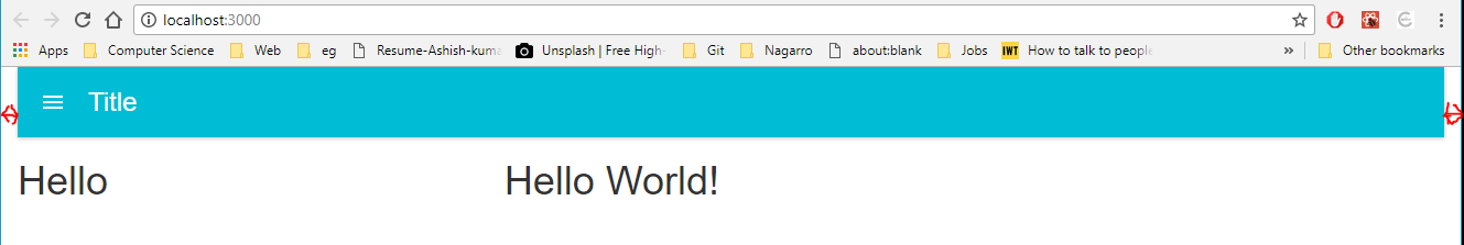
I’m getting the following output:
enter image description here

If I remove xs and md from <Col> then the issue gets fixed.

Importing twitter-bootstrap is causing this issue. If I remove the twitter-bootstrap import then the bootstrap styling doesn’t work.

This issue is same as Twitter-Bootstrap’s issue, but I’m not able to fix it in React-Bootstrap.

7

Answers


  1. EDIT: I changed the row to grid. if that fails, then you need to post more code. is there any other div containers the navbar is inside?

    there is a few ways to do this:

    grid
    {
    margin: 0;
    }
    

    another way is:

    grid
    {
    padding-right: 0px;
    padding-left: 0px;
    }
    
    Login or Signup to reply.
  2. I tested your code with a clean react app. The previous suggestions were wrong. You need to set Grid components padding-left and padding-right to 0.

    UPDATE: Just setting Grid is not enough. Also need to set margins to 0 of Row and paddings to 0 of Col.

    You can achieve this by 3 ways.

    1. Way: Add inline style for Grid, Row and Col

    <Grid fluid style={{ paddingLeft: 0, paddingRight: 0 }}>
        <Row style={{ margin-left: 0, margin-right: 0 }}>
            <Col style={{ padding-left: 0, padding-right: 0 }}>
                ...
            </Col>
        </Row>
    </Grid>
    

    OR

    const styles = {
        grid: {
            paddingLeft: 0,
            paddingRight: 0
        },
        row: {
            marginLeft: 0,
            marginRight: 0
        },
        col: {
            paddingLeft: 0,
            paddingRight: 0
        }
    };
    <Grid fluid style={styles.grid}>
        <Row style={styles.row}>
            <Col style={styles.col}>
                ...
            </Col>
        </Row>
    </Grid>
    

    2. WAY: Add a custom class name

    //App.css
    div.noPadding {
        padding-left: 0;
        padding-right: 0;
    }
    
    div.noMargin {
        margin-left: 0;
        margin-right: 0;
    }
    
    //App.js
    import '/path/to/your/App.css';
    
    render() {
        return (
            <Grid fluid className="noPadding">
                <Row className="noMargin">
                    <Col className="noPadding">
                        ...
                    </Col>
                </Row>
            </Grid>
        )
    }
    

    3. WAY You can globally change Grid, Row and Col components behaviour by overriding components className

    //App.css
    
    div.container-fluid {
        padding-left: 0;
        padding-right: 0;
    }
    
    div.row {
        margin-right: 0px;
        margin-left: 0px
    }
    
    div.col-lg-1,div.col-lg-10,div.col-lg-11,div.col-lg-12,div.col-lg-2,div.col-lg-3,div.col-lg-4,div.col-lg-5,div.col-lg-6,div.col-lg-7,div.col-lg-8,div.col-lg-9,
    div.col-md-1,div.col-md-10,div.col-md-11,div.col-md-12,div.col-md-2,div.col-md-3,div.col-md-4,div.col-md-5,div.col-md-6,div.col-md-7,div.col-md-8,div.col-md-9,
    div.col-sm-1,div.col-sm-10,div.col-sm-11,div.col-sm-12,div.col-sm-2,div.col-sm-3,div.col-sm-4,div.col-sm-5,div.col-sm-6,div.col-sm-7,div.col-sm-8,div.col-sm-9,
    div.col-xs-1,div.col-xs-10,div.col-xs-11,div.col-xs-12,div.col-xs-2,div.col-xs-3,div.col-xs-4,div.col-xs-5,div.col-xs-6,div.col-xs-7,div.col-xs-8,div.col-xs-9 {
        padding-left: 0;
        padding-right: 0;
    }
    
    Login or Signup to reply.
  3. The answer above is overkill. This really isn’t that complicated. According to the official React Bootstrap documentation on Grid the fluid property can be applied. Here’s the description for fluid:

    Turn any fixed-width grid layout into a full-width layout by this property.
    Adds container-fluid class.

    Here’s what I did and it works perfectly:

    <Grid fluid={true}>
    
    Login or Signup to reply.
  4. Really late to the party here; I just wanted to add that in Bootstrap 4, I was able to remove the column margins by adding fluid="true" to the Container and noGutters to the Row, e.g.

    <Grid fluid="true">
      <Row noGutters>
        <Col>
          {/* ... <contents> ... */}
        </Col>
      </Row>
    </Grid>
    

    Adding fluid only does not seem to be enough. Sample code is untested.

    Login or Signup to reply.
  5. The most correct answer that worked for me is

    <Container fluid style={{paddingLeft: '0px', paddingRight: '0px'}}>
    <Row noGutters>
    <COl>
    //Whatever your content
    </COl>
    </Row>
    </Container>
    
    Login or Signup to reply.
  6. I used react-bootstrap with next.js. I came up with short solution:

    <Container fluid className="p-0">
        ...
    </Container>
    

    Comment. bootstrap’s css was imported in my _App.js

    import 'bootstrap/dist/css/bootstrap.min.css';
    
    Login or Signup to reply.
  7. 2021

    I faced the same issue with react bootstrap the way I solved it is by nullifying gutters. Bootstrap 5 classes work perfectly in such cases.

       <Container fluid className='gx-0'>
        <Row className='gx-0'>
          <Col>
            <div>Content</div>
          </Col>
        </Row>
       </Container>
    

    Note that you also need to add gx-0 not only to the parent Container, but also to the child Row, otherwise it won’t work.

    Login or Signup to reply.
Please signup or login to give your own answer.
Back To Top
Search