 Question posted in


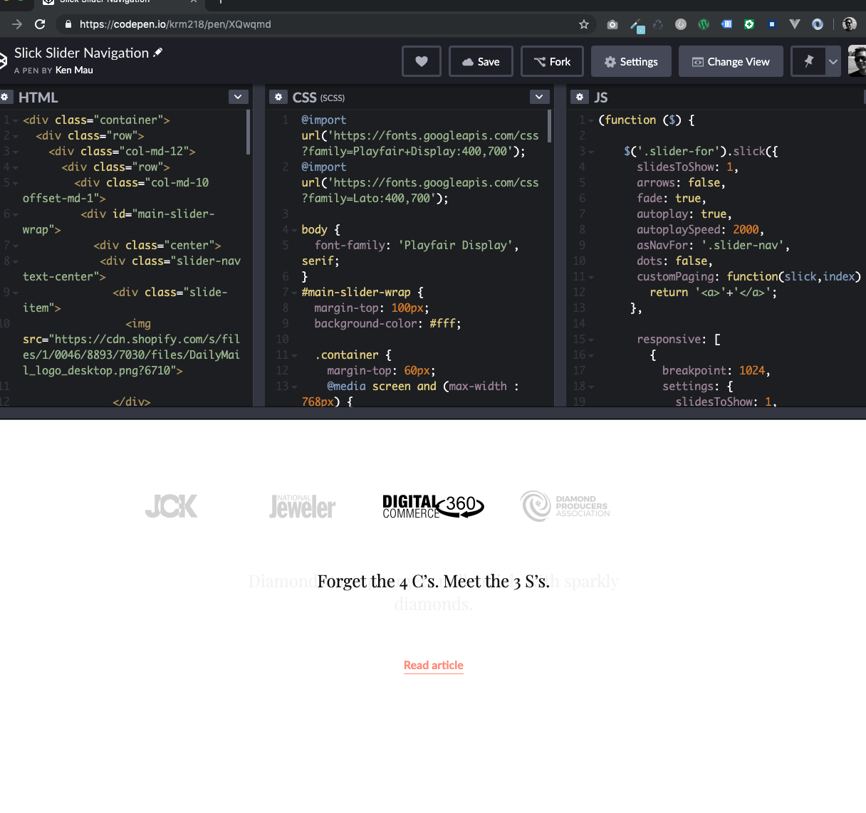
I’ve built a slick slider with custom navigation.
(function ($) {

    $('.slider-for').slick({
      slidesToShow: 1,
      arrows: false,
      fade: true,
      autoplay: true,
      autoplaySpeed: 2000,
      asNavFor: '.slider-nav',
      dots: false,
      customPaging: function(slick,index) {
        return '<a>'+'</a>';
     },

      responsive: [
        {
          breakpoint: 1024,
          settings: {
            slidesToShow: 1,
            slidesToScroll: 1,
            arrows: false,
            dots: true,
          }
        }

        // You can unslick at a given breakpoint now by adding:
        // settings: "unslick"
        // instead of a settings object
      ]

    });
    $('.slider-nav').slick({
      infinite: true,
      slidesToShow: 5,
      asNavFor: '.slider-for',
      focusOnSelect: true,
      dots: false,
      customPaging: function(slick,index) {
        return '<a>' + (index + 1) + '</a>';
     },

      responsive: [
        {
          breakpoint: 1024,
          settings: {
            slidesToShow: 1,
            slidesToScroll: 1,
            centerMode: false,
            arrows: false,
            dots: false,
          }
        }

        // You can unslick at a given breakpoint now by adding:
        // settings: "unslick"
        // instead of a settings object
      ]


    });


  })(jQuery);
@import url("https://fonts.googleapis.com/css?family=Playfair+Display:400,700");
@import url("https://fonts.googleapis.com/css?family=Lato:400,700");
body {
font-family: 'Playfair Display', serif;
}
#main-slider-wrap {
margin-top: 100px;
background-color: #fff;
margin-bottom: 150px;
}
#main-slider-wrap .container {
margin-top: 60px;
}
@media screen and (max-width: 768px) {
#main-slider-wrap .container {
margin-top: 40px;
}
}
#main-slider-wrap .slick-slide {
opacity: 0.2;
}
#main-slider-wrap .slick-slide.slick-current {
opacity: 1;
}
@media screen and (max-width: 768px) {
#main-slider-wrap .slide-item {
opacity: 1;
}
}
#main-slider-wrap .slide-item.slick-center {
opacity: 1;
}
#main-slider-wrap .slide-item img {
width: auto;
height: 44px;
cursor: pointer;
margin: 0 auto;
}
@media screen and (max-width: 768px) {
#main-slider-wrap .slide-item img {
height: 54px;
}
}
#main-slider-wrap .slick-dots {
position: relative;
list-style: none;
text-align: center;
padding-left: 0;
}
@media screen and (max-width: 1080px) {
#main-slider-wrap .slick-dots {
margin-top: 100px;
}
}
#main-slider-wrap .slick-dots li {
width: auto;
margin: 0;
margin-right: 18px;
height: 12px;
display: inline-block;
}
#main-slider-wrap .slick-dots li:last-child {
margin-right: 0;
}
#main-slider-wrap .slick-dots li.slick-active a {
background-color: #7AE1BF;
}
@media screen and (max-width: 480px) {
#main-slider-wrap .slick-dots li.slick-active {
border-bottom: none;
}
}
#main-slider-wrap .slick-dots li a {
font-size: 12px;
cursor: pointer;
color: #001D3A;
text-transform: uppercase;
width: 12px;
display: block;
background-color: #EEEEEE;
height: 12px;
border-radius: 50%;
}
#main-slider-wrap .slick-dots li a:hover {
text-decoration: none;
}
#main-slider-wrap .slider-for .text-center a {
border-bottom: 1px solid;
}
#main-slider-wrap .slider-for h3 {
font-weight: 400;
font-size: 24px;
color: #000000;
letter-spacing: -0.15px;
text-align: center;
line-height: 32px;
margin-bottom: 40px;
height: 81px;
min-height: 81px;
}
@media screen and (max-width: 768px) {
#main-slider-wrap .slider-for h3 {
margin-bottom: 20px;
height: auto;
min-height: auto;
}
}
#main-slider-wrap .slider-for a {
font-family: 'Lato', sans-serif;
font-weight: 700;
font-size: 16px;
color: #FF8672;
text-align: center;
line-height: 28px;
padding-bottom: 3px;
font-size: 16px;
}
#main-slider-wrap .slider-for a:hover {
text-decoration: none;
}
#main-slider-wrap .slider-nav .slick-current h3 {
border-bottom: 3px solid #00DDBD;
}<link href="https://cdnjs.cloudflare.com/ajax/libs/twitter-bootstrap/4.1.3/css/bootstrap.min.css" rel="stylesheet"/>
<link href="https://13779usreg20181102.com/us/sites/all/themes/krm/slick/slick.css" rel="stylesheet"/>
<script src="https://cdnjs.cloudflare.com/ajax/libs/jquery/3.3.1/jquery.min.js"></script>
<script src="https://cdnjs.cloudflare.com/ajax/libs/slick-carousel/1.9.0/slick.min.js"></script>
<div class="container">
<div class="row">
<div class="col-md-12">
<div class="row">
<div class="col-md-10 offset-md-1">
<div id="main-slider-wrap">
<div class="center">
<div class="slider-nav text-center">
<div class="slide-item">
<img src="https://cdn.shopify.com/s/files/1/0046/8893/7030/files/DailyMail_logo_desktop.png?6710">
</div>
<div class="slide-item">
<img src="https://cdn.shopify.com/s/files/1/0046/8893/7030/files/JCK_logo_desktop.png?6710">
</div>
<div class="slide-item">
<img src="https://cdn.shopify.com/s/files/1/0046/8893/7030/files/NationalJeweler_logo_desktop.png?6710">
</div>
<div class="slide-item">
<img src="https://cdn.shopify.com/s/files/1/0046/8893/7030/files/DigitalCommerce_logo_desktop.png?6710">
</div>
<div class="slide-item">
<img src="https://cdn.shopify.com/s/files/1/0046/8893/7030/files/DPA_logo_desktop.png?6710">
</div>
</div>
</div>
<div class="container">
<div class="row">
<div class="col-sm-12 col-md-8 offset-md-2">
<div class="slider-for">
<div class="text-center">
<h3>They're real and they're spectacular!</h3>
<a href="https://www.dailymail.co.uk/femail/article-6655049/The-company-cracked-code-harnessing-light-diamonds-invisible-cuts.html" target="_blank">Read article</a>
</div>
<div class="text-center">
<h3>A New Diamond Brand Helmed by Former Apple & Sleep Number Bed Execs</h3>
<a href="https://www.dailymail.co.uk/femail/article-6655049/The-company-cracked-code-harnessing-light-diamonds-invisible-cuts.html" target="_blank">Read article</a>
</div>
<div class="text-center">
<h3>Forget the 4 C’s. Meet the 3 S’s.</h3>
<a href="https://www.dailymail.co.uk/femail/article-6655049/The-company-cracked-code-harnessing-light-diamonds-invisible-cuts.html" target="_blank">Read article</a>
</div>
<div class="text-center">
<h3>Diamond startup targets millennials with sparkly diamonds.</h3>
<a href="https://www.dailymail.co.uk/femail/article-6655049/The-company-cracked-code-harnessing-light-diamonds-invisible-cuts.html" target="_blank">Read article</a>
</div>
<div class="text-center">
<h3>Sparkle Cut CEO interview.</h3>
<a href="https://www.dailymail.co.uk/femail/article-6655049/The-company-cracked-code-harnessing-light-diamonds-invisible-cuts.html" target="_blank">Read article</a>
</div>
</div>
</div>
</div>
</div>
</div>
</div>
</div>
</div>
</div>
</div>At 1024, I have it so it only shows one.
For some reason at certain breakpoints, the top slider (slider-nav) shows less than 5 items? Not sure why it’s happening? Any CSS issues? Thanks in advance!
this one only showing 4 items
this only is only showing 2

2
Answers
Not sure you are using the slick slider in a way it was intended to work.
My previous option didn’t work so I rolled back to this answer.
The slides aren’t missing, they are hidden by the slick slider script with a css transform inline style on slick-track container.
Perhaps is there a function to disable sliding effect for wide screens as it is what make your slides hidding.
Otherwise, you should be able to overwrite it with css:
This code was already in
primary.csssheet but I added the !important as it couldn’t take control on element style.This code should be placed in a media query for targeted screen sizes because the translate3d is used to slide elements in mobile view (1 by 1 element).
here, I try something this, I know it’s not permanent solution but it’s perfectly work for me for whatever I want to do.