skip to Main Content

I want to make all the columns to same height in a row. So, all columns in a row should have the same height as any column with max height.

Fiddler: https://jsfiddle.net/ebwwvy6m/11/

<div class="container-fluid">
  <div class="row">
    <div class="col-sm-2 bg-warning">
      This is a col-sm-2
      Some test content
       Some test content
        Some test content
         Some test content
    </div>
    <div class="col-sm-6 bg-success">
      .col-sm-6
    </div>
    <div class="col-sm-4 bg-info">
      .col-sm-4      
      Some test content
      Some test content
    </div>
  </div>
</div>

Issue:

enter image description here

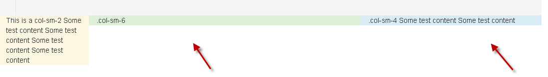
Both column 2 and column 3 should expand to have the same height as column 1.

Any help / suggestion will be greatly appreciated.

4

Answers


  1. Add your own class and set height.

    Login or Signup to reply.
  2. Option 1 (for the layzy)

    <div class="container-fluid">
      <div class="row">
        <div class="col-sm-2 bg-warning my-super-class">
          This is a col-sm-2
           Some test content
            Some test content
             Some test content
              Some test content
        </div>
        <div class="col-sm-6 bg-success my-super-class">
          .col-sm-6
        </div>
        <div class="col-sm-4 bg-info my-super-class">
          .col-sm-4      
          Some test content
          Some test content
        </div>
      </div>
    </div>
    
    
    .my-super-class {
      min-height: 12em;
    }
    

    Option 2: give the col’s id, grab said DOMelement by their Id’s in JavaScript. Then check for the biggest of them all, and use that value to set the (min-)height for all.

    Login or Signup to reply.
  3. The best way to do this is using display:flex; on the parent row and on the col.

    Working Demo.

    .example {
      display: flex;
    }
    .example .exaple-items {
      display: flex;
    }
    <link href="https://maxcdn.bootstrapcdn.com/bootstrap/3.3.7/css/bootstrap.min.css" rel="stylesheet"/>
    <div class="container">
      <div class="row example">
        <div class="col-sm-2 bg-warning exaple-items">
          This is a col-sm-2
          Some test content
           Some test content
            Some test content
             Some test content
        </div>
        <div class="col-sm-6 bg-success exaple-items">
          .col-sm-6
        </div>
        <div class="col-sm-4 bg-info exaple-items">
          .col-sm-4      
          Some test content
          Some test content
        </div>
      </div>
    </div>

    Since flextbox is a new CSS feature check the browser compatibility: caniuse.com

    And use the vendor prefix:

    .example {
        display: -webkit-box;
        display: -ms-flexbox;
        display: flex;
    }
    

    If you want to know more about display:flex; read this: https://css-tricks.com/snippets/css/a-guide-to-flexbox/

    P.S. The new bootstrap v4 will have this feature integrated.

    Login or Signup to reply.
  4. .row-eq-height{
        display: -webkit-box;
        display: -webkit-flex;
        display: -ms-flexbox;
        display: flex;
    }
    

    Add this class with your row class.

    <div class="container-fluid">
      <div class="row-eq-height row">
        <div class="col-sm-2 bg-warning">
          This is a col-sm-2
          Some test content
           Some test content
            Some test content
             Some test content
        </div>
        <div class="col-sm-6 bg-success">
          .col-sm-6
        </div>
        <div class="col-sm-4 bg-info">
          .col-sm-4      
          Some test content
          Some test content
        </div>
      </div>
    </div>
    

    https://jsfiddle.net/ebwwvy6m/16/

    Login or Signup to reply.
Please signup or login to give your own answer.
Back To Top
Search