 Question posted in


I am using Twitter Bootstrap and encountered this weird situation where everything goes well on desktop, but on a Samsung Galaxy S5, or other similar size displays (360 x 640 or 640 x 360 for this particular example) I get this weird margin on the right side I cannot get rid of.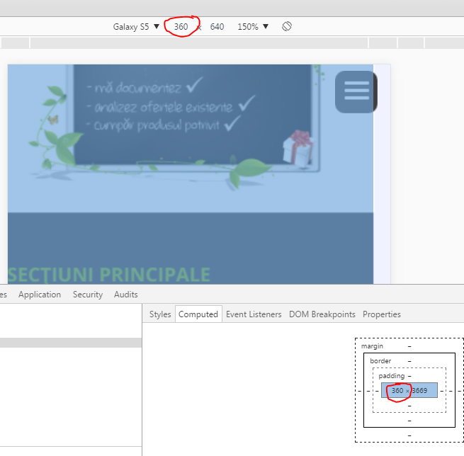
Although my body element scales to the exact width.
Screen capture is taken into Chrome browser.
The code is live at: http://11784vic.bphp56.webrahost.ro/
2
Answers
There are only
col-lg-12classess in your div addcol-md-12andcol-sm-12. This will solve your problem.you can add overflow:hidden to your body but in my openion you have to solve the source of problem and it comes from class row cange it to col-xs-12
it may change your style but it’s right way.