skip to Main Content

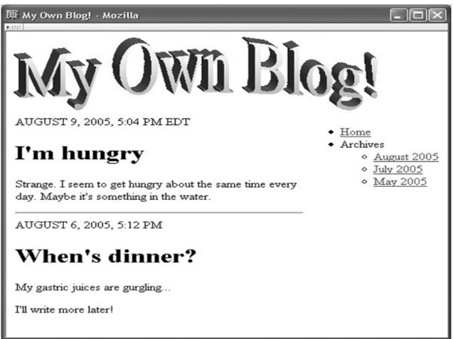
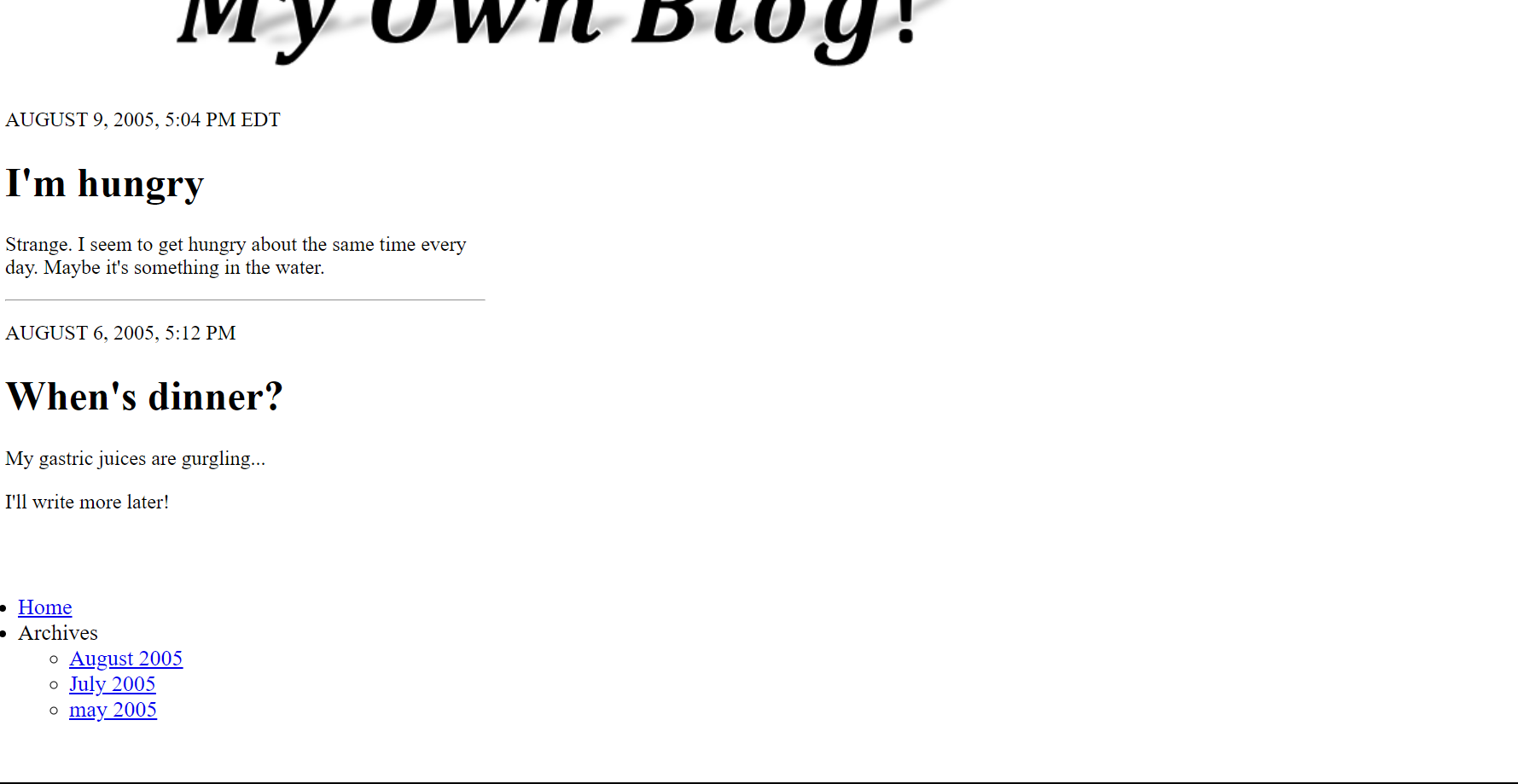
Please help me find the html codes to put the list on the right side of the page. I already tried to use css but the code doesn’t work

i don't know how to put the "home,archives.." to the right upper side of the page

Can you tell me what syntax i should use to make the "home,archives…" to the right side of the page.

I made this one

this the remake i make

#konten {
  padding: 0px;
  width: 100%;
  float: right;
  font-size: 13pt;
  margin: 30px;
}
<nav>
  <img src="navbar.png" style="margin-left: 10px;" />
</nav>
<p>AUGUST 9, 2005, <time>5:04</time> PM EDT</p>

<h1>I'm hungry</h1>

<p>Strange. I seem to get hungry about the same time every<br> day. Maybe it's something in the water.</p>

<hr align="left" width="30%">

<p>AUGUST 6, 2005, <time>5:12</time> PM </p>

<h1>When's dinner?</h1>

<p>My gastric juices are gurgling...</p>

<p>I'll write more later!</p>

<div class="col-9 col-m-7">
  <div id="konten">
    <div class="col-12 col-m-12">
      <ul id="menu">
        <li><a href="#">Home</a></li>
        <li><a>Archives</a>
          <ul>
            <li><a href="#">August 2005</a></li>
            <li><a href="#">July 2005</a></li>
            <li><a href="#">may 2005</a></li>
          </ul>
        </li>
      </ul>
    </div>
  </div>
</div>

2

Answers


  1. youn need to put the code that you want to be side by side in a container, then turn the container into a flexbox by adding display: flex in css,

    make sure that the stuff you want to be on the right is in its own container
    and the stuff you want to be on the left is in its on container.

    if you want to add space between the 2 containers (the left and right containers) add this css to conater class

    justify-content: space-between this will put the elements on opposit ends

    justify-content: space-around this will add equal space around the containers

    if you wan just a bit of space this css will help

    #konten{
      margin-left: 20px
    }
    
    .container{
      display: flex; /*set the disp-lay of the cotainer to flex*/
    }
    <div class="container"> <!-- create a main container that will house all the code you want to separate -->
       
       <div><!-- create a container for the stuff that will be on the right  -->
        <nav>
            <img src="navbar.png"style="margin-left: 10px;" />
        </nav>
        <p>AUGUST 9, 2005, <time>5:04</time> PM EDT</p>
    
        <h1>I'm hungry</h1>
    
        <p>Strange. I seem to get hungry about the same time every<br> day. Maybe it's something in the water.</p>
    
        <hr align="left" width="30%">
    
        <p>AUGUST 6, 2005, <time>5:12</time> PM </p>
    
        <h1>When's dinner?</h1>
    
        <p>My gastric juices are gurgling...</p> 
    
        <p>I'll write more later!</p>
       </div>
    
        <div class="col-9 col-m-7"> <!-- this will be the container for the stuff that will be on the right -->
            <div id="konten">
                <div class="col-12 col-m-12">
                    <ul id="menu" >
                        <li><a href="#">Home</a></li>
                        <li><a>Archives</a>
                            <ul>
                                 <li><a href="#">August 2005</a></li>
                                 <li><a href="#">July 2005</a></li>
                                 <li><a href="#">may 2005</a></li>
                            </ul>
                        </li>
                    </ul>
                </div>
            </div>
        </div>
        
     </div>
    Login or Signup to reply.
  2. It looks as if you might be using Bootstrap. If that’s the case, place the following in the <head>

    <link href="https://cdn.jsdelivr.net/npm/[email protected]/dist/css/bootstrap.min.css" rel="stylesheet">
    

    The most basic layout you’ll use with Bootstrap is as follows:

    <div class="container">
      <div class="row">
        <div class="col-6">This takes up 6 column spaces -- half of ".row"</div>
        <div class="col-6">Same as previous sibling div</div>
      </div>
    </div>
    
    Bootstrap Class Position
    container
    Wrap around ".row" tags.
    row
    Wrap around ".col-*" tags.
    col-*
    Wrap around content. * is a number in the range of 1 to 12.

    Example A

    <link href="https://cdn.jsdelivr.net/npm/[email protected]/dist/css/bootstrap.min.css" rel="stylesheet">
    
    <div class="container">
      <div class="row">
        <header class="col-12">
          <h1>Example A</h1>
          <p>This header takers up all 12 column spaces.</p>
        </header>
      </div>
      <main class="row">
        <section class="col-7">
          <h2>Section</h2>
          <p>This section takes up 7 out of 12 column spaces.</p>
        </section>
        <nav class="col-5">
          <h2>Nav</h2>
          <menu>
            <li>This section takes up 5 out of 12 column spaces.
              <ul>
                <li><a href="#">LINK</a></li>
                <li><a href="#">LINK</a></li>
                <li><a href="#">LINK</a></li>
              </ul>
            </li>
          </menu>
        </nav>
      </main>
    </div>

    Example B

    <!DOCTYPE html>
    <html lang="en">
    
    <head>
      <meta charset="UTF-8">
      <meta http-equiv="X-UA-Compatible" content="IE=edge">
      <meta name="viewport" content="width=device-width, initial-scale=1.0">
      <link href="https://cdn.jsdelivr.net/npm/[email protected]/dist/css/bootstrap.min.css" rel="stylesheet">
    
      <title>Document</title>
    </head>
    
    <body>
      <div class="container">
        <header class="row">
          <h1>Hunger Blog</h1>
        </header>
        <div class="row">
          <main class="col-9">
            <section>
              <p>AUGUST 9, 2005, <time>5:04</time> PM EDT</p>
    
              <h2>I'm Hungry</h2>
    
              <p>Strange. I seem to get hungry about the same time every<br> day. Maybe it's something in the water.</p>
            </section>
            <hr align="left" width="30%">
            <section>
              <p>AUGUST 6, 2005, <time>5:12</time> PM </p>
    
              <h2>When's Dinner?</h2>
    
              <p>My gastric juices are gurgling...</p>
    
              <p>I'll write more later!</p>
            </section>
          </main>
    
          <nav class="col-3">
            <menu>
              <li><a href="#">Home</a></li>
              <li><a>Archives</a>
                <ul>
                  <li><a href="#">August 2005</a></li>
                  <li><a href="#">July 2005</a></li>
                  <li><a href="#">May 2005</a></li>
                </ul>
              </li>
            </menu>
          </nav>
        </div>
      </div>
    </body>
    
    </html>
    Login or Signup to reply.
Please signup or login to give your own answer.
Back To Top
Search