 Question posted in


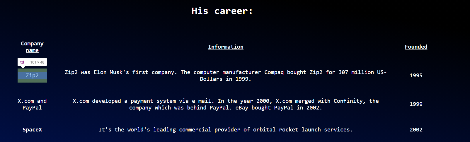
I want to center the column in the middle of my table so that the table header "Information" is centered exactly beneath the h2 header "His career". I have found out that the table is centered, but column 1 is wider than column 3:
I thought that this
            <colgroup>
              <col style="width:5%">
              <col style="width:90%">
              <col style="width:5%">
            </colgroup>
would give column 1 and column 3 equal width. Why doesn’t it, and how can I make the 2 columns the same width?
My HTML and CSS:
body {
  font-family: monospace;
  background: linear-gradient(190deg, black 50%, #001A7A);
  color: white;
  background-repeat: no-repeat;
  height: 100%;
  width: 100%;
  text-align: center;
  font-size: min(4vw, 20px);
}

h1 {
  text-align: center;
  font-size: 60px;
}

#tribute-link {
  color: #BBFEFF;
}

#image {
  display: block;
  max-width: 60%;
  height: auto;
  margin: auto;
}

#img-caption {
    font-size: 18px;
}

.career {
  font-size: 35px;
  text-align: center;
}

#tribute-companies {
  margin: auto;
  max-width: 1500px;
  height: auto;
  border-spacing: min(3vw, 50px) 50px;
}
<script src="https://cdn.freecodecamp.org/testable-projects-fcc/v1/bundle.js"></script>
<body>
<main id="main">
<h1 id="title">Elon Musk</h1>
<div id="img-div">
<img src="https://upload.wikimedia.org/wikipedia/commons/e/ed/Elon_Musk_Royal_Society.jpg" id="image" alt="A picture of Elon Musk">
<p id="img-caption">Elon Musk on the Royal Society admissions day in London, July 2018</p>
</div>
<div id="tribute-info">
<table id="tribute-companies">
<h2 class="career">His career:</h2>
<colgroup>
<col style="width:5%">
<col style="width:90%">
<col style="width:5%">
</colgroup>
<tr>
<th><u>Company name</u></th>
<th><u>Information</u></th>
<th><u>Founded</u></th>
</tr>
<tr>
<td>Zip2</td>
<td>Zip2 was Elon Musk's first company. The computer manufacturer Compaq bought Zip2 for 307 million US-Dollars in 1999.</td>
<td>1995</td>
</tr>
<tr>
<td>X.com and PayPal</td>
<td>X.com developed a payment system via e-mail. In the year 2000, X.com merged with Confinity, the company which was behind PayPal. eBay bought PayPal in 2002.</td>
<td>1999</td>
</tr>
<tr>
<td>SpaceX</td>
<td>It's the world's leading commercial provider of orbital rocket launch services.</td>
<td>2002</td>
</tr>
<tr>
<td>Tesla</td>
<td>Elon Musk invested in Tesla in the year 2004. It has become the biggest electric vehicle company since then.</td>
<td>2003</td>
</tr>
<tr>
<td>SolarCity</td>
<td>SolarCity manufactured solar cells. It merged with Tesla in the year 2016.</td>
<td>2006</td>
</tr>
<tr>
<td>OpenAI</td>
<td>OpenAI developed artificial intelligence. Elon Musk left the project in 2019.</td>
<td>2015</td>
</tr>
<tr>
<td>Neuralink</td>
<td>Neuralink tries to connect the human brain to machines.</td>
<td>2016</td>
</tr>
<tr>
<td>The Boring Company</td>
<td>A tunnel boring company.</td>
<td>2016</td>
</tr>
</table>
<div>
<a href="https://de.wikipedia.org/wiki/Elon_Musk" id="tribute-link" target="_blank">Read more about Elon Musk on Wikipedia</a>
</body>
3
Answers
Try adding to your th and td
or you can use
I think this css one works best, if you like it when shrunk down for mobile.
This also works but it breaks up the text, and doesn’t look as good.
The reason is obviously that your left column contains words that are longer than the 5% width of the column. In this case the column will adjust its width automatically.
If you don’t want these words to be broken (using hyphenation or similar), I would suggest you make both the first and third column wider by the same amount. The middle column must become narrower then. Try 10%/80%/10% or any value that suits your particular content.