skip to Main Content

I have created a website for desktop and mobile, and it has to be responsive. My problem is that when I resize the browser all the content gets zoomed out instead of adapting. I also have an issue with the HTML. why is it only taking up 1/3 of the page according to dev tools and when I add width:1100px to my sections it renders the desktop version, but when I take it away it floats to the left side? Why is this happening?

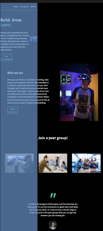
Images of the problem:

* {
     margin: 0;
     padding: 0;
     box-sizing: border-box;
}
 body {
     font-family: 'Source Sans Pro', sans-serif;
     background-color: black;
     color: white;
     line-height: 30px;
}
 html {
     width:100%;
}
 img {
     width: 100%;
}
 h1 {
     font-weight: 700;
     font-size: 44px;
     margin-bottom: 40px;
     line-height: 50px;
}
 h3 {
     width: 100%;
}
/* header */
 header {
     display: flex;
     background-color: black;
     height: 80px;
     min-width: 1100px;
     justify-content: right;
     align-items: center;
     margin-bottom: 50px;
     border-bottom: 1px solid white;
}
 nav ul li {
     display: inline-block;
     list-style-type: none;
     margin-right: 20px;
}
 .nav-links{
     color: white;
     font-size: 18px;
}
/* Banner */
 .banner {
     display: flex;
     justify-content: space-around;
     align-items: center;
     min-height: 500px;
     width: 100%;
}
 .banner-text-container {
     max-width: 30%;
     font-size: 22px;
}
 span {
     color: #11cc9e;
}
 .consultation-link{
     color: #11cc9e;
     text-decoration: none;
     margin-top: 30px;
     font-weight: 900;
     display: block;
     border: 1px solid white;
     max-width: 40%;
     text-align: center;
     padding: 5px;
}
 .consultation-link:hover{
     background-color: #fff;
}
/* About */
 .about {
     display: flex;
     justify-content: space-around;
     align-items: center;
     min-height: 600px;
     min-width: 1100px;
}
 .about-text-container {
     max-width: 40%;
     font-size: 22px;
     margin-left: 20px;
}
 .about-img{
     width: 400px;
     margin-right: 22px;
}
 .about-title {
     margin-bottom: 40px;
}
 .about-us-link{
     color: #11cc9e;
     text-decoration: none;
     margin-top: 30px;
     font-weight: 900;
     display: block;
     border: 1px solid white;
     text-align: center;
     max-width: 25%;
     padding: 5px;
}
 .about-us-link:hover{
     background-color: #fff;
}
/* Join */
 .join {
     min-height: 600px;
     min-width: 1100px;
     max-width: 100%;
}
 .join-header{
     width: 100%;
     text-align: center;
     margin-top: 150px;
     font-size: 40px;
}
 .container-boxes{
     position: relative;
     top: 0;
     bottom: 0;
     display: flex;
     flex-wrap: wrap;
     justify-content: space-evenly;
     align-items: center;
     min-height: 500px;
     min-width: 1100px;
}
 .box {
     position: relative;
     overflow: hidden;
     transition: 0.5s;
     height: 200px;
     width: 300px;
}
 .box:hover{
     z-index: 1;
     transform: scale(1.25);
     box-shadow: 0 25px 40px rgba(0, 0, 0, .5);
     cursor: pointer;
}
 .box .imgBX{
     position: absolute;
     top: 0;
     left: 0;
     width: 100%;
     height: 100%;
}
 .box .imgBX img{
     position: absolute;
     top: 0;
     left: 0;
     width: 100%;
     height: 100%;
     object-fit: cover;
}
 .box .imgBX:before{
     content: '';
     position: absolute;
     top: 0;
     left: 0;
     width: 100%;
     height: 100%;
     z-index: 1;
     background: linear-gradient(180deg,rgba(0,0,0.7),#79dbc3);
     mix-blend-mode: multiply;
     opacity: 0;
     transition: 0.5s;
}
 .box:hover .imgBX:before {
     opacity: 1;
}
 .box .imgBX img{
     position: absolute;
     top: 0;
     left: 0;
     width: 100%;
     height: 100%;
     object-fit: cover;
}
 .content{
     display: flex;
     flex-direction: column;
     text-align: center;
     position: absolute;
     top: 20%;
     bottom: 40%;
     width: 100%;
     height: 100%;
     z-index: 1;
     padding: 20px;
     visibility: hidden;
}
 .box:hover .content{
     visibility: visible;
}
/* Quote section */
 .quote-section {
     display: flex;
     justify-content: center;
     max-width: 100%;
     min-height: 500px;
     min-width: 1100px;
}
 .quote-container {
     display: flex;
     flex-direction: column;
     flex-wrap: wrap;
     align-items: center;
     justify-items: center;
     max-width: 50%;
     font-size: 22px;
     text-align: center;
}
 .quote {
     line-height: 90px;
     font-size: 150px;
     font-style: italic;
     color: #11cc9e;
     text-indent: -37px;
     font-weight: 600;
     width: 37px;
}
 .quote-img{
     width: 90px;
     margin: 40px auto;
}
 .person-name{
     color: #ccc;
}
 .person-role{
     font-size: 17px;
     color: #ccc;
}
/* Footer */
 footer {
     text-align: center;
     margin-top: 100px;
     padding-top: 50px;
     max-width: 100%;
     min-height: 200px;
     min-width: 1100px;
     border-top: 1px solid #fff;
}
<!DOCTYPE html>
<html lang="en">
   <head>
      <title>Codes</title>
      <link rel="preconnect" href="https://fonts.googleapis.com">
      <ink rel="preconnect" href="https://fonts.gstatic.com" crossorigin>
      <link href="https://fonts.googleapis.com/css2?family=Source+Sans+Pro:wght@400;600&display=swap" rel="stylesheet">
      <meta charset="UTF-8">
      <meta http-equiv="X-UA-Compatible" content="IE=edge">
      <meta name="viewport" content="width=device-width, initial-scale=1">
      <link rel="stylesheet" href="./Resources/styles.css">
   </head>
   <body>
      <header>
         <!-- insert logo -->
         <nav class="nav-links">
            <ul>
               <li>About</li>
               <li>Peer group</li>
               <li>Review</li>
            </ul>
         </nav>
      </header>
      <section class="banner">
         <div class="banner-text-container">
            <h1>Build. Grow. <span class="color-Learn">Learn.</span></h1>
            <p>Unlock your potential with your peers!, using Blockchain, Fintech or the IT outsourcing company Boosty Labs helps you create an innovative end to end product or augment your team with the right experts.</p>
            <a class="consultation-link" href="#">Free consultation </a>
         </div>
         <div class="banner-img">
            <img src="./Resources/Images/banner.png" alt="">
         </div>
      </section>
      <section class="about">
         <div class="about-text-container">
            <h2 class="about-title">Who we are</h2>
            <p>Here you can find our ,collection of coding, data science and statistics tutorials with examples in R, Python, JavaScript and Python. As you click through, you'll notice that some tutorials have ribbons on their logos - they are part of our free and self-paced online course Data Science for Ecologists and Environmental Scientists! Yellow for the Stats from Scratch stream, blue for Wiz of Data Viz and purple for Mastering Modelling.</p>
            <a class="about-us-link" href="#">More about us </a>
         </div>
         <div class="about-img">
            <img src="./Resources/Images/whoweare.png" alt="">
         </div>
      </section>
      <section class="join">
         <h3 class="join-header" >Join a peer group!</h3>
         <div class="container-boxes">
            <div class="box">
               <div class="imgBX"> 
                  <img src="./Resources/Images/box-1.png" alt="">
               </div>
               <div class="content">
                  <h3>AI</h3>
                  <P>Discover The Complete Range Of Artificial Intelligence Solutions.</P>
               </div>
            </div>
            <div class="box">
               <div class="imgBX">
                  <img src="./Resources/Images/box-2.png" alt="">
               </div>
               <div class="content">
                  <h3 class="frontend-title">Frontend Dev</h3>
                  <p>Discover The Complete Range Of Frontend Solutions.</p>
               </div>
            </div>
            <div class="box">
               <div class="imgBX">
                  <img src="./Resources/Images/box-3.png" alt="">
               </div>
               <div class="content">
                  <h3>Microsoft systems</h3>
                  <p>Discover The Complete Range Of Microsoft Solutions.</p>
               </div>
            </div>
         </div>
      </section>
      <section class="quote-section">
         <div class="quote-container">
            <div class="quote">"</div>
            <p class="p-quote">In coded, the progress of the topics and the exercises are really good. It's so nice to practice on good story told tasks. Also if you are stuck, it is nice to have a broad range of coders around in the peer groups  that you can get the answers you are looking for.</p>
            <div class="quote-img">
               <img src="./Resources/Images/person-img.png" alt="">
            </div>
            <div class="person-name">Peter Gangland </div>
            <div class="person-role">Director of business dev at <span>Microsoft</span></div>
         </div>
      </section>
      <footer>
         <div id="contact">
            <h2>
            Contact us</h5>
            <h5>[email protected]</h5>
            <h5>831-867-5309</h5>
         </div>
         <div id="copyright">
            <h5>@copyright coded Enterprises 2022</h5>
         </div>
      </footer>
   </body>
</html>

2

Answers


  1. For making your website responsive you need to use media queries. It’s like you tell the browser how to style your website in different sizes. I think your problem with your sections might also get solved if you try to make your website responsive.

    Login or Signup to reply.
  2. Some issues I noticed:

    • The horizontal scrollbar opens when the screen width is reduced after the web page is loaded; This situation is not suitable for responsive design. To avoid this situation, add overflow-x: hidden to the <body> I used the style.

    • You should use media queries to make a mobile responsive website. In this example I’ve edited the <img> element to remove it when the page shrinks.

    • I completely removed the width: 1100px style you added to the elements. You don’t need to use this type to give width to the element.

    • On mobile-responsive websites, <img> elements are displayed on the new line at 100% width; you can implement this idea by using media queries at this stage.

    You can visit this link for media query blocks according to the display size of the devices in CSS.

    For example, the styles in @media only screen and (max-width: 880px){} are applied when the page size drops below 880px:

    enter image description here

     * {
         margin: 0;
         padding: 0;
         box-sizing: border-box;
    }
     body {
         font-family: 'Source Sans Pro', sans-serif;
         background-color: black;
         color: white;
         line-height: 30px;
         width:100%;
         overflow-x: hidden;
    }
     img {
         width: 100%;
    }
     h1 {
         font-weight: 700;
         font-size: 44px;
         margin-bottom: 40px;
         line-height: 50px;
    }
     h3 {
         width: 100%;
    }
     header {
         display: flex;
         background-color: black;
         height: 80px;
         justify-content: right;
         align-items: center;
         margin-bottom: 50px;
         border-bottom: 1px solid white;
    }
     nav ul li {
         display: inline-block;
         list-style-type: none;
         margin-right: 20px;
    }
     .nav-links{
         color: white;
         font-size: 18px;
    }
     .banner {
         display: flex;
         justify-content: space-around;
         align-items: center;
         min-height: 500px;
         width: 100%;
    }
     .banner-text-container {
         max-width: 30%;
         font-size: 22px;
    }
     span {
         color: #11cc9e;
    }
     .consultation-link{
         color: #11cc9e;
         text-decoration: none;
         margin-top: 30px;
         font-weight: 900;
         display: block;
         border: 1px solid white;
         max-width: 40%;
         text-align: center;
         padding: 5px;
    }
     .consultation-link:hover{
         background-color: #fff;
    }
     .about {
         display: flex;
         justify-content: space-around;
         align-items: center;
         min-height: 600px;
    }
     .about-text-container {
         max-width: 40%;
         font-size: 22px;
         margin-left: 20px;
    }
     .about-img{
         width: 400px;
         margin-right: 22px;
    }
     .about-title {
         margin-bottom: 40px;
         width: 100% !important;
    }
     .about-us-link{
         color: #11cc9e;
         text-decoration: none;
         margin-top: 30px;
         font-weight: 900;
         display: block;
         border: 1px solid white;
         text-align: center;
         max-width: 25%;
         padding: 5px;
    }
     .about-us-link:hover{
         background-color: #fff;
    }
     .join {
        /* */
    }
     .join-header{
         width: 100%;
         text-align: center;
         margin-top: 75px;
         font-size: 40px;
    }
     .container-boxes{
         position: relative;
         top: 0;
         bottom: 0;
         display: flex;
         flex-wrap: wrap;
         justify-content: space-evenly;
         align-items: center;
         min-height: 500px;
    }
     .box {
         position: relative;
         overflow: hidden;
         transition: 0.5s;
         height: 200px;
         width: 300px;
    }
     .box:hover{
         z-index: 1;
         transform: scale(1.25);
         box-shadow: 0 25px 40px rgba(0, 0, 0, .5);
         cursor: pointer;
    }
     .box .imgBX{
         position: absolute;
         top: 0;
         left: 0;
         width: 100%;
         height: 100%;
    }
     .box .imgBX img{
         position: absolute;
         top: 0;
         left: 0;
         width: 100%;
         height: 100%;
         object-fit: cover;
    }
     .box .imgBX:before{
         content: '';
         position: absolute;
         top: 0;
         left: 0;
         width: 100%;
         height: 100%;
         z-index: 1;
         background: linear-gradient(180deg,rgba(0,0,0.7),#79dbc3);
         mix-blend-mode: multiply;
         opacity: 0;
         transition: 0.5s;
    }
     .box:hover .imgBX:before {
         opacity: 1;
    }
     .box .imgBX img{
         position: absolute;
         top: 0;
         left: 0;
         width: 100%;
         height: 100%;
         object-fit: cover;
    }
     .content{
         display: flex;
         flex-direction: column;
         text-align: center;
         position: absolute;
         top: 20%;
         bottom: 40%;
         width: 100%;
         height: 100%;
         z-index: 1;
         padding: 20px;
         visibility: hidden;
    }
     .box:hover .content{
         visibility: visible;
    }
    /* Quote section */
     .quote-section {
         display: flex;
         justify-content: center;
         max-width: 100%;
         min-height: 500px;
    }
     .quote-container {
         display: flex;
         flex-direction: column;
         flex-wrap: wrap;
         align-items: center;
         justify-items: center;
         max-width: 50%;
         font-size: 22px;
         text-align: center;
    }
     .quote {
         line-height: 90px;
         font-size: 150px;
         font-style: italic;
         color: #11cc9e;
         text-indent: -37px;
         font-weight: 600;
         width: 37px;
    }
     .quote-img{
         width: 90px;
         margin: 40px auto;
    }
     .person-name{
         color: #ccc;
    }
     .person-role{
         font-size: 17px;
         color: #ccc;
    }
     footer {
         text-align: center;
         margin-top: 100px;
         padding-top: 50px;
         max-width: 100%;
         min-height: 200px;
         border-top: 1px solid #fff;
    }
    
    @media only screen and (max-width: 1279px) {
         nav ul li {
             display: inline-block;
             list-style-type: none;
             margin-right: 20px;
             color: #11cc9e;
        }
    }
    
    @media only screen and (max-width: 880px){
         html{
             margin-left: 25px !important;
             margin-right: 25px !important;
        }
         .banner-text-container {
             max-width: 100%;
             font-size: 20px;
        }
         img{
             display: none;
        }
         .about-text-container {
             max-width: 100% !important;
             font-size: 22px;
        }
         .about-text-container {
             margin-left: 0px;
        }
         .about {
             display: inline;
        }
         .banner {
             display: inline;
             justify-content: space-around;
             width: 100%;
        }
         .consultation-link{
             color: #11cc9e;
             text-decoration: none;
             margin-bottom: 50px;
             font-weight: 900;
             display: block;
             border: 1px solid white;
             max-width: 100%;
             text-align: center;
             padding: 5px;
        }
         .about-us-link {
             color: #11cc9e;
             text-decoration: none;
             margin-top: 30px;
             font-weight: 900;
             display: block;
             border: 1px solid white;
             text-align: center;
             max-width: 100%;
             padding: 5px;
        }
         .join{
             display: none;
        }
         .join-header{
             display: none;
        }
         .quote-section{
             display: none;
        }
    }
    <!DOCTYPE html>
    <html lang="en">
        <head>
            <title>Codes</title>
            <link rel="preconnect" href="https://fonts.googleapis.com">
            <ink rel="preconnect" href="https://fonts.gstatic.com" crossorigin>
            <link href="https://fonts.googleapis.com/css2?family=Source+Sans+Pro:wght@400;600&display=swap" rel="stylesheet">
            <meta charset="UTF-8">
            <meta http-equiv="X-UA-Compatible" content="IE=edge">
            <meta name="viewport" content="width=device-width, initial-scale=1">
            <link rel="stylesheet" href="style.css">
        </head>
        <body>
            <header>
                <!-- insert logo -->
                <nav class="nav-links">
                    <ul>
                        <li>About</li>
                        <li>Peer group</li>
                        <li>Review</li>
                    </ul>
                </nav>
            </header>
            <section class="banner">
                <div class="banner-text-container">
                    <h1>Build. Grow. <span class="color-Learn">Learn.</span></h1>
                    <p>Unlock your potential with your peers!, using Blockchain, Fintech or the IT outsourcing company Boosty Labs helps you create an innovative end to end product or augment your team with the right experts.</p>
                    <a class="consultation-link" href="#">Free consultation </a>
                </div>
                <div class="banner-img">
                    <img src="https://via.placeholder.com/400" alt="">
                </div>
            </section>
            <section class="about">
                <div class="about-text-container">
                    <h2 class="about-title">Who we are</h2>
                    <p>Here you can find our ,collection of coding, data science and statistics tutorials with examples in R, Python, JavaScript and Python. As you click through, you'll notice that some tutorials have ribbons on their logos - they are part of our free and self-paced online course Data Science for Ecologists and Environmental Scientists! Yellow for the Stats from Scratch stream, blue for Wiz of Data Viz and purple for Mastering Modelling.</p>
                    <a class="about-us-link" href="#">More about us </a>
                </div>
                <div class="about-img">
                    <img src="https://via.placeholder.com/400" alt="">
                </div>
            </section>
            <section class="join">
                <h3 class="join-header" >Join a peer group!</h3>
                <div class="container-boxes">
                    <div class="box">
                        <div class="imgBX"> 
                            <img src="https://via.placeholder.com/400" alt="">
                        </div>
                        <div class="content">
                            <h3>AI</h3>
                            <P>Discover The Complete Range Of Artificial Intelligence Solutions.</P>
                        </div>
                    </div>
                    <div class="box">
                        <div class="imgBX">
                            <img src="https://via.placeholder.com/400" alt="">
                        </div>
                        <div class="content">
                            <h3 class="frontend-title">Frontend Dev</h3>
                            <p>Discover The Complete Range Of Frontend Solutions.</p>
                        </div>
                    </div>
                    <div class="box">
                        <div class="imgBX">
                            <img src="https://via.placeholder.com/400" alt="">
                        </div>
                        <div class="content">
                            <h3>Microsoft systems</h3>
                            <p>Discover The Complete Range Of Microsoft Solutions.</p>
                        </div>
                    </div>
                </div>
            </section>
            <section class="quote-section">
                <div class="quote-container">
                    <div class="quote">"</div>
                    <p class="p-quote">In coded, the progress of the topics and the exercises are really good. It's so nice to practice on good story told tasks. Also if you are stuck, it is nice to have a broad range of coders around in the peer groups  that you can get the answers you are looking for.</p>
                    <div class="quote-img">
                        <img src="https://via.placeholder.com/400" alt="">
                    </div>
                    <div class="person-name">Peter Gangland </div>
                    <div class="person-role">Director of business dev at <span>Microsoft</span></div>
                </div>
            </section>
            <footer>
                <div id="contact">
                    <h2>
                    Contact us</h5>
                    <h5>[email protected]</h5>
                    <h5>831-867-5309</h5>
                </div>
                <div id="copyright">
                    <h5>@copyright coded Enterprises 2022</h5>
                </div>
            </footer>
        </body>
    </html>
    Login or Signup to reply.
Please signup or login to give your own answer.
Back To Top
Search