skip to Main Content

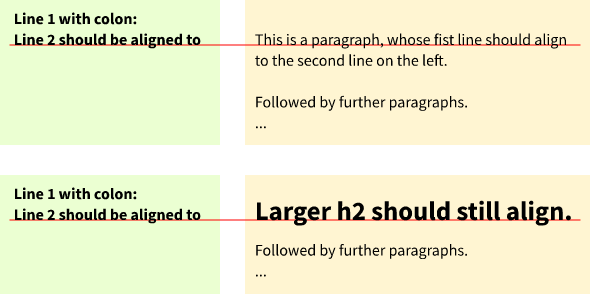
I am faced with the CSS implementation of a multi-column layout that aligns the first line of the second column, which may have various font sizes, to the second line of the first column. Like this:

Two examples of a two-column layout, with a visual guide to illustrate the desired baseline alignment.

(The colored background and highlighted baseline are for illustration purposes.)

The first column will always consist of two lines of known typeface, line height, and weight.

The second column may consist of headings, paragraphs, images etc. It will start either with a paragraph or a h2.

Here is a minimal reproducible example:

div.column {
  width: 30%;
  float:left;
}

p.highlight {
  font-weight:bold;
}
<div class="column">
  <p class="highlight">
    Line 1 with colon:<br>
    Line 2 should be aligned to
  </p>
</div>
<div class="column">
  <p>
    This is a paragraph, whose fist line should align to the second line on the left.
  </p>
  <p>
    Followed by further paragraphs.
  </p>
</div>
<div class="column">
  <h2>Larger h2 should still align.</h2>
  <p>
    Followed by further paragraphs.
  </p>
</div>

The second column will be under CMS control and might be subject to change by editors at any time, i.e. start with a paragraph in the first iteration, but might be changed to a h2 later, and maybe back.

The editors should preferably only use plain h2 and p tags in the second column, without any requirement for inline CSS. Assigning a class like <p class="top_align"> or similar would probably be okay.

Constraints:

  • I have to solve it in pure CSS, I can not use any JavaScript nor CSS preprocessors.
  • The solution must be pixel-perfect across desktop devices, desktop operating systems and desktop browsers. Mobile layout is not an issue.
  • The solution still has to work when zooming in, up to a level of 300 %.

I have done quite some CSS work, but never this kind of cross-column baseline alignment. I know there are some baseline-related rules in CSS, but I have neither seen nor found any reference techniques to baselines outside the current container.

My line of thought is that the second column somehow would have to know the distance of the second baseline to the top of the first column, and then adjust the top padding of the first paragraph or the heading, given its line height, to match that distance.

Is that even possible, given my constraints?

How would I start to tackle this?

3

Answers


  1. You can make an element span 2 lines by using the line-height property. If you set it to 2em, it will be as height as 2 lines. Remember to reset default paddings and margins.

    /* reset default margin */
    p, h2 {
      margin: 0;
    }
    
    
    /* setting the line height of the first element on the right side */
    .right :first-child {
      line-height: 2em;
    }


    /* just for visualizsation purpose */
    .container {
      display: flex;
    }
    
    .inner-container {
      border: 2px dashed red;
      padding: 0.5em;
    }
    <div class="container">
      <div class="inner-container left">
        <p>First Line</p>
        <p>Second Line</p>
      </div>
      <div class="inner-container right">
        <h2>Headline</h2>
      </div>
    </div>
    Login or Signup to reply.
  2. You can do it but its a bit of a faff. You basically have to make sure you set line-heights and margins consistently. Using CSS Custom Properties makes this a little easier.

    :root {
      --base-font-size: 1rem;
      --base-line-height: 1.5rem;
    }
    
    .demo {
      display:grid;
      grid-template-columns: 1fr 1fr 1fr;
      margin:0;
      gap:10px;
    }
    
    
    div.column {
      padding:var(--base-line-height);
      background:beige;
      font-size:var(--base-font-size);
      line-height:var(--base-line-height);
      background-image:repeating-linear-gradient(to bottom, transparent 0 calc(var(--base-line-height) - 1px), #ccc calc(var(--base-line-height) - 1px) var(--base-line-height))
    }
    
    p.highlight {
      font-weight:bold;
    }
    
    div.column p {
      margin:0;
      margin-top:var(--base-line-height);
    }
    
    div.column p.highlight {
      margin-top:0rem;
    }
    
    div.column h2 {
      margin:0;
      font-size:calc(var(--base-font-size) * 1.5);
      line-height:var(--base-line-height);
      margin-top:var(--base-line-height);
    }
    <div class="demo">
    <div class="column">
      <p class="highlight">
        Line 1 with colon:<br>
        Line 2 should be aligned to
      </p>
    </div>
    <div class="column">
      <p>This is a paragraph, whose first line should align to the second line on the left.</p>
      <p>Followed by further paragraphs.</p>
    </div>
    <div class="column">
      <h2>Larger h2 should still align.</h2>
      <p>Followed by further paragraphs.</p>
    </div>
    </div>
    Login or Signup to reply.
  3. This can be done quite simply with inline-block and inline-table.

    Inline-block aligns the last line of its contents, and inline-table (via table-cell) aligns its first line.

    (There’s a proposed CSS property called "baseline-source" that will control this, but the browser support right now is limited to Chromium.)

    div.column {
      width: 30%;
    }
    
    .column {
      display: inline-block;
    }
    .column:nth-child(n + 2) {
      display: inline-table;
    }
    
    p.highlight {
      font-weight:bold;
    }
    <div class="column">
      <p class="highlight">
        Line 1 with colon:<br>
        Line 2 should be aligned to
      </p>
    </div>
    <div class="column">
      <p>
        This is a paragraph, whose fist line should align to the second line on the left.
      </p>
      <p>
        Followed by further paragraphs.
      </p>
    </div>
    <div class="column">
      <h2>Larger h2 should still align.</h2>
      <p>
        Followed by further paragraphs.
      </p>
    </div>
    Login or Signup to reply.
Please signup or login to give your own answer.
Back To Top
Search