


The code in the following snippet renders a resonsive grid, that expands an element that is clicked.
const Demo = () => {

  const Item = ({content}) => {

    const [expanded, setExpanded] = React.useState(false);

    return (<div className = {
        expanded ? "expanded" : "item"
      }
      onClick = {
        () => setExpanded(!expanded)
      }>
        {content}
      </div>)
  }

  return (<div className = "grid" >
      <Item content = "Item 1" / >
      <Item content = "Item 2" / >
      <Item content = "Item 3" / >
      <Item content = "Item 4" / >
      <Item content = "Item 5" / >
      <Item content = "Item 6" / >
    </div>)
}

ReactDOM.render( < Demo / > , document.querySelector("#app"))
.grid {
display: grid;
gap: 1rem;
grid-template-columns: repeat(auto-fit, minmax(min(200px, 100%), 1fr));
}
.item {
display: flex;
height: 100px;
border: 1px solid black;
justify-content: center;
align-items: center;
}
.expanded {
display: flex;
height: 200px;
border: 1px solid black;
justify-content: center;
align-items: center;
}<script src="https://cdnjs.cloudflare.com/ajax/libs/react/17.0.2/umd/react.development.js"></script>
<script src="https://cdnjs.cloudflare.com/ajax/libs/react-dom/17.0.2/umd/react-dom.development.js"></script>
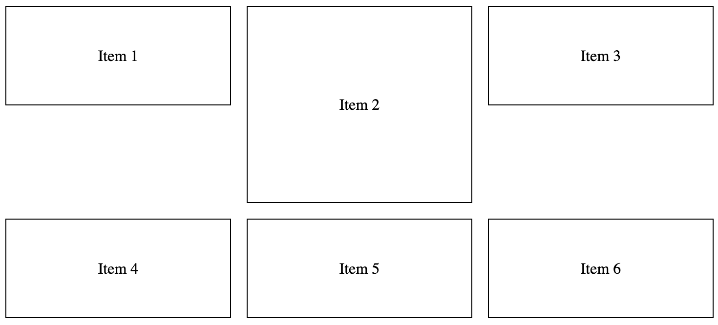
<div id="app" />When clicking on e.g. Item 2, the grid looks as follows:
However, in this case, I would like the grid to look like:
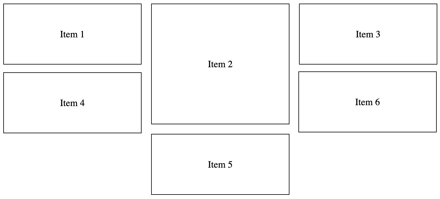
How would I go about fixing this? The solution does not have to use the a CSS Grid. However, the responsive width of the elements, and the responsive number of rows and columns must be maintained.
2
Answers
I don’t think it’s really possible to do what do you want to do only with Grid property.
Because we have two main grid size property: grid-template-rows and grid-template-columns.
And the third one: grid-template-columns, you can make different sizes for rows and columns.
But the main problem is if you get bigger than the column height, you will push everyone around.
This is an example using the method I mentioned above:
So to resolve your problem, use Flex property, you can do a grid with 3 columns and every column has its flex property.
Like that:
If you are looking for dense grid layout then on grid container you need mention that you need dense auto flow in rows:
To properly increase the items’ height, increase row span as well: