skip to Main Content

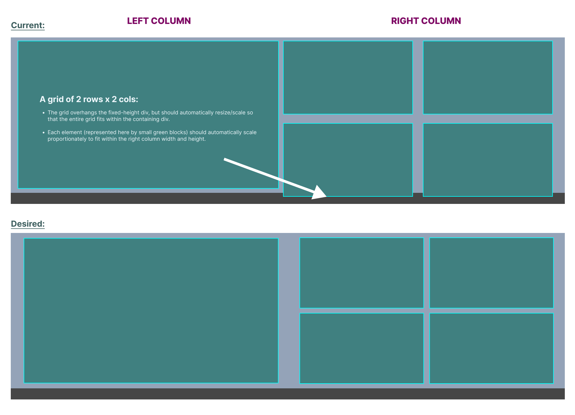
I have an image gallery that is overflowing its containing div. I have tried various solutions to no avail. What CSS code approach will fit the grid to the fixed-height outer div, including making each image with caption automatically resize/scale to fit proportionally?

@@@

What I’ve Tried

The basic approach I tried was this:

  1. Set a fixed height on container div
  2. Set the direct children of the container div to height: 100%, so that it will automatically fill the available space

Additionally, I’ve tried setting height and width on various levels of nested content items to no avail. I’m not sure what I’m missing.

Here is a link to the live staging site: http://elijahlisttv.org/home-3/

2

Answers


  1. Chosen as BEST ANSWER

    Well, I didn't find the answer to this exact/specific question, but I did discover the answer to the problem I was trying to solve. Having played around with the CSS a bit more, it looks like the root issue is I can't seem to remove the spacing between the the rows on the right. I've tried removing margin, padding, and ensuring there was no "gap" property of any kind. No love.

    SOLUTION: Drag column widths until the Elementor posts grid widget in the right column looks even with the image in the left column.

    Elementor posts grid widget image grid even with large full-column image on left as result of adjusting column widths

    Still taking answers for how to do this with CSS.


  2. Elementor generates terrible code 😞.
    Below I provide one of the options for implementation 👇.

    .grid {
      display: grid;
      grid-template-columns: repeat(4, 1fr);
      grid-gap: 20px;
      max-width: 1200px;
    }
    
    @media (max-width: 599px){
      .grid {
        grid-template-columns: repeat(2, 1fr);
      }
    }
    
    .cell:first-child {
      grid-row: span 2;
      grid-column: span 2;
    }
    
    @media (max-width: 599px){
      .cell:first-child {
        grid-row: unset;
      }
    }
    
    .cell img {
      aspect-ratio: 16/9;
      display: block;
      width: 100%;
      height: 100%;
      object-position: center;
      object-fit: cover;
    }
    <div class="grid">
      <div class="cell">
        <img src="https://picsum.photos/600/340" alt="">
      </div>
      <div class="cell">
        <img src="https://picsum.photos/600/340" alt="">
      </div>
      <div class="cell">
        <img src="https://picsum.photos/600/340" alt="">
      </div>
      <div class="cell">
        <img src="https://picsum.photos/600/340" alt="">
      </div>
      <div class="cell">
        <img src="https://picsum.photos/600/340" alt="">
      </div>
    </div>
    Login or Signup to reply.
Please signup or login to give your own answer.
Back To Top
Search