


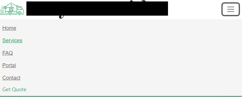
In desktop and mobile screen sizes I have a white nav bar.
For the mobile dropdown I want the background to be grey.
I’ve accomplished this targeting .show on smaller screens – writing in the css for the grey background.
However, when toggling the nav button to open the menu, the transition will display a white background and no CSS I’ve written, after the transition it hops to what I’ve told it to.
Im unsure, but maybe the answer is within css3’s ::before or ::after.
Any ideas?
HTML
<!-- Nav -->
<nav class="navbar navbar-expand-lg fixed-top">

  <img class="navlogo img-fluid" src="img/master/logo1.jpg">

<button class="navbar-toggler" type="button" data-toggle="collapse" data-target="#navbarNav"
  aria-controls="navbarNav" aria-expanded="false" aria-label="Toggle navigation" style="
  margin-right: 12px;">
  <span class="navbar-toggler-icon"></span>
</button>

<div class="collapse navbar-collapse justify-content-end" id="navbarNav">
  <ul class="navbar-nav">

      <li class="nav-item active">
          <a class="nav-link" href="Default.html"><u>Home</u></a>
      </li>

    <li class="nav-item">
          <a class="nav-link" href="services.html"><u>Services</u></a>
      </li>
</nav>
CSS
 @media (min-width:345px) and (max-width: 379px) {
    .navbar .show  {background-color: #f5f5f5; padding:10px; border-bottom:solid 1px black; border-radius: 5px;}
  }
2
Answers
Austin hello, is what you want to do is add a background directly to the navigation bar menu or are you thinking about adding a background to the links you have listed? will you export my show property to the nav tag or to the div tag containing the collepse class.
The issue you’re facing with the mobile navigation bar background not displaying correctly during the transition is likely due to the default Bootstrap styles interfering with your custom CSS. Bootstrap applies its own styles during transitions and then your custom styles take effect after the transition is complete.
To solve this issue, you can use a combination of CSS selectors to ensure your custom styles take precedence during the transition. One way to do this is by using the !important declaration in your CSS, which gives your styles the highest specificity and overrides any conflicting styles. Here’s an example:
css
By adding !important to your custom styles, you ensure that they take precedence during the transition, and the background will be grey with padding-left applied as intended.
However, it’s important to use !important sparingly, as it can make your CSS harder to maintain in the long run. If you find that using !important is causing more issues or conflicts in your project, you might consider restructuring your CSS or using more specific selectors to target the elements you want to style.