skip to Main Content

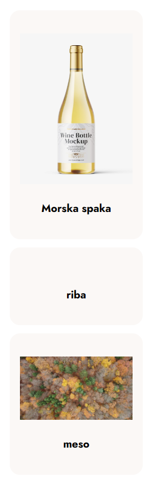
I’ve managed to make all columns in a row the same height, however, I don’t know how to do it for rows (see the screenshots and code below). I would like that in a mobile view, when there is only one card in a row, all rows have the same height.

<div ref={ponudbaRef} className="trending-menu-section">
    <div className="container-fluid">
        <div className="row g-3 g-lg-4">
            <>
                {data?.map((item, i) => (
                    <div className="col-sm-6 col-lg-3 d-flex" key={i}>
                        <div className={`card-body offer-item text-center`}>
                            <div className="text-center">
                                <img src={item.slika} alt="" />
                            </div>
                            <h4 className="title">
                                <Link to="/productDetails" state={{ime: item.ime}}>{item.ime}</Link>
                            </h4>
                        </div>
                    </div>
                ))}
            </>
        </div>
    </div>
</div>

Here all the rows are different:

three rows

Here columns in the same row have the same height:
two columns

2

Answers


  1. You can make each row (col-sm-6 col-lg-3 d-flex) a flex container and then apply align-items: stretch, which is the default behavior of a flex container. This makes each card (a flex item in this context) stretch to the height of the tallest item in the row. Because each row in the grid of cards is a new flex container, this ensures that all cards in each row have the same height. However, it does not ensure that cards in different rows have the same height.

    <div ref={ponudbaRef} className="trending-menu-section">
        <div className="container-fluid">
            <div className="row g-3 g-lg-4">
                {data?.map((item, i) => (
                    <div className="col-sm-6 col-lg-3 d-flex align-items-stretch" key={i}>
                        <div className={`card-body offer-item text-center d-flex flex-column`}>
                            <div className="text-center">
                                <img src={item.slika} alt="" />
                            </div>
                            <h4 className="title mt-auto">
                                <Link to="/productDetails" state={{ime: item.ime}}>{item.ime}</Link>
                            </h4>
                        </div>
                    </div>
                ))}
            </div>
        </div>
    </div>
    
    Login or Signup to reply.
  2. Add the following CSS:

    @media only screen and (max-width: 576px) { // CSS will apply to mobile only
      .card-body {
        height: 200px; // Make all cards the same height
      }
    
      img {
        width: 100%; // Make the image full window width
        max-height: 150px; // But not higher than 150px
        object-fit: contain; // Preserve image aspect ratio
      }
    }
    

    See the live demo.

    App.js

    import "./styles.css";
    import img1 from "./salmon3.png";
    import img2 from "./rib.png";
    
    export default function App() {
      return (
        <div className="pb-120 desert-menu-section">
          <div className="container-fluid">
            <div className="row g-3 g-lg-4">
              {data?.map((item, i) => (
                <div
                  className="col-sm-6 col-lg-3 d-flex align-items-stretch"
                  key={i}
                >
                  <div className="card-body offer-item text-center">
                    <div className="text-center">
                      <img src={item.img} alt="" />
                    </div>
                    <h4 className="title">
                      <p to="/productDetails" state={{ ime: item.title }}>
                        {item.title}
                      </p>
                    </h4>
                  </div>
                </div>
              ))}
            </div>
          </div>
        </div>
      );
    }
    
    const data = [
      {
        img: img1,
        title: "Juicy Beef Burger Meal"
      },
      {
        img: img2,
        title: "Choko Milkshake From Heaven"
      }
    ];
    

    styles.css

    .App {
      font-family: sans-serif;
      text-align: center;
    }
    
    .container {
      position: relative;
      z-index: 1;
    }
    
    @include breakpoint(xl) {
      .container {
        max-width: 1260px;
        padding-left: 15px;
        padding-right: 15px;
      }
    }
    
    @include breakpoint(max-lg) {
      .container,
      .container-fluid {
        padding-inline: 30px;
      }
    }
    
    .pb-120 {
      padding-bottom: 120px;
      @include breakpoint(max-lg) {
        padding-bottom: 90px;
      }
    }
    
    @include breakpoint(max-md) {
      .desert-menu-section {
        padding-top: 40px;
      }
    
      .trending-menu-section {
        padding-top: 140px;
      }
    
      .layer-section {
        padding: 140px 0 130px;
        .btn-base {
          font-size: 18px;
          padding: 10px 45px;
        }
      }
    }
    
    /* Added */
    @media only screen and (max-width: 576px) {
      .card-body {
        border: 1px solid red;
        height: 200px;
      }
    
      img {
        width: 100%;
        max-height: 150px;
        object-fit: contain;
      }
    }
    
    Login or Signup to reply.
Please signup or login to give your own answer.
Back To Top
Search