skip to Main Content

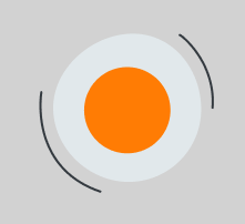
I want to create some decoration for my website and this is the svg I have:
svg image

<svg width="156" height="142" viewBox="0 0 156 142" fill="none" xmlns="http://www.w3.org/2000/svg">
<g>
<path d="M144.094 67.4748C144.094 75.9193 142.43 84.2811 139.197 92.0827C135.965 99.8842 131.226 106.973 125.253 112.943C119.28 118.913 112.189 123.649 104.385 126.879C96.5816 130.109 88.2177 131.771 79.7716 131.768C44.2485 131.768 12.9238 101.745 12.9238 66.1794C12.9238 30.6139 48.0205 0.410156 83.5437 0.410156C119.067 0.410156 144.094 31.942 144.094 67.4748Z" fill="#E1E8EB"/>
<path d="M78.6071 106.451C99.7205 106.451 116.836 89.3382 116.836 68.2288C116.836 47.1194 99.7205 30.0068 78.6071 30.0068C57.4937 30.0068 40.3779 47.1194 40.3779 68.2288C40.3779 89.3382 57.4937 106.451 78.6071 106.451Z" fill="#FF7C04"/>
<path d="M2.42712 52.3071C2.42712 52.3071 -8.97112 118.683 54.695 140.344" stroke="#343A40" stroke-width="2" stroke-miterlimit="10" stroke-linecap="round"/>
<path d="M125.151 1.63965C126.644 1.63965 157.148 26.1207 154.147 66.048" stroke="#343A40" stroke-width="2" stroke-miterlimit="10" stroke-linecap="round"/>
</g>
</svg>

As you can see there is two curved lines around the two circles. I want those lines to be rotating around circles indefinitely. Could someone guide me on the correct approach to implement this effect? Thank you!

I tried using css transform: rotate(); but I was unsucussfull.

3

Answers


  1. An easy solution would be to use the css animation-feature (link to the documenation), than you just need to create 2 keyframes for the animation. The first one (0% of the animation-time) with no rotation and the second one (100% of the animation-time).

    In the animationproperty you just need to sethow long the rotation should take and some other properties.

    Info: I set the property transform-origin to the middle of the svg, since I assume the lines should rotate around the center. btw.: the reason why the lines are sometimes cut off, is because the size (width/height) of the svg is too small.

    Here a working demo:

    .rotating-lines {
      animation: rotate 12s linear infinite;
      transform-origin: 80px 70px;
    }
    
    @keyframes rotate {
       0% {
        transform: rotate(0deg); 
        
        }
       100% { 
              transform: rotate(360deg);
       }
    }
    <svg width="156" height="142" viewBox="0 -15 160 170" fill="none" xmlns="http://www.w3.org/2000/svg">
    <g>
    <path d="M144.094 67.4748C144.094 75.9193 142.43 84.2811 139.197 92.0827C135.965 99.8842 131.226 106.973 125.253 112.943C119.28 118.913 112.189 123.649 104.385 126.879C96.5816 130.109 88.2177 131.771 79.7716 131.768C44.2485 131.768 12.9238 101.745 12.9238 66.1794C12.9238 30.6139 48.0205 0.410156 83.5437 0.410156C119.067 0.410156 144.094 31.942 144.094 67.4748Z" fill="#E1E8EB"/>
    <path d="M78.6071 106.451C99.7205 106.451 116.836 89.3382 116.836 68.2288C116.836 47.1194 99.7205 30.0068 78.6071 30.0068C57.4937 30.0068 40.3779 47.1194 40.3779 68.2288C40.3779 89.3382 57.4937 106.451 78.6071 106.451Z" fill="#FF7C04"/>
    <path class="rotating-lines" d="M2.42712 52.3071C2.42712 52.3071 -8.97112 118.683 54.695 140.344" stroke="#343A40" stroke-width="2" stroke-miterlimit="10" stroke-linecap="round"/>
    <path class="rotating-lines" d="M125.151 1.63965C126.644 1.63965 157.148 26.1207 154.147 66.048" stroke="#343A40" stroke-width="2" stroke-miterlimit="10" stroke-linecap="round"/>
    </g>
    </svg>
    Login or Signup to reply.
  2. Although your svg code is correct I opted for a simplified version.

    Please observe that the outer circle has a stroke-dasharray attribute.
    The stroke-dasharray attribute is a presentation attribute defining the pattern of dashes and gaps used to paint the outline of the shape.

    The total length of the stroke is 483 so the stroke-dasharray="120.75" which is 1/4 of the total length (2 * stroke + 2 * gaps).

    For the animation I’m animating the stroke-dashoffset from 241.5 (half total length) to 0.

    The stroke-dashoffset attribute is a presentation attribute defining an offset on the rendering of the associated dash array.

    .anim{
      stroke-dashoffset: 241.5;
      animation: dash 5s linear infinite
      ;}
    
    @keyframes dash {
      to {
        stroke-dashoffset: 0;
      }
    }
    <svg width="156" viewBox="0 0 156 156" fill="none" xmlns="http://www.w3.org/2000/svg">
     <circle fill="#E1E8EB" cx="78" cy="78" r="65"/> 
     <circle fill="#FF7C04"  cx="78" cy="78" r="40"/>
     <circle class="anim" fill="none" cx="78" cy="78" r="77" stroke="black" stroke-dasharray="120.75">
    </svg>
    Login or Signup to reply.
    • Set pathLength="4" on the circle (or path) to divide it into 4 segments and avoid doing any calculations

    • Use SVG SMIL animation to avoid using any CSS

    <svg width="156" viewBox="0 0 156 156">
     <circle fill="lightgrey" cx="78" cy="78" r="65"/> 
     <circle fill="orange"    cx="78" cy="78" r="40"/>
     <circle fill="none"      cx="78" cy="78" r="77" stroke="black" 
             pathLength="4" stroke-dasharray="1">
        <animateTransform attributeName="transform" attributeType="XML"
                          type="rotate" from="0 78 78" to="360 78 78"
                          dur="15s" repeatCount="indefinite" />
     </circle>
    </svg>
    Login or Signup to reply.
Please signup or login to give your own answer.
Back To Top
Search